Weekly S&P500 ChartStorm - 27 November 2022
This week: technicals check, insider selling, flows, foreigners, positioning, margin debt, shorts, ERP, macro, value vs growth...
Welcome to the Weekly S&P500 #ChartStorm — a selection of 10 charts which I hand pick from around the web and post on Twitter.
These charts focus on the S&P500 (US equities); and the various forces and factors that influence the outlook - with the aim of bringing insight and perspective.
Hope you enjoy!
Sign up for the Daily Shot Brief — Global Macro Currents, Visualized.
The Daily Shot is one of my personal favorite sources of interesting macro & market charts — be sure to check it out if you haven’t signed up yet!
1. Trendline Tasks: Looks like the market has reclaimed the 4000-level on its second attempt, but now the key task ahead of the S&P500 is to deal with that downtrend line (and the 200-day moving average).
Source: @Callum_Thomas
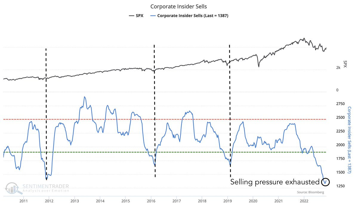
2. Insiders Out! Insider selling pressure easing off... bullish? A couple of things to think about: a. insiders are probably less inclined to sell at lower prices all else equal (unless they have to); b. forced selling by those that have to sell likely gets exhausted over time; c. insiders who in their mind (and often in reality) perceive a much brighter future for a given company than the market are less likely to sell.
Source: @sentimentrader via @GameofTrades_
3. Fun With Fund Flows: This is an intriguing picture. According to EPFR data, the big surge into cash in 2020 has not been unwound. Neither has the more gradual stampede into equities. (bonds on the other hand saw outflows as fixed income went through its worst performance in history due to the inflation/rate shock)
What happens next? Does all that cash go into equities? Do investors rotate out of equities and into bonds? I know what I would do, but sometimes hard to figure out what the crowd will do as this chart is somewhat counterintuitive in some respects.
Source: @YunLi626
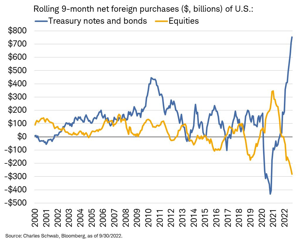
4. Foreign Rotation: Interesting picture, and kind of at odds with the previous chart: foreigners have been rotating out of equities and into bonds...
Source: @LizAnnSonders via @f_wintersberger
5. Exposure Round Trip: Hedge funds have reduced net-leverage and equity mutual funds have raised cash (n.b. cash allocation is inverted in that chart) — on both fronts back to pre-covid-mega-stimulus-bubble-levels (albeit arguably they could move further, given how they are tracking vs history).
Source: @PhilipJagd
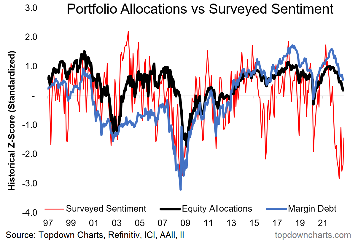
6. Positioning vs Sentiment: Investors are slowly but surely reducing equity allocations and de-leveraging margin debt positions...
(but still at odds with how they say they feel about the market outlook in surveys)
Source: @topdowncharts
7. Margin Called! File under "things that look exactly like 00/01 & 08/09".
Source: @topdowncharts
8. Fallen Short: More on positioning — short interest is tentatively turning up from the lowest levels since 2000. Is this one going to do a round trip back to pre-2020 levels too?
Source: @macro84
9. Equity Risk: In times of stress and uncertainty investors require a higher equity risk premium to compensate for risk... As things stand, by this measure, investors are not getting compensated (enough) for taking on equity risk above and beyond bonds. I would say bonds have the upper hand vs equities going into 2023 (particularly given the macro outlook, and the main currents).
Source: @MichaelAArouet
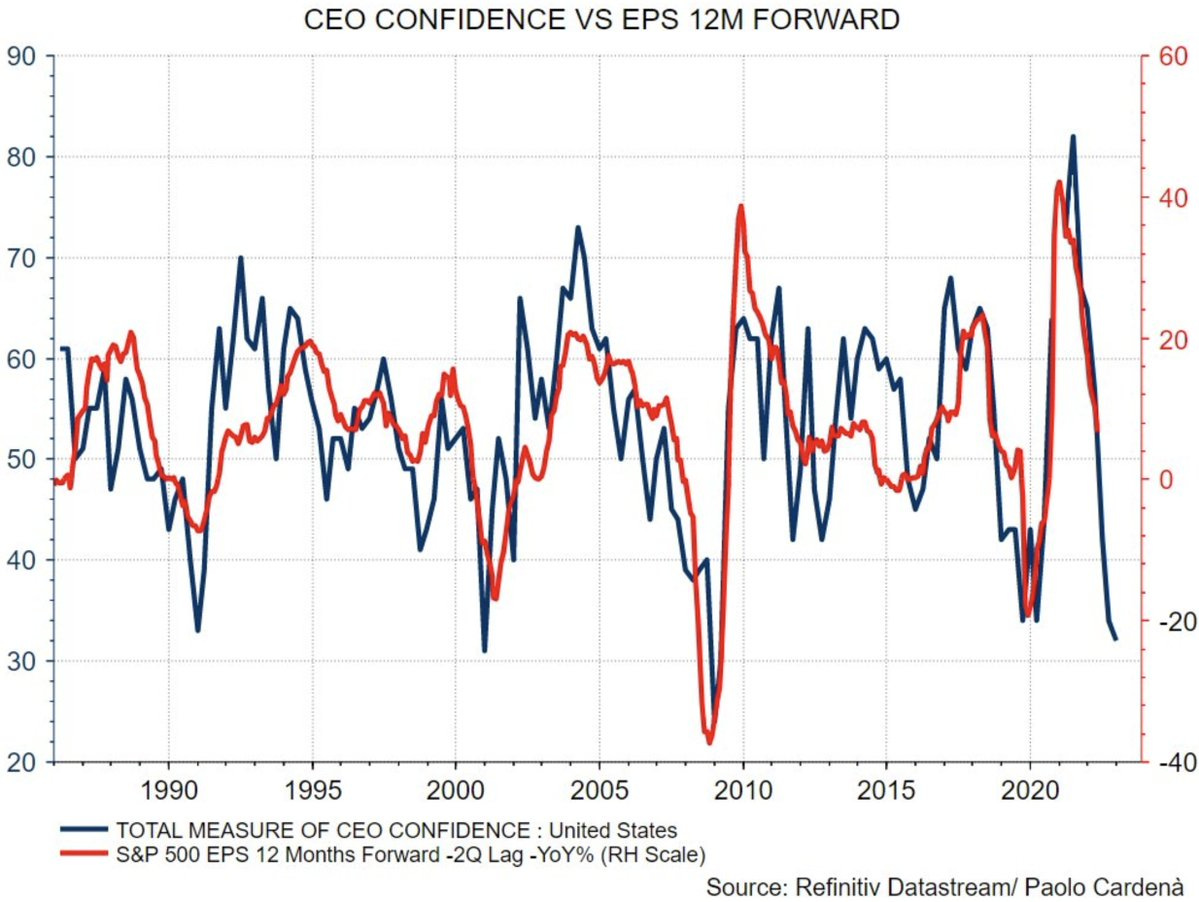
10. CEO (crisis of) Confidence: The plunge in CEO confidence is consistent with a sharp economic downturn; earnings recession.
Source: @paolocardena via @saxena_puru
The Investor’s Podcast Network — We Study Markets Newsletter
For years on the show “We Study Billionaires”, The Investor’s Podcast Network has made a habit of chatting with the world’s best investors, like Ray Dalio, Joel Greenblatt, Howard Marks, and many more. With 100+ million downloads, they make podcasts by investors, for investors.
Now, they’re joining the newsletter space. Read The Investor’s Podcast Network’s full daily commentary and expert insights in the We Study Markets newsletter.
Click here to sign up (for free) today.
BONUS CHART >> got to include a goody for the goodies who subscribed.
Value vs Growth: markets have a habit of stampeding in one direction, only to turnaround and run just as furiously in the opposite direction. It’s reflective of macro/financial cycles, and social/crowd-psychology cycles.
One of the best illustrations of this is the long-term relative performance chart of value stocks vs growth stocks.
In this chart I have shown the total return view (i.e. inclusive of dividends reinvested) because the price-only view overstates the underperformance of value stocks (given growth stocks historically generated most of their returns from capital growth rather than dividends as such).
But back onto the line of thought from before. We can see several episodes where the line in this chart stretched far from the long-term average, for instance during the dot-com bubble where tech stocks were the new hot thing (for a short while). And then later it was all about financials and commodity related stocks during the subprime credit bubble and commodity supercycle. Only then for commodity bust and financial regulation-reaction to crunch value stocks, along with tech’s second coming — culminating in the 2020 pandemic purge (tech stocks were gifted a growth shock, and value stocks were the initial losers of the pandemic).
Now things are clearly turning around, and by this stage it is looking more and more like *the* turning point is in (these things tend to be multi-year in nature).
Growth stocks (tech and tech related) are taking a back seat as exponential growth assumptions are brought back to reality, and value stocks are finding growth in the form of higher bond yields and commodity prices (e.g. in the case of energy & financials), and a defensive bid (e.g. in the case of healthcare, consumer staples, utilities).
By my metrics, tech stocks still have a long way to go before they show up as cheap, while value stocks are still relatively cheap by comparison. So in keeping with the comment from the start about macro/psychological cycles, maybe this one has a ways to run yet…
—
Best regards,
Callum Thomas
My research firm, Topdown Charts, has a NEW entry-level service, which is designed to distill some of the ideas/themes/charts from the institutional research service to provide the same high quality insights at a more accessible price.
Give it a try and let me know what you think! :-)
For more details on the service check out this recent post which highlights: What you get with the service; Performance of the service; and importantly: What our clients say about it…


Reminder to get in touch if you want to sponsor the Weekly ChartStorm -- we still have a few spaces available early next year: https://chartstorm.substack.com/p/information-for-sponsorsadvertisers