
Weekly S&P500 ChartStorm - 27 April 2025
This week: technical check, economic noise, sentiment snippets, cash cash cash, retail buying, rich vs poor wealth, investor sentiment vs economic sentiment...

Welcome to the latest Weekly S&P500 #ChartStorm!
Learnings and conclusions from this week’s charts:
Short-term technicals look good, but resistance looms overhead.
The negative economic noise is deafening.
Sentiment remains deeply pessimistic.
Cash piles are building.
Economic sentiment is catching down to investor sentiment.
Overall, the absence of new bad news, some less bad news, and the rebound in stocks is enough to frustrate the bears and embolden the bulls. The key words of “bull traps”, “bear market rallies” and “the eye of the storm” (on the looming but lagging impacts of tariffs) all come to mind as we simply don’t know how bad (or benign) it may end up being. So what do you do? Keep an eye on the charts of course…
1. Technical Check: We’ve seen the index make a higher low, breadth tick up from oversold, and the S&P500 is now back above 5400 — short-term, on technicals only: that looks promising. The key test from here is that dual resistance of the 50-day moving average and the ~5600 zone… thing I would be wary of is, yes OK maybe technicals are less important in this heavily news/noise driven market, but the thing is you tend to see these catalysts/excuses show up at technically convenient points. So be wary of bad news risk as we head towards that bull-bear resistance showdown.

Source: Callum Thomas using MarketCharts charting tools
2. Economic Noise: And to keep with that theme, the economic noise index remains deep in negative noise for now; policy uncertainty remains very high (inverted on this chart), and economic surprises have been heading lower.
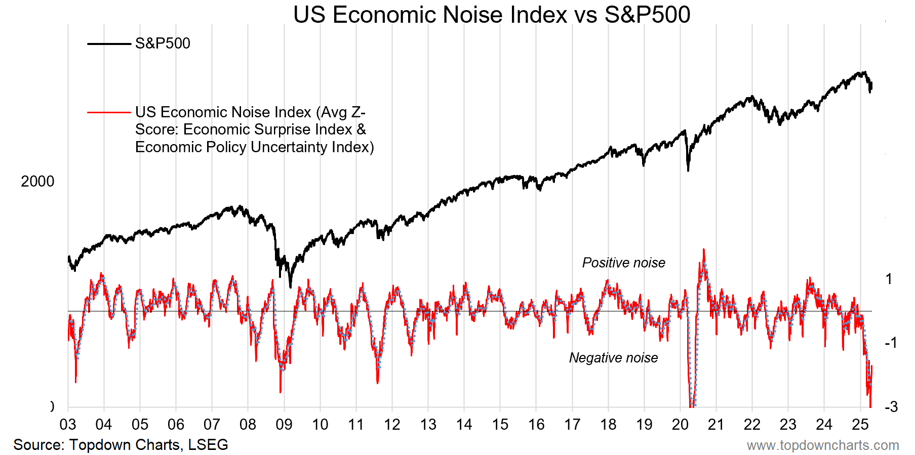
Source: Topdown Charts
3. Surprise… On economic surprises, the soft data (surveys) have plunged faster than expected, but hard data seems to be surprising — I think there are 3 things at play here; 1. expectations may have gotten too low; 2. some of the hard data upside surprises may relate to tariff front-running and distortions; and 3. the gap on this chart may relate to an eye-of-the-storm effect… it takes around a month for goods to ship from China to America, and that pull-forward of demand from tariff front-running is going to leave a demand air pocket. May-June data could get ugly.
