
Weekly S&P500 ChartStorm - 26 September 2021
This week: checking on technicals, sentiment, covid, value vs growth, profit margins and earnings growth, inflation, household equity allocations, and active management...

Welcome to the Weekly S&P500 #ChartStorm (by email!)
The Chart Storm is a weekly selection of 10 charts which I hand pick from around the web (+some of my own charts), and then post on Twitter.
The charts focus on the S&P500 (US equities); and the various forces and factors that influence the outlook - with the aim of bringing insight and perspective.
Hope you enjoy!
p.s. if you haven’t already, subscribe (free) to receive the ChartStorm direct to your inbox, so you don’t miss out on any charts (you never know which one could change the whole perspective!)
1. S&P500 and the 50-Day Moving Average: After a very close call there, the S&P500 has reclaimed its 50dma. So strictly speaking, at least for now, the well-entrenched habit of the past year of the S&P500 bouncing off the 50dma seems to continue. I would note though that much of the worry list that we were looking at in the past couple of weeks is still in play (Evergrande, Fed taper, corporate tax hike prospects, debt ceiling, delta, stagflation, etc).

Source: @Callum_Thomas
2. S&P 500 -- 50-day Moving Average Breadth: That’s a clear and compelling rebound in the 50dma breadth indicator from very familiar levels. As an oscillator this looks like a textbook bullish signal (bouncing from oversold). The counterpoint though is that as of Friday (despite the index being back above the 50) still only ~47% of stocks are above their respective 50dma...

Source: @Callum_Thomas
3. (re)Reopening: Forget about Fed tapering, what I am more interested in is “Covid Tapering“ — we can observe a clear tapering of Covid cases. As such, we're starting to see the Reopening Beneficiaries outperform as the market prices in better covid outcomes. I believe this is a critical piece of information for markets - especially bonds (which are already on the move).

Source: @MikeZaccardi
4. Sentiment: Investor sentiment has been properly rinsed out -- currently the bulls vs bears indicator (combined across the AAII and II surveys) is sitting 0.5 S.D. below long term average (vs previous extreme optimism). The open question though is whether this is enough of a reset, and too - whether this is simply a harbinger of further downside.
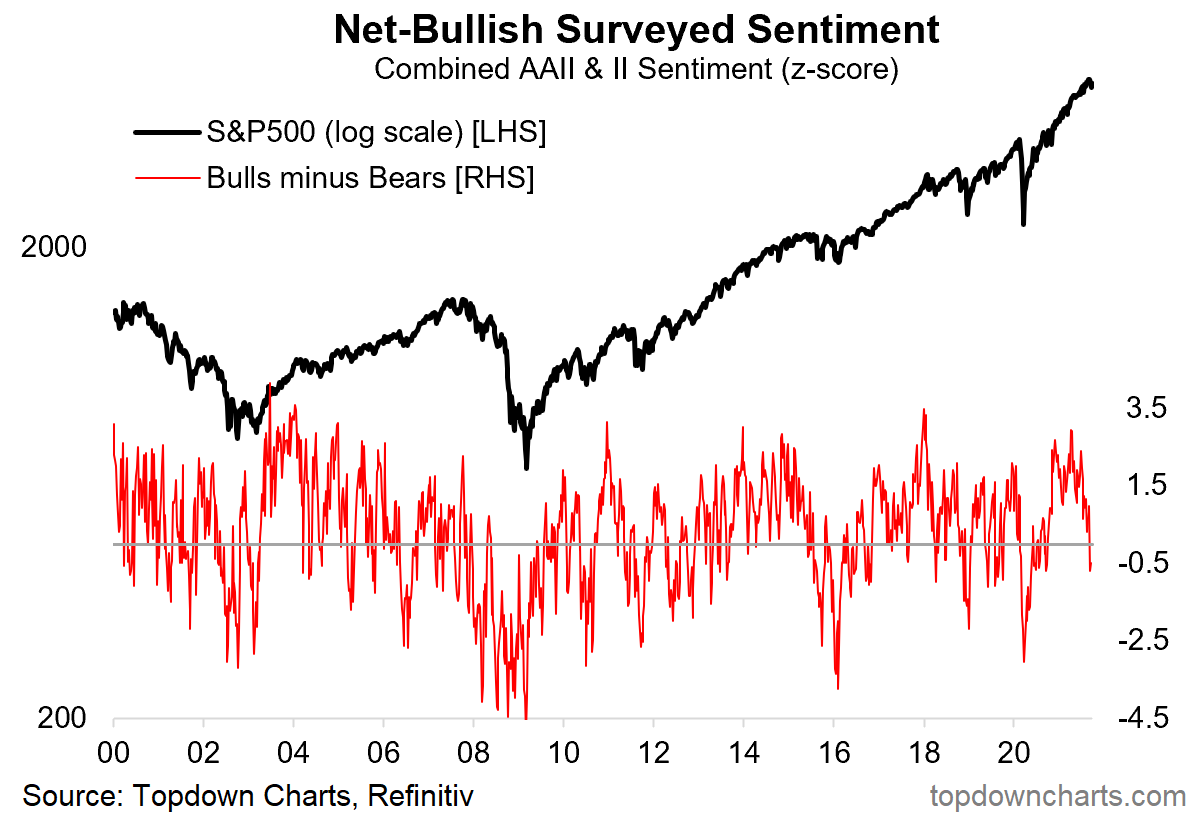
Source: @topdowncharts
5. Value vs Growth: This chart shows the relative performance of Value and Growth vs the S&P500 - a couple of things standout to me. First, obviously the WIDE divergence in experience across the two cohorts. Second, both of them look to be showing signs of trend exhaustion - dare I say: is value bottoming? (apologies in advance if I have just jinxed it!!).

Source: @Mayhem4Markets
6. Profit Margins: New All-Time-High for S&P500 profit margins. Goes to show it’s not just smoke and mirrors (and Fed policy) driving this market higher.

Source: @charliebilello
7. From Sales to Profits: Now that we know what’s going on in profit margins, this next chart makes all the more sense, but is still very fascinating and stark to see -- massive improvement in sales and earnings vs 2019.
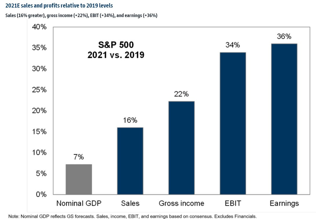
Source: @DavidSchawel
8. Inflation Mentions: A record number of companies mentioned “inflation“ in their Q2 earnings calls - clearly though this is NOT having an impact on profit margins at this stage (maybe later?). Albeit, for many companies higher inflation simply means higher nominal growth (i.e. higher sales).

Source: @PriapusIQ @FactSet
9. US Household Equity Allocations: Another new ATH! I think this one kind of speaks for itself, so I will save the embellishment.
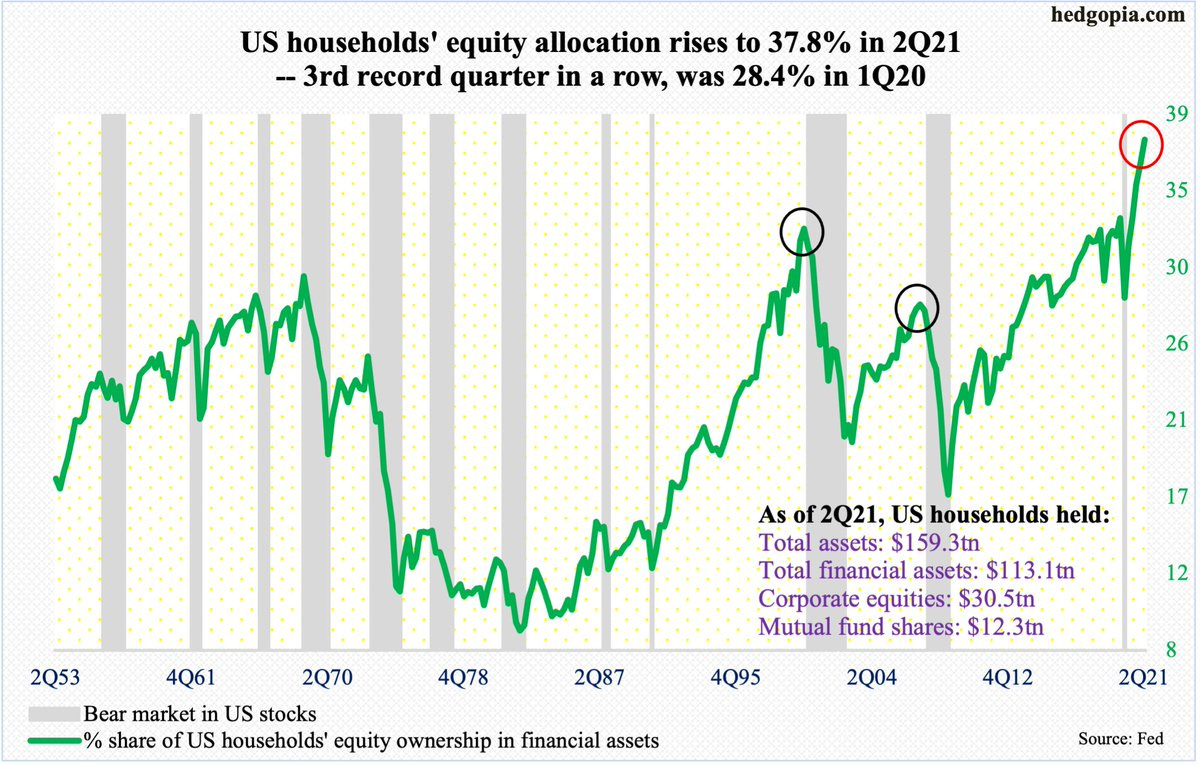
Source: @hedgopia
10. Proportion of Funds Underperforming their Benchmark: Analysis by S&P Dow Jones Indices shows at least historically just how hard it is to beat the benchmark. Over most time frames most active managers underperformed: even in emerging markets and small caps where arguably selection would intuitively add value…. I guess that’s one reason why they say asset allocation drives most of most portfolio returns.
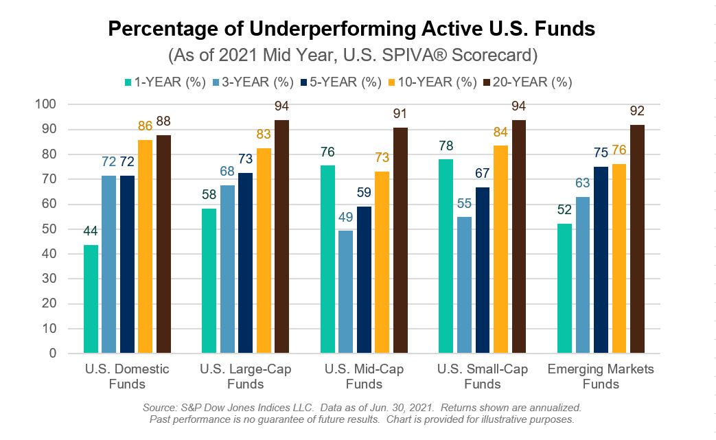
Source: @sherifa_issifu
Thanks for following, I appreciate your interest!
oh… that’s right, almost forgot!
BONUS CHART >> got to include a goody for the goodies who subscribed.
US Margin Debt Trends: the August margin debt data was just released (yes laggy - margin debt data gets released monthly with basically a 1-month lag).
Looking at the net amount of margin debt we find things sitting at new all time highs (that phrase is familiar… think I heard it somewhere…).

Of course this is somewhat one-dimensional as we need to remember that the market has gone up a lot and obviously done a lot of heavy lifting (but even then I would say it is still an important chart given the magnitude of things).
So the next chart shows a slightly broader version of leveraged stockmarket bets, but importantly - standardized against the market cap of the S&P500.

After you normalize/standardize it, leveraged bets in the US stockmarket only look VERY HIGH, rather than EXTREMELY HIGH (and not quite at an all time high).
To be fair, it does exclude other sources of leverage (e.g. credit cards, or the leverage afforded by options and other derivatives), but it does go to show how exposed investors are if things don’t quite go to plan…
Let’s be careful out there.
—
Best regards,
Callum Thomas
SPONSOR: ( …he’s me!)
My research firm, Topdown Charts, has a new entry-level Substack service, which is designed to distill some of the key ideas and themes from the institutional fund manager service to provide the same high quality insights at a more accessible price.
Give it a try and let me know what you think