Weekly S&P500 ChartStorm - 26 March 2023
This week: technical check, sentiment and positioning, Fed cycles, financial conditions, earnings outlook and confusion, credit cycles, small vs large, +update on key risk indicators for bank stocks
Welcome to the latest Weekly S&P500 #ChartStorm!
Learnings and conclusions from this week’s charts:
The market remains sandwiched between support(s) and resistance(s).
Range-trading is actually very normal for this type of macro environment (where the Fed is in a fast hiking cycle), especially when there is such disagreement between bulls and bears.
Fund managers remain decidedly defensive in their positioning.
Wall Street analysts as a group see a short and shallow earnings recession, but with heavy disagreement, and in contrast to the leading indicators which say deep steep recession for US corporate earnings.
Global and US bank stocks +CDS pricing are still within risk trigger limits; monitoring closely for a breach of limits (I will update when and if).
Overall, the bulk of medium-term and macro indicators remain consistent with the recessionary bear market thesis, but short-term it’s a case of waiting and watching the various trigger points (on the downside AND upside).
1. S&P Support Sandwich: As a status check, the S&P500 closed up on the week — above its 200-day moving average, above 3900, and above that fabled downtrend line. But it also closed below its 50-day moving average, below 4000, and below it’s apparent short-term uptrend line. So it’s a case of being sandwiched between various support and resistance heuristics as the range-trade stalemate continues…
Source: Topdown Charts @TopdownCharts
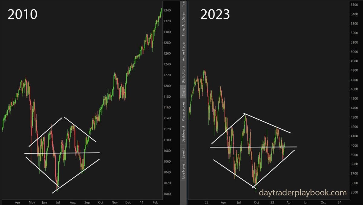
2. Rare as Diamonds: Here’s an intriguing image to think about — while the macro backdrop is obviously very different (very), the suggestion is that we could be seeing the same kind of “diamond“ technical formation that showed up in 2010. The idea is that the period of expanding and then contracting range trading is an attempt by markets to factor in all the competing evidence (and a struggle between bulls and bears). But anyway, perhaps the key takeaway from this one is that it’s actually kind of moot until it breaks out (or down for that matter) — but a useful trigger point.
Source: @yuriymatso
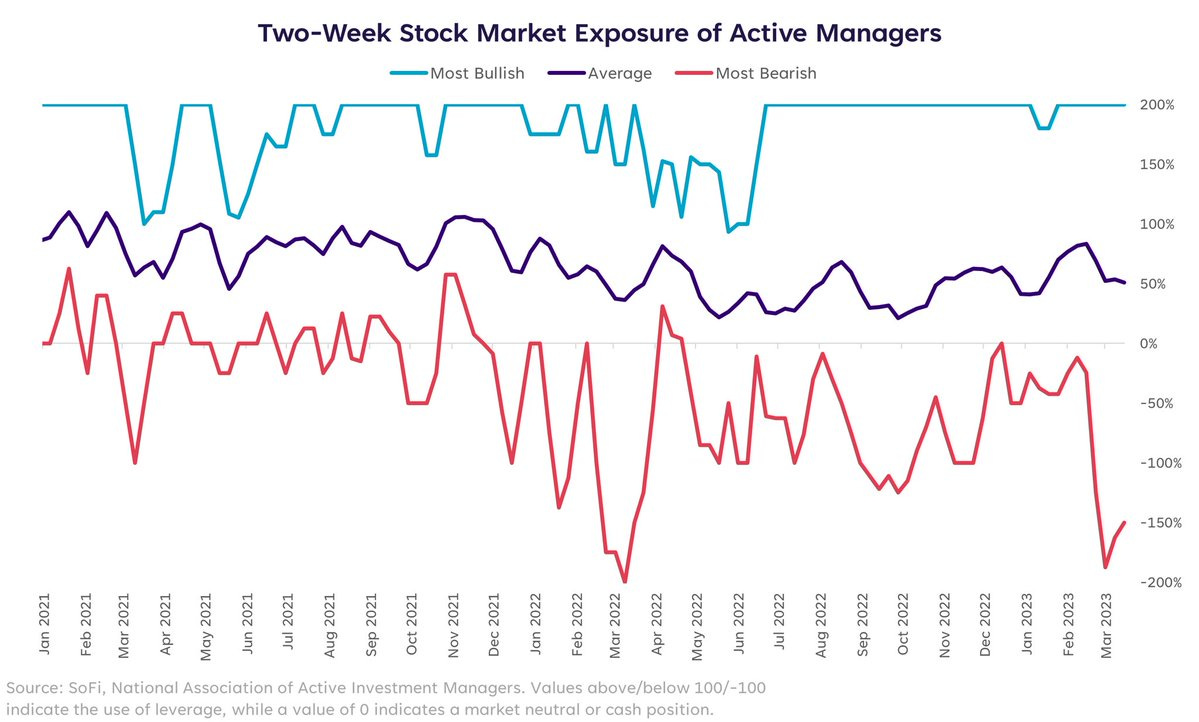
3. Most Bearish Managers: This chart maps the path of equity exposure levels of the most bullish vs most bearish managers in the NAAIM survey. It’s interesting to note that the most bearish managers are running the most bearish positioning since the Russian invasion of Ukraine last year …and yet how the most bullish managers are running maximum bullish exposures. So, who’s wrong?
Source: @LizYoungStrat
4. Fund Manager Positioning: Firstly, this is an entirely different cohort of investors than the previous survey, but the main point is that fund managers surveyed by BofA say they are running high exposure to cash and light exposure to equities (and interestingly, very long EM vs US). I think much of the positioning in this chart makes sense (and is what I have been advocating), but I am equally aware of how consensus it is. Now, it is important to note that the consensus can be right —and often is in the early and middle stages of a trend, but the existence of a consensus means the risk of sometimes sharp short-term countermoves is elevated (and the existence of a heavy consensus is often also fuel for trend changes).


