Weekly S&P500 ChartStorm - 26 June 2022
This week: YTD markets check, technicals sit-rep, oversold indicators, capitulation or not, and monetary + fiscal headwind hurdles...
Welcome to the Weekly S&P500 #ChartStorm — a selection of 10 charts which I hand pick from around the web and post on Twitter.
These charts focus on the S&P500 (US equities); and the various forces and factors that influence the outlook - with the aim of bringing insight and perspective.
Hope you enjoy!
NEW: Sign up to the (free) Chart Of The Week over at the new Topdown Charts Substack entry-level service: Subscribe to the Chart of the Week
Each week we send you one of the most interesting charts on our radar, along with commentary/context and a key takeaway — so you’re never left guessing on why the chart matters ...and the charts matter! > > > Subscribe Now
1. Asset Return Quilt YTD: Well, we’re almost at the half-way point for 2022 (and what a year it has been (so far!)), basically: cash & commodities good, everything else bad. Raises the question if H2 will be more of the same or something entirely different…
Source: @MikeZaccardi
2. S&P SitRep: Gap closed, but a key test for the current rally lies plain to see overhead...
Meanwhile, we’ve seen some improvement in the correction/risk driver proxies (geopolitics, bond yields, tech burst) -- but not very convincing at this stage
Source: @Callum_Thomas
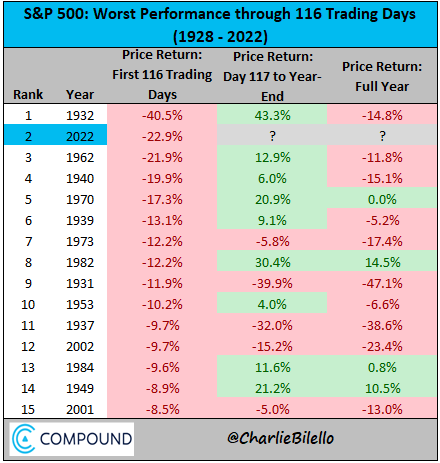
3. First Half Reflections: What happens when the market is down big in the first half of the year? ...something ¯\_(ツ)_/¯ (no real pattern, except perhaps you could say it's easier to rebound big in % change if you're down big to begin with!)
also n.b. updated YTD as of Friday close = -18.45%
Source: @charliebilello
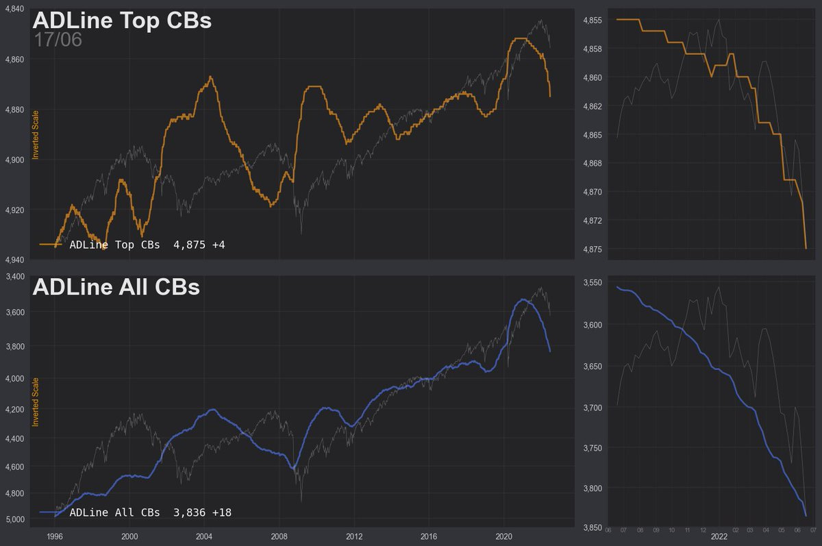
4. Bad breadth...
...sometimes good buy, sometimes goodbye.
Source: @the_chart_life
5. Oversold? Market is oversold on this metric.
All else equal (and it rarely is), this raises the odds of a rally — but also n.b. that the condition of the market being oversold (i.e. bearish momentum) is a natural characteristic of a bear-market/down-trend...
Source: @TimmerFidelity
6. On the Future(s): Do the futures tell the future? Asset manager equity futures positioning has dropped to a new record low (again though, this condition helps pick a bottom in an uptrend, but in a downtrend/bear market this is actually where positioning would habituate)
Source: @MacroCharts
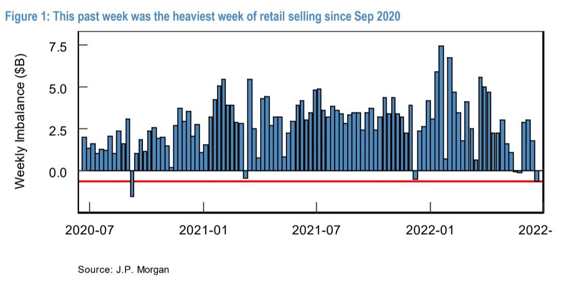
7. Retail Set Sail: Some signs of capitulation…
Source: @SethCL
8. What Capitulation? But then again, on this metric (cumulative equity fund flows) there doesn’t appear to be much or any capitulation at all… in fact that memeish “DCA“ rallying cry comes to mind.
Source: @GunjanJS
9. Rate-Hike-Ructions: Rate hikes coming in thick and fast. (chart shows cumulative global interest rate cuts minus hikes vs stockmarket)
I’ve said it before, and I’ll say it again: rate cuts helped on the way up -- so it’s only logical that rate hikes hurt on the way down...
Source: @BarnabeBearBull
10. Fiscal Drag Too: You could say that Yellen is helping her old mates at the Fed fight inflation via demand destruction with a bunch of fiscal tightening too!
Economy being squeezed every which way: look out below for earnings...
Source: @albertedwards99
Thanks for following, I appreciate your interest!
BONUS CHART >> got to include a goody for the goodies who subscribed.
The Long and Short of Leveraged ETFs: here’s a return-appearance from a favorite chart showing the rise and collapse in bullish speculation via ETFs.
The red line tracks the relative trading activity in leveraged long vs short US equity ETFs. The higher it is, the more traders are getting into leveraged long relative to short equity ETFs.
So peaks = pique in bullish speculation, while troughs = transition to bearish bets.
With a 10-year low chalked up, clearly the mood has changed (and this is actual trading activity vs surveyed sentiment). Unfortunately the data only goes back to 08 (these products only really took-off after the financial crisis), but in that time - typically readings around these levels were at least short-term bullish.
But again, this is an extremely unusual market environment relative to the post-financial crisis experience.
Looking at Assets Under Management aggregated across leveraged long vs short ETFs, it’s interesting to note that short/inverse equity ETF AUM has basically doubled since the start of the year, and levered long has almost halved.
Again, some big shifts, but also… leveraged long is still well above pre-pandemic levels, and despite all the bearishness (with surveys saying more bearish than 2020), the short ETF AUM is still only about on-par with March 2020 levels.
So in terms of what people are doing vs saying, they are clearly making some moves here, but again there hasn’t really been an full capitulation… or perhaps yet even a fulsome pivot to outright bearish speculation.
Basically, to wrap-up I would say these two charts are consistent with the idea that you could get a short-term bottom in the market based on how seemingly one-sided sentiment is, but also that there is still work to be done in terms of deleveraging and capitulation.
Mixed signals, murky times.
—
Best regards,
Callum Thomas
My research firm, Topdown Charts, has a new entry-level Substack service, which is designed to distill some of the ideas/themes/charts from the institutional research service to provide the same high quality insights at a more accessible price.
Give it a try and let me know what you think! :-)


Thank you, Callum.
Terrific and most helpful to have these indications and comments grouped in one letter.
It’s tough to keep sitting on my hands …getting the blue (buy) tickets out is still a bit of time away.
Cheers from Canada,
Alan