Weekly S&P500 ChartStorm - 25 April 2021
Your weekly selection of charts...
Welcome to the Weekly S&P500 #ChartStorm (by email!)
The Chart Storm is a weekly selection of 10 charts which I hand pick from around the web (+some of my own charts), and then post on Twitter.
The charts focus on the S&P500 (US equities); and the various forces and factors that influence the outlook - with the aim of bringing insight and perspective.
Hope you enjoy!
1. Insider Transactions Ratio: There has been a flurry of insider selling! (some of this may have to do with possible tax changes, as well as the surge in IPO action - see below… not to mention some “FONGO“ as tech stocks wobble).
Source: @ISABELNET_SA
2. IPO (SPAC) LockUps: Indeed, speaking of insider transactions, here's a cool schematic of when SPAC+IPO lockups expire: selling wave to come in Q3?
Source: @enlundm
3. SPACtacular rise + fall: The initial numbers for April show a collapse in the number of SPACs after a frenzy in the last few months. Dismal performance of SPACs in recent months is likely a key driver, but the SEC has also launched an inquiry into the space and impending accounting rule changes make things tricky near-term.
Source: @carlquintanilla
4. SPACs vs IPOs: This chart helps put the SPAC surge into context - note that the 2020 figure is *annual* and 2021 is *Year To Date*… !
As I noted last week: "some might argue the surge in SPACs overstates the overall number of IPOs, but I would say it does *not* overstate the state of speculation"
Source: @topdowncharts
5. Trouble in Tech Stocks: The advance-decline line for the NASDAQ has, well, been declining. I always pay attention to divergences like this for prospective warnings signs: hints of underlying weakness starting to take hold.
Source: @allstarcharts
6. Rydex Funds Indicator: Regular readers will remember chart no. 3 from last week had a similar indicator. And it’s a similar conclusion - traders ryding defensive allocations into the ground.
Source: @jessefelder
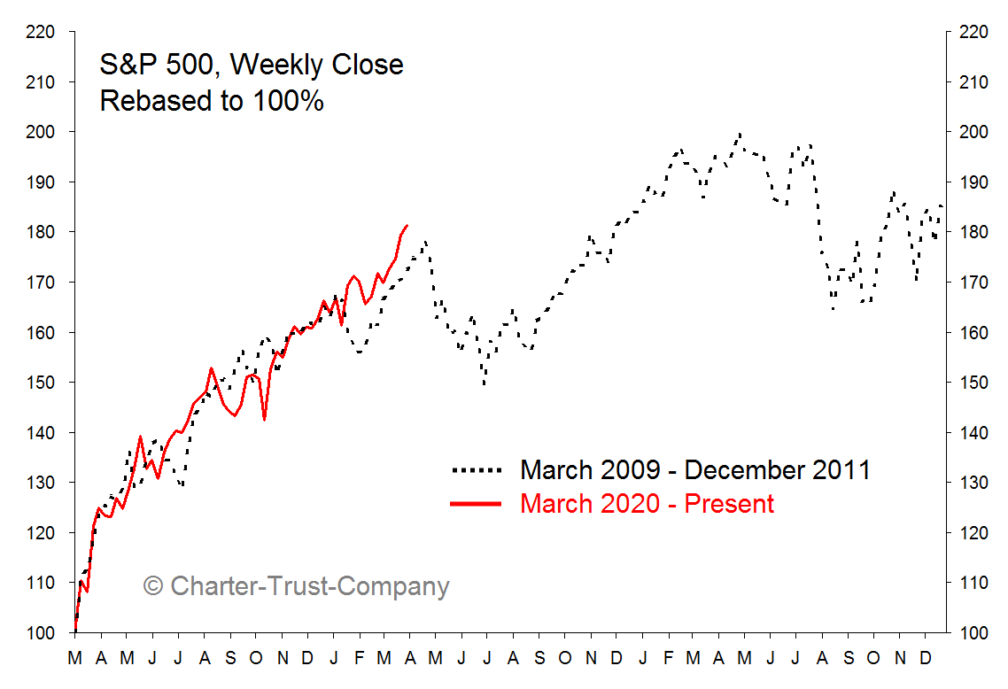
7. The 2009 Analog: market needs a breather?
Source: @mark_ungewitter
8. Long Term Cycles: If you like long term charts and Rastafarian color schemes this next one is for you!
But on a serious note I am a big believer (based on observations of actual data/charts) in long-term cycles across markets/economy/society.
Source: @michaellebowitz
9. Capital Gains Tax Rate Changes vs Market Returns: It's almost as if it's not the only thing that matters...
Source: @LizAnnSonders
10. Home Equity Withdrawals: Remember the mid-2000’s and we were talking about folk using their home as an ATM as the housing market went crazy and banks were lending like they were running out of time? It’s definitely different this time in a whole lot of respects, but very interesting chart nonetheless - surely some of this is going into the markets (but which one? crypto or equities??).
Source: @SoberLook
Thanks for following, I appreciate your interest!
oh… that’s right, almost forgot!
BONUS CHART >> got to include a goody for the goodies who subscribed.
Global Flash PMI vs Bond Yields: with the April round of preliminary PMI data we can calculate a “global“ flash PMI. The April reading was up +1.2pts to a 15-year high of 60.3, with all 4 countries/regions up vs March.
It’s fairly interesting by itself just by how stark the move is and how far things have come from this time last year. But the other very interesting thing is the apparent linkage with bond yields…
I’ve recently noted the sentiment/positioning/technicals set up in bonds tilts the risks to the upside (down for yields): and thus see the current move as a short-term counter-trend move. It probably can go a little further…
But, looking at charts like this (and I have a half dozen others which say the same thing), the macro/intermarket/thematic picture still points north for bond yields (my composite model says high 2’s for UST 10yr yields).
So as noted in my half-joking tweet, bond yields likely dip a little further …before heading a lot higher.
—
Best of luck out there,
Callum Thomas


