Weekly S&P500 ChartStorm - 24 September 2023
This week: technical check, triggers, seasonality, micro caps, risk indicators, fundamental headwinds, bonds vs stocks, 60/40 indicators, and real yields vs stocks...
Welcome to the latest Weekly S&P500 #ChartStorm!
Learnings and conclusions from this week’s charts:
Some indicators are starting to light-up oversold, and a key longer-term support level is approaching (+ plenty of Fed-speak this week).
(but) Financial conditions tightening remains a problem (higher bond yields, stronger dollar, higher energy prices, rising real yields), and a key short-term support level has already been broken.
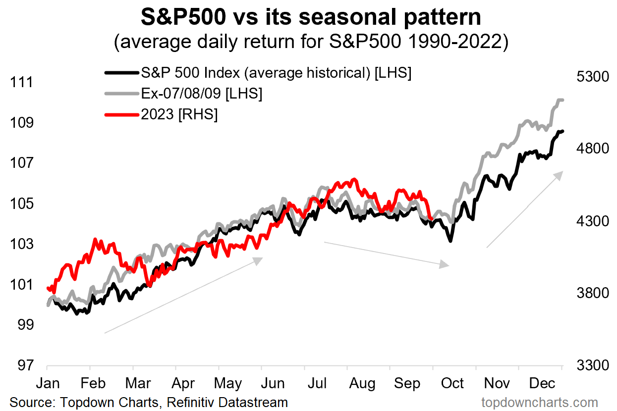
Seasonally some weakness is to be expected (into mid-October).
Medium-term macro downside signals are mounting.
In hindsight, 60/40 never stood a chance (given record low “portfolio yield” and portfolio valuation scores).
Overall, those looking to buy the dip probably ought to exercise a degree of patience as the correction runs its course. There are a few key trigger-points and background risk-drivers highlighted in today’s charts that need to be kept on close-watch, and need to be resolved before the all-clear can be sounded.
p.s. Check out the Topdown Charts “Chart Of The Week” series for interesting macro/market charts and insights. Sign Up now for free
1. When BTFD? This is probably a question on many a mind at the moment as various indicators start to light-up as oversold (e.g. the 50-day moving average breadth indicator in the chart below — albeit a true oversold signal comes only when it drops to an extreme *and then turns up*). But overall I would say if the market is to make a short-term bottom that major 4300 zone is going to be key. It would be a logical pausing point, and thinking out loud, there is a lot of Fed speak this week, so it will be interesting to see if the various FOMC members attempt to manage markets (or on the contrary even double down on higher-for-longer).
Source: Callum Thomas using MarketCharts
2. Correction Drivers: But taking another perspective, and updating that correction-drivers chart, we can see that the market has already edged down through the key short-term support at 4350 — but more importantly, financial conditions have been tightened. A lot. So I would say in terms of what to watch for in terms of any buying opportunity would be a peak in yields, a peak in the US dollar, and a peak in energy prices… in the meantime, the momentum is still higher on all 3 counts, which is a real and material tightening already delivered by markets.
Source: @Callum_Thomas using StockCharts
3. All is as it (seasonally) Should be? But then again, closing our eyes to all of the macro and technicals and everything else, maybe this is just the expected seasonal dip. And in that respect, dip-buyers should be waiting until the seasonal turbulence passes (and when we all start talking about Q4/year-end/Santa Claus rallies!).
Source: Topdown Charts
4. Microcaps on the edge: Another trigger point (and I should also clarify, if 4300 gets broken, then it will be down to 4200 and a test of the 200-day moving average, and really a foray deep into bear country)… micro cap stocks are teetering on the edge here. As a sort of risk indicator, if these guys break support, that’s also going to be a key bearish risk flag (so add that to your list of things to watch!).
Source: @WillieDelwiche Willie Delwiche, CMT, CFA
5. When the Hiking’s Done: This one is conceptually interesting, basically it tells us that when the Fed makes its last interest rate hike of the cycle: stocks go up (if there is no recession). But as with most studies like this, if there is a recession, then stocks go down. The tricky bit is: a. when is the last hike? (hindsight can only tell us that for sure), and b. when/is there a recession? (many mixed signals on that front).
Source: Simon White via Zero Hedge
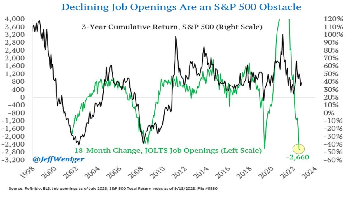
6. With a JOLT: Speaking of recession signals, and while yes — the job market is still running hot/tight in terms of metrics like the unemployment rate and consumer + business surveys of labor market tightness… if we look at the rate of change in job openings, it’s getting less good. And it’s not the only piece of data saying things are softening, and we while shouldn’t necessarily take it as a signal of an incoming market crash, it is one of a mounting body of evidence pointing to macro downside risks for markets.
Source: @JeffWeniger
7. Of Interest: Similar note, interest expense is trending notably higher — this is starting to exert clear downside pressure to earnings. And this despite all those charts highlighting how corporates had locked in lower borrowing costs. I guess you can hide from monetary tightening for a while, but not forever.
Source: Daily Chartbook Daily Chartbook
8. Stocks vs Bonds: This is an interesting chart for a few reasons. First is how historically (pre-crisis) it was actually kind of normal for bond yields to track higher than dividend yields. Second is how starkly though it has broken from the pattern of the past decade where “TINA” was the mantra. But also third is how treasuries now offer almost 3x the yield income that stocks do (at the index level).
Source: Michael Graham
9. The 60/40 Portfolio Yield: Here’s an interesting historical perspective on the combined yield for a 60/40 portfolio (using 10-year bond yields on the 40% side and cyclically adjusted earnings yield on the 60% side) — in hindsight, it was always going to be a struggle for 60/40 returns coming from a record low like that. And even after a significant adjustment, it still doesn’t look great.
Source: @TaviCosta
10. The 60/40 — Valuation Composite: Another angle on it, using my valuation indicators at Topdown Charts for stocks and bonds — both were showing up as extreme expensive toward the end of 2021 (and a good clue as to the joint carnage both of them suffered in 2022). Since then, similarly, we have seen a significant adjustment, but the portfolio level valuation indicator remains slightly expensive (n.b. I would point out that on the detail: stocks are almost 1 S.D. expensive, and bonds are almost 1 S.D. cheap).
Source: Topdown Charts Professional Topdown Charts
Thanks for reading, I appreciate your support! Please feel welcome to share this with friends and colleagues — referrals are most welcome :-)
BONUS CHART >> got to include a goody for the goodies who subscribed.


