Weekly S&P500 ChartStorm - 24 October 2021
This week: market technicals, value (vs growth), energy sector equities, buyback window, China vs US stockmarkets
Welcome to the Weekly S&P500 #ChartStorm (by email!)
The Chart Storm is a weekly selection of 10 charts which I hand pick from around the web (+some of my own charts), and then post on Twitter.
The charts focus on the S&P500 (US equities); and the various forces and factors that influence the outlook - with the aim of bringing insight and perspective.
Hope you enjoy!
p.s. if you haven’t already, subscribe (free) to receive the ChartStorm direct to your inbox, so you don’t miss out on any charts (you never know which one could change the whole perspective!)
1. Enter the Doji: Curiously enough (one for the fans of candle sticks), a doji formed in the S&P 500 daily chart on Friday. According to the ever-wonderful Wikipedia: "Dojis form when the opening and closing prices are virtually equal… the doji represents indecision in the market." Perhaps the most important point: "A doji is a key trend reversal indicator." (and this he says as the market reaches a logical overhead resistance point).
Source: @Callum_Thomas
2. Value Stocks — New ATH: While the main S&P500 Index was forming a doji on Friday (and apparently running into resistance), the S&P500 Value Index was busy making a new All Time High… and as it seems was also extending what looks to be a breakout from about a 6-month trading range. Looks good.
Source: @topdowncharts
3. Value vs Growth - Long Term Perspective: Zooming out, and comparing the performance of value vs growth stocks, it’s still very much a work in progress. You know what they say, some times when you’re in a deep hole you just have to keep digging. At the very least, based on my indicators there is deep value in value vs growth, so certainly an interesting area of the market to keep tabs on.
Source: @topdowncharts
4. Energy (under)Investment: One aspect of value stocks - the Energy sector - looks set to benefit from stagnant investment in supply. This is an interesting chart by itself but all the more interesting when seen alongside the next couple charts…
Source: @Theimmigrant84
5. Energy Sector Allocations: On energy stocks, ESG investors are understandably underweight energy (given carbon intensity, environmental impact of Oil/Gas/Coal), but so too are traditional active managers. The (traditional/fossil fuel) energy sector is all out of love!
Source: @MikeZaccardi
6. Global Energy Stocks: Global energy stocks also trying to turn the corner, and the relative performance line looks like it is trying to catch back up to resurgent oil prices -- and that’s a big gap to close!
Source: @RichardDias_CFA
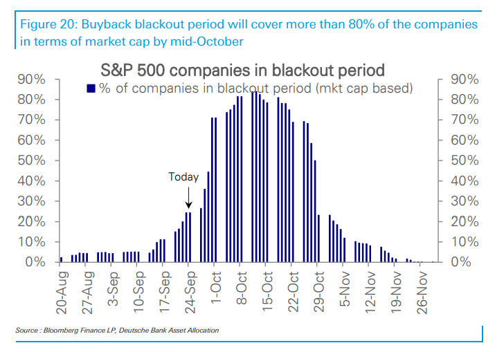
7. Buybacks Back: The majority of buyback blackouts are wrapping up the next week (and p.s. there are record buyback authorizations aka dry-powder lying in wait). This could become a key source of buying to underpin the markets or even fuel the typical year-end rally (mentioned last week).
Source: @zerohedge
8. SPACtacular: SPAC deal flow (YTD!) in 2021 is far outpacing the total for all of 2020. Very interesting dynamic in the markets, and a nod to the still ample liquidity and risk appetite we see permeating the markets.
Source: @spac_insider
9. Capitalism vs Communism: Chinese stocks remain in a 13-year relative bear market vs USA. Are they near a logical turning point?
Source: @mark_ungewitter
10. China A-Shares: Despite the news flow, Chinese A-shares have been a range-trade lately. Longer-term it looks like an uptrend, but strictly speaking given the lower highs it’s probably more of a gigantic symmetrical triangle pattern! This is one of those very policy-driven markets that’s either ON or OFF, and I would say (despite relative policy forbearance so far) it's probably only a matter of time before policy makers end up flipping the switch one way or another.
Source: 10 Charts to Watch in 2021 [Q4 Update]
Thanks for following, I appreciate your interest!
oh… that’s right, almost forgot!
BONUS CHART >> got to include a goody for the goodies who subscribed.
WTI Crude Oil Price Seasonality: yet another seasonality chart!!
This chart maps the seasonal tendency of the WTI Crude Oil price — in contrast to equities, the oil price has a tendency of weakness into year-end.
The obvious question is “will it be different this time?“ In the yes camp would be the point that energy markets are experiencing significant bullish momentum (with tight supply: pandemic disruption + years of underinvestment, and resurgent demand on stimulus + reopening).
In the no camp would be the point that oil does look a little overbought, and the supply response will be incentivize by these higher prices.
I think they are both right: I like commodities in general over the medium-term given what I mentioned above, but in the short-term it’s hard to ignore the risk warning of an overbought market heading into negative seasonality.
—
Best regards,
Callum Thomas
SPONSOR: ( …he’s me!)
My research firm, Topdown Charts, has a new entry-level Substack service, which is designed to distill some of the key ideas and themes from the institutional fund manager service to provide the same high quality insights at a more accessible price.
Give it a try and let me know what you think


