Weekly S&P500 ChartStorm - 23 October 2022
This week: bullish RSI divergence, breadth indicators, sentiment, tech stocks, cash allocations and levels, cash on balance sheets, expected returns shifts, 60/40 again...
Welcome to the Weekly S&P500 #ChartStorm — a selection of 10 charts which I hand pick from around the web and post on Twitter.
These charts focus on the S&P500 (US equities); and the various forces and factors that influence the outlook - with the aim of bringing insight and perspective.
Hope you enjoy!
This week’s edition is sponsored by Bright Cellars
Bright Cellars makes discovering and learning about wine approachable and easy. We know discovering wine can be intimidating, and we want to help!
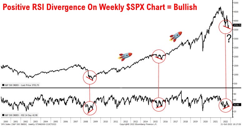
1. What If? Starting off this week with an intriguing “what-if” setup on the weekly chart (bullish RSI divergence: when the index makes a lower low and the indicator makes a higher low — can indicate a shift in market dynamics).
I think charts like this are very interesting and important, I’m still leaning bearish medium-term, but 2 things: 1. maybe I am wrong and therefore need to consider new evidence against my base case; 2. regardless of if I am right/wrong, bear markets do not go in a straight line, and indeed often feature wild and substantial rallies. This chart speaks to both possibilities. But then again, it is just one chart, so…
Source: @mattcerminaro
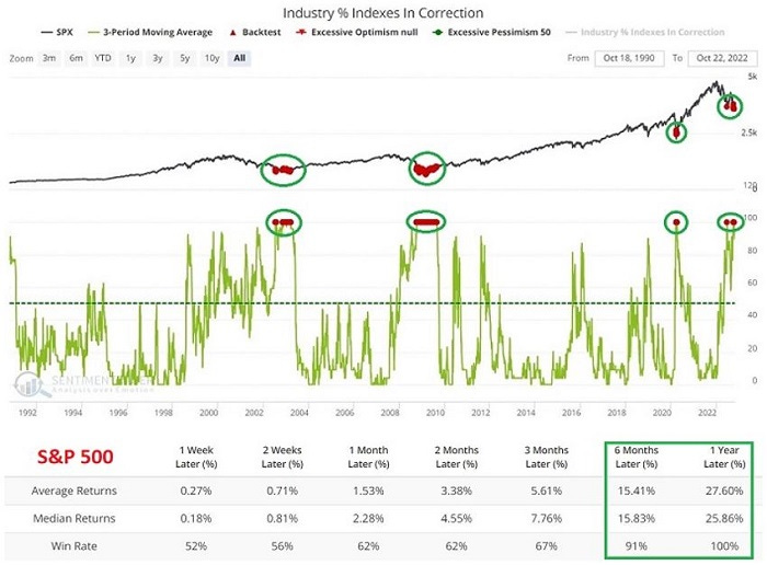
2. Industries in Correction Mode: Pretty interesting indicator, and interesting implications, albeit in 02/03 + 08/09 you still had to trudge through a bit of a market valley for a while before back to bull... and of course the usual caveat that this time could be different applies.
Source: @jaykaeppel
3. A/D Line: On the other hand, the A/D line does not appear to be confirming (the index is above its June low, but the A/D line is still below its June low)
Source: @BBaxter2020
4. Tick Tock on the Tech Top: Seems like the Tech Top is still a work in progress...
Source: @daChartLife
5. Lowest Since… Advisory sentiment lowest since 08/09.
(...and to make things complicated, I will point out that it is at similar level as early 08 before all hell broke loose, and also similar level as early 09 when market bottomed!)
Source: @Lvieweconomics
6. Cash Allocations: Fund manager (surveyed) cash levels are apparently at the highest levels since 2001. Albeit n.b. cash actually pays interest now (vs near-zero the past decade), and also n.b. cash allocations were fairly high all the way down the stairs in early 00's. That all said, it could easily be fuel for BMRs.
Source: @RyanDetrick
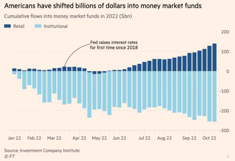
7. More on Cash: Retail, upon witnessing both stocks and bonds melting down, (where possible) have piled into cash funds -- where the nominal return is positive, and real return is still beating most other assets...
(n.b. as a guess, the insto draws probably = rebalancing + redemptions)
Source: @unusual_whales
8. Corporate Cash: Japan has the highest proportion of companies with "net cash" (cash > liabs). Too conservative? Dry powder for divs/buybacks?
Source: @SnippetFinance
9. Expecting Returns? GMO’s expected return forecasts for US equities turned positive in September (n.b. they have been negative for a *long* time).
(also interesting to note the standouts within/across stocks vs bonds)
Source: @rblue215
10. Expecting Returns — Another Perspective: This time from me/my company. Again, it is interesting to note the standouts within and across asset classes. But also of note is how stark a contrast from the start of the year it now looks (e.g. back in Dec when most things on this chart were negative/very low).
Source: @topdowncharts
SPONSOR — please take a moment to support us by checking out our sponsor…
Discover Wines You Love
Bright Cellars is the monthly wine club that matches you with wine that you'll love, based on an algorithm that selects wines based on your taste preferences. Created to not only deliver excellent wine, but to also give the added bonus of learning about your wines and own tastes. Join now and get 50% off the first 6 bottle order!
BONUS CHART >> got to include a goody for the goodies who subscribed.
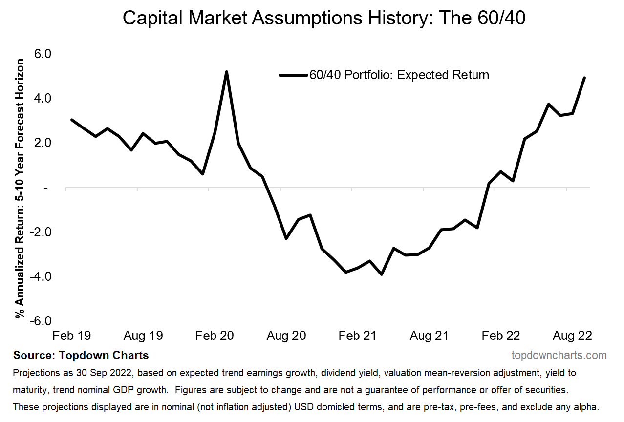
60/40 Resurrection: some might argue that several rounds of shock therapy have brought the 60/40 portfolio investing approach back from the dead…
You might recall I shared a chart a couple of weeks ago which showed the 60/40 weighted average valuation indicator going from record expensive in December last year to now slightly cheap.
As a reminder, “60/40“ refers to a very simplistic approach to building portfolios, by simply weighting 60% to equities and 40% to bonds. I noted that while this approach had its day in the sun (and in fact got burnt to a crisp this year), the approach is probably too simple in general as it is missing other important assets and missing an active process to control risk.
And while many pronounced 60/40 as dead, it is interesting to reflect on the path of my capital market assumption outputs in this chart (same from chart 10) over the past year — going from negative expected returns to now positive: similar levels as March 2020.
Could the outputs end up being wrong? Yes. Can they get even better (which would happen by further drawdowns in stocks & bonds)? Yes. Could they be right longer-term and wrong short-term? (almost certainly) Yes. (and also: could 60/40 turn in positive returns with equities still drifting lower? (i.e. if we got a situation of stocks down and bonds up) Yes!).
In other words, there is a whole lot of things to consider and various caveats around this type of data, but it certainly is intriguing food for thought as the bear market(s) progresses and the adjustments and resets fall into place.
—
Best regards,
Callum Thomas
My research firm, Topdown Charts, has a NEW entry-level service, which is designed to distill some of the ideas/themes/charts from the institutional research service to provide the same high quality insights at a more accessible price.
Give it a try and let me know what you think! :-)
For more details on the service check out this recent post which highlights: What you get with the service; Performance of the service; and importantly: What our clients say about it…


Let me know if you want to sponsor the next edition: https://chartstorm.substack.com/p/information-for-sponsorsadvertisers
Your Bonus Chart and commentary was very interesting, thank you!