Weekly S&P500 ChartStorm - 23 May 2021
Your weekly selection of charts...
Welcome to the Weekly S&P500 #ChartStorm (by email!)
The Chart Storm is a weekly selection of 10 charts which I hand pick from around the web (+some of my own charts), and then post on Twitter.
The charts focus on the S&P500 (US equities); and the various forces and factors that influence the outlook - with the aim of bringing insight and perspective.
Hope you enjoy!
1. Weakness in EM cyclicals vs defensives: cause for concern?
Given that it’s been cyclicals driving much of the strength in equities, we definitely want to keep an eye on cyclicals vs defensive relative performance… but also around the world, and especially Emerging Markets, where the tapering off of performance in 2017 served as an advance warning of a more volatile market.
Source: @topdowncharts
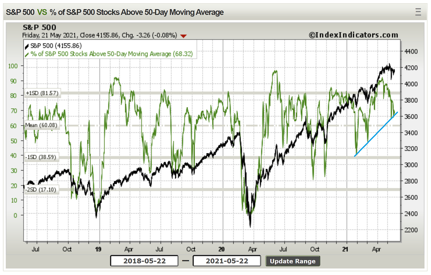
2. 50-Day Moving Average Breadth: That “arbitrarily drawn trendline” from last week makes a return this week — touched again, but not violated... Chart lines like this can be controversial, but at the very least it gives us some triggers/framework to monitor things.
Source: @Callum_Thomas
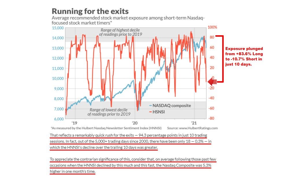
3. Hulbert Nasdaq Newsletter Sentiment: Sentiment on tech stocks understandably very skittish -- market timers don't want to be the last one out the door... (and don’t want to be left behind if it runs again). It’s an increasingly challenging stage of the market cycle, but short-term, with sentiment dropping this quickly, could be good for a bounce at least.
Source: @MacroCharts
4. Defensive sectors relative performance: looks like a base forming... what does it say if you think defensive sectors are starting to look attractive?
Source: @topdowncharts [chart from my new Substack service]
5. Same energy: "Quality" factor finding a base? Typically these stocks (defined as strong balance sheet, stable earnings, good margins/profitability) tend to be more defensive — i.e. typically more mature companies and more predictable business models. Again… what does it say if you think quality/defensive stocks are starting to look interesting?
Source: @TheOneDave
6. “Real Earnings Yield“ Still not sure exactly what this is, or indeed, if it is even useful… But mildly interesting to see it at a 40-year low.
Source: @MichalStupavsky
7. Real Earnings Yield (my version): That previous chart got me curious, got me thinking, and so I quickly put this one together - it shows the PE10 inverted or the E10 yield [i.e. trailing average 10 years earnings divided by price] minus 10-year TIPS breakevens (market based measure of inflation expectations). It’s an interesting shape: kind of reminds me of credit spreads. Anyway, the takeaway should be clear: it’s at 2000 levels… what could go wrong?
Source: @topdowncharts
8. Energy Sector: New dawn? (or false dawn?)
I wouldn’t count out the energy sector just yet, while there is a push to zero carbon, green investment, etc (which is probably a good thing, and a major macro theme)… we still need to use a lot of old energy to function day-to-day, and a lot of energy will be expended to move towards a zero or low carbon world.
Source: @ceteraIM
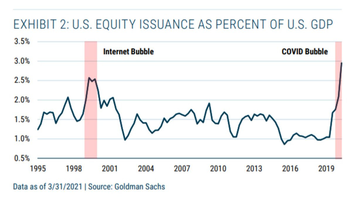
9. U.S. equity issuance as a % of GDP: As I’ve previously highlighted, there has been a frenzy of equity issuance in the US - largely centered around the SPAC craze. Albeit, this chart might overstate it a little bit as the GDP figure is likely a bit lower than usual due to the pandemic impact. Anyway, it is true that we have seen a historic clamoring by deal makers to cash-in on stimmi flows, FOMO, excess liquidity, and high valuations vis a vis raising equity capital. What does that say about the type of market environment?
Source: @ercorbeil
10. Household Asset Allocation: This one shows the trend in US households’ allocations to the mainstream asset classes… I was kind of shocked to see that equities ranked above real estate. Perhaps lingering damage from the subprime bubble, or simply a reflection of the dream run equities have had since 09. No surprise to see bonds and cash at the low end of the range though.
Source: @MichaelaArouet
Thanks for following, I appreciate your interest!
oh… that’s right, almost forgot!
BONUS CHART >> got to include a goody for the goodies who subscribed.
Global Cyclicals vs Defensives: As a follow-on from the first chart in this week’s session, this chart shows the global cyclicals vs defensives relative performance line.
I used this chart successfully during the pandemic panic to confirm my bullish view on global equities when global cyclicals vs defensives hit the bottom end of that trend channel and then turned upwards.
So it’s interesting to say the least, to see it now reaching the top end of the channel.
On the one hand, it is a sign of strength: cyclicals outperform defensives when the economy is expanding, sentiment is on the up, inflation is rising, and times are good. And indeed, the strength in cyclicals has been driving the market higher.
On the other hand… the last two episodes where cyclicals got stretched vs defensives happened before major corrections; or at least periods of heightened market volatility.
So I think this is an important chart to keep track of as we get later in the cycle (with higher valuations, higher inflation, and high expectations).
—
Best regards,
Callum Thomas
SPONSORS: my research firm, Topdown Charts, has a new entry-level Substack service, which is designed to distill some of the key ideas and themes from the full service to provide the same high quality insights at a more accessible price.
Give it a try and let me know what you think


