Weekly S&P500 ChartStorm - 22 September 2024
Weekly ChartStorm Classics -- digging into the archives of the early years...
Welcome to the latest Weekly S&P500 #ChartStorm!
NOTE: I’m running a slightly different format this week as I’m traveling and not sure if I’ll have reliable internet access! I have rounded up some timeless classics from when I used to only do the ChartStorm on Twitter (from 2015-2021, before shifting to Substack).
Should be quite interesting — maybe a few charts you’ve never seen before, and plenty of food for thought!
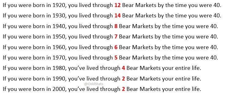
1. Bear Market Life: Here’s an interesting table from an old favorite “@OddStats” which looks at how many bear markets people experienced by the time they turned 40. NOTE UPDATE (table is from 2018) — those born in 1980 will now be 40, and will have lived through 5 bear markets if you count the 2020 crash [also you can add on 1 to the 1990, 2000 groups for 2020, and probably also 1 for the 2022 bear market].
p.s. check out the bonus chart section at the end for more color on this…
Source: April 2018 Tweet (from @OddStats)
2. Peaky Markets: Here’s how the S&P500 has traded on average before and after market peaks since 1930. The bearish takeaway is how quickly and significantly things can turn, but the bullish/optimists perspective is that things eventually get back on track + great opportunities are uncovered.
Source: Nov 2015 Tweet
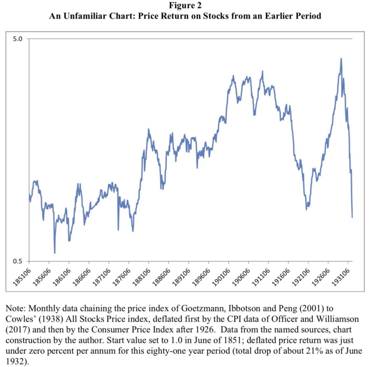
3. Stocks for the Long-Run? This chart provides some useful perspective and a reminder that although those were extremely different times to now in just about every way, markets don’t always just go up all the time every time. There are plenty of examples across countries and history of relatively trend-less markets and lost decades. It’s not a reason to be pessimistic, but a reason to be pragmatic and ready in case the market doesn’t do what ever finfluencer talking-head tells you (i.e. stocks only go up, just DCA). Practically speaking a key takeaway is to pay attention to asset allocation, diversification, and capital protection.
Source: Nov 2018 Tweet (from @TihoBrkan)
4. Rare Growth: It’s hard to grow revenues fast for long. There are many examples of companies that can grow sales by more than 10% in a year, even 2 years, but very few examples of companies that can grow sales more than 10% year-after-year. Persistently high growth is rare and special — and unusual; the odds are against it happening.
Source: Jan 2017 Tweet (from @iancassel)
5. Surviving Funds Management: Much like the stats that say 50% of new businesses fail within the first 5 years, many funds also fall by the wayside (albeit the stats are slightly better than your average business). The chart below shows that over the 10yr period ending in June 2020, nearly *40%* of US equity mutual funds failed to survive.
It’s a tough game — hard to consistently outperform, increasingly competitive, passive investing is increasingly eating active’s lunch, and then there’s the business/people side of things too (not to mention market cycles + client management and psychology). A game only for the obsessed (love it or leave it).
Source: Oct 2020 Tweet (from @NateGeraci)
6. Equity Research Headcount: Fund managers may also be finding it harder to find sell-side analysts to talk to! Sell-side equity research analyst headcount shrank from nearly 4500 in 2012 to just over 3000 in 2020 (not sure what the number is more recently, couldn’t find the data, but I imagine it probably hasn’t gone up — why would we need more stock research analysts when just about every investor these days is either in passive index investments or just buying the biggest tech stocks!).
Source: Nov 2020 Tweet (from @markets)
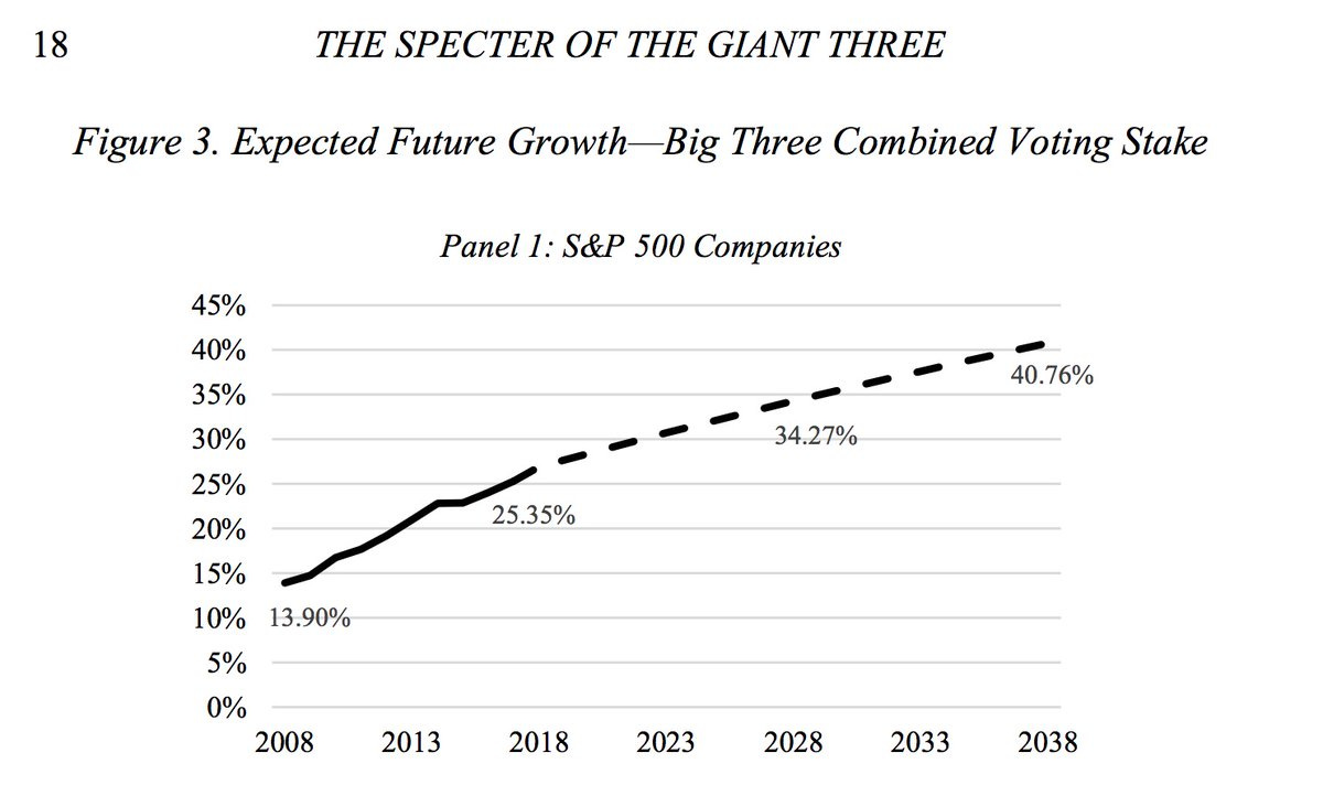
7. Passive Activism: Speaking of the rise of passive index investing, the voting share and influence of the big 3 (BlackRock, Vanguard, State Street) is also on the rise. Now there have been legislative and industry movements to try and pass through much of the important voting through to the end investors, but that is still nascent and there are issues and complexity around the logistics. Regardless of the voting, there’s also the point that those firms have been spear-heading shareholder engagement on issues like ESG. Maybe that’s fine, maybe even good, but then it also has the potential to become a bit perverse and put power and influence into the hands of people that didn’t really get explicitly chosen or appointed or mandated to take on such missions. Just another example of the complexities and unintended consequences of the rise of passive index investing.
Source: June 2019 Tweet (original)
8. Towering Over: For a while there, you could correlate construction of the world’s tallest tower with market peaks. It kind of made sense in some respects as a marker of the stage of the business/financial/sentiment cycles. I wondered if this indicator might now be defunct with the Burj Khalifa (completed in 2009 at 828m) holding the title uncontested for over a decade now, but then there is a planned 1km tall Jeddah Tower — which has been plagued with delays (construction started in 2013 after initial soil testing as early as May 2008, then paused in 2018, and only resuming earlier this year, with construction scheduled to complete potentially in 2028/29). Very facetiously; maybe market analysts need to watch that project closely!
Source: Dec 2015 Tweet
9. Spurious or Curious? OK, let’s be real for minute, this is definitely an example of spurious correlations… But then again, it doesn’t take too many leaps to consider how it could make some sense; greater wealth and consumption over time mean greater demand for more meat (so that’s the demand side), and then greater technological and economic progress means improvement in breeding/genetics, feed and pharmaceuticals, knowledge and development in farming practices, etc. So yeah, maybe you can make a link, but otherwise, it should serve as a reminder that if you get creative enough with your charts and data torturing you can probably show (and justify!) just about anything…
Source: Nov 2017 Tweet (from @ukarlewitz)
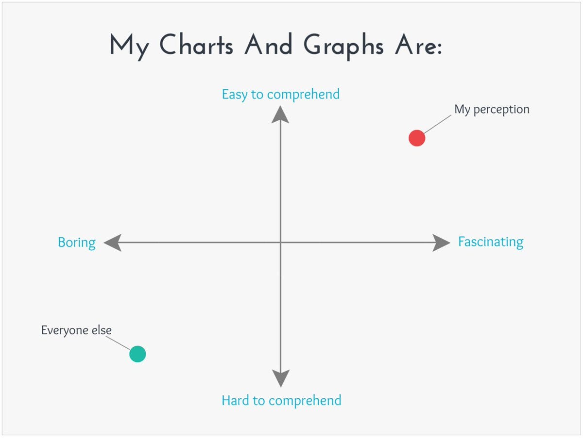
10. My Worst Fear: I always think I’m in the red dot, but often end up down in the green dot! Funny chart for sure, but actually a useful reminder to always aspire to the red dot and a prompt to keep yourself honest and check where you really are.
Source: Dec 2017 Tweet (original)
Thanks for reading, I appreciate your support! Please feel welcome to share this with friends and colleagues — referrals are most welcome :-)
BONUS CHART >> got to include a goody for the goodies who subscribed.
Mind the Path: this slide from the ChartStorm Perspectives Pack provides some extra context and color on the first chart from this week. As noted, if you are an index investor you will definitely see numerous 10-20% declines and most likely at least one -40% move during your lifetime (and probably worse if you are in individual stocks). You may also need to wait years before the market makes a new high.
Again, though this is not a pessimistic message, it’s a warning to travelers to be prepared and bring a map. The path may be windy but it doesn’t mean you have to fall off, just have a plan — either be psychologically prepared for it, or strategically prepared (and ideally both!).
—
Best regards,
Callum Thomas
Looking for further insights? Check out my work at Topdown Charts


