Weekly S&P500 ChartStorm - 22 May 2022
This week: risk-driver check, equal weighted strength, no capitulation, sentiment vs allocations, drawdowns and IPOs, commodity producer cash, rotation and bubble bursts, value vs growth value...
Welcome to the Weekly S&P500 #ChartStorm — a selection of 10 charts which I hand pick from around the web and post on Twitter.
These charts focus on the S&P500 (US equities); and the various forces and factors that influence the outlook - with the aim of bringing insight and perspective.
Hope you enjoy!
NEW: Sign up to the (free) Chart Of The Week over at the new Topdown Charts Substack entry-level service: Subscribe to the Chart of the Week
Each week we send you one of the most interesting charts on our radar, along with commentary/context and a key takeaway — so you’re never left guessing on why the chart matters ...and the charts matter! > > > Subscribe Now
1. Correction-Drivers Update:
-EPOL [Poland ETF] (geopolitics proxy): up off the lows
-LQD [IG Credit ETF] (credit/rates): bottoming?
-ARKK [New Tech Fund] (tech burst): stopped making new lows (for now), follows -73% drawdown
Overall, the fact that these things have stopped going down (in contrast to the market as a whole) is probably a positive short-term sign. But it is still early days, and technically those 3 lines are still going down (lower lows and lower highs). As noted previously, bear markets don’t go down in a straight line — indeed, bear market rallies are common feature. I think these 3 are worth watching in that respect.
Source: @Callum_Thomas
2. Strength or Weakness? The equal-weighted S&P 500 is breaking out vs the cap-weighted index, and this follows a confirmed higher low. My first impression on this is that it says less about the prospects for the market as a whole and more about the powerful rotations underway below the surface — but more on that later.
Source: @adaptiv
3. "Not there yet..." As I've highlighted a few times before (and check the next chart), we are far from bearish capitulation. There is still a lot of denial, and why not? -- we've been taught for years that the Fed has our back (but not now, not anymore, the game has changed).
Source: @saxena_puru
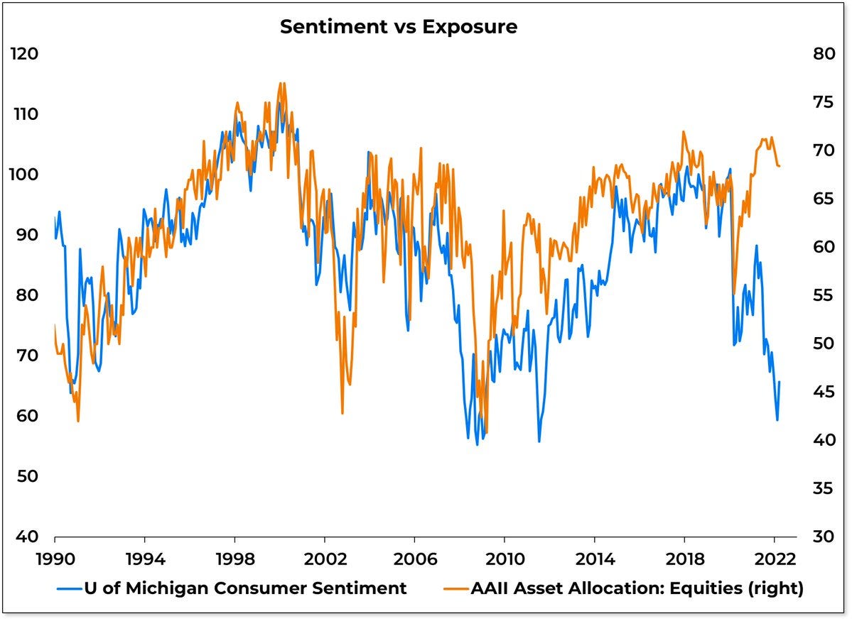
4. "VTI and Chill?" (google that)
Despite extreme pessimism across numerous economic and market sentiment indicators, investors have not really done much in the way of actively pulling back on equity exposure. Some might argue this is the next shoe to drop…
Source: @WillieDelwiche via @TihoBrkan
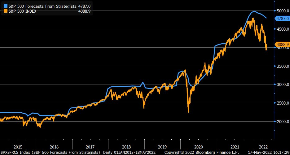
5. Catching Down: Wall Street strategists are busily catching down to the market with their year end price target forecasts... I never understood why people bother with price targets, but that’s just me, I hate forecasts — I try to avoid imposing my biases on the market and would rather just focus on the facts and adapt: let that guide me vs trying to dream up some scenario. But anyway, it sure does seem that collectively strategists’ opinions are changing as the market facts are changing.
Source: @LizAnnSonders
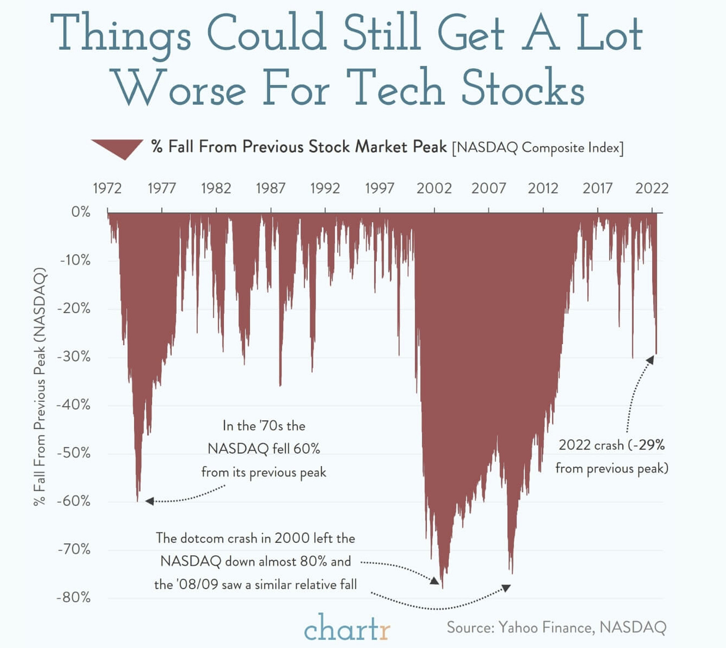
6. "What's the worst that can happen?"
the worst:
Source: @chartrdaily via @ritholtz
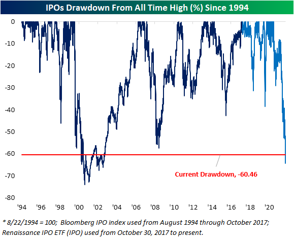
7. IPO Market Drawdowns: After the IPO frenzy of the past couple of years, now comes the IPO frustration...
Source: @bespokeinvest
8. Commodity Cash: Commodity producers seem to be relatively more focused on returning cash to shareholders than investing in new production.
Maybe they see the commodity price shock as temporary, or maybe we all just made it too hard to invest in new supply...
Source: @TaviCosta
9. Bubble-Bursting Bear-Market: The same hot stocks that were the drivers of strength on the way up are now drivers of weakness on the way down. Funny that.
Source: @topdowncharts
10. Growth vs Value: “Growth stock beatings will continue until valuation morale improves.”
Looks like there is a LOT of gas left in the tank for value vs growth rotation. I like to say: valuation speak loudly at extremes (and over the longer-term).
Source: @CliffordAsness via @FT
Thanks for following, I appreciate your interest!
BONUS CHART >> got to include a goody for the goodies who subscribed.
Stocks vs Bonds: Here’s what it looks like if you compare the very well known “S&P 500 Index“ with the S&P 500 …*bond* Index (which tracks the performance of corporate debt issued by S&P 500 constituents).
From first glance, after almost doubling from the low point in March 2020, the S&P 500 stock/bond ratio now looks to be peaking.
Interestingly enough, up until about mid-April, stocks had actually been outperforming bonds (at that point the stock/bond ratio was up 6% for the year).
That might come as a surprise given the way the stockmarket has traveled this year, but it was one of those situations where both were down — it’s just one was down less than the other!
At this point (as of Friday 20 May 2022), the S&P500 itself is down -18.7% YTD, whereas its corporate bond counterpart is “only“ down -12.3%.
For what it’s worth just about every chart and indicator I track for the stock/bond ratio is pointing to stocks lagging behind bonds in the coming months.
This chart (and the observations above) is perhaps as important for thinking about the stock market as it is for thinking about the bond market…
—
Best regards,
Callum Thomas
My research firm, Topdown Charts, has a new entry-level Substack service, which is designed to distill some of the ideas/themes/charts from the institutional research service to provide the same high quality insights at a more accessible price.
Give it a try and let me know what you think! :-)


thanks, the entire market pulse in a minute, much appreciated
Thx for the excellent chart analysis! These technical pics show the real truths. As you said, and true...the forecasts are relative & mostly meaningless...other than the herd blindly following the gurus. Thx again!👍