
Weekly S&P500 #ChartStorm - 21 March 2021
Your weekly selection of charts...

Welcome to the Weekly S&P500 #ChartStorm (by email!)
Just to be clear, the chart storm will continue as always on Twitter, this is just a means by which to make access more convenient and consistent for those who happen to miss it on Twitter for whatever reason.
1. Another similarity between now and the dot com bubble?
Rising stocks and rising volatility...

2. Interesting stat: upside volatility (moves greater than +1%) almost twice that of downside volatility (moves worse than -1%).

3. Junk bonds ETF a bit softer of late. Cause for concern?
(albeit do compare and contrast credit vs duration)
h/t @ErikHansen_IG

4. e.g. credit spreads remain very tight: bottom end of the range (and interestingly, much lower than usual vs the VIX).

5. (but) in terms of the duration side, it is still worth noting: should bond yields head materially higher we will head down the slip-n-slide...
h/t @TN
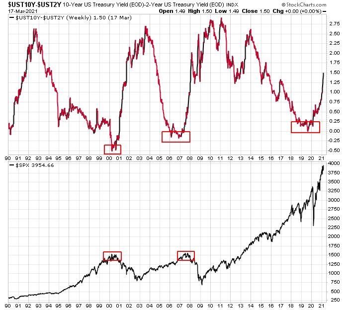
6. Remember a couple years ago all the bears were warning us about the yield curve?
Steepening has tended to be more problematic than flattening
(albeit n=2)
h/t @JasonLeavitt
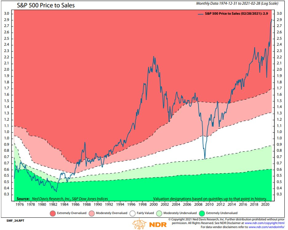
7. Couple years ago they were also warning us about the lofty price to sales ratio when it was an eye-watering 2x
About that...
h/t @TN
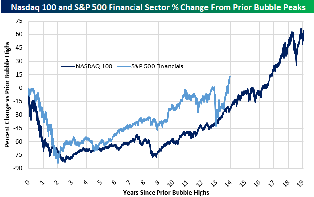
8. We want a financials bubble!
h/t @pelias01 & @bespokeinvest
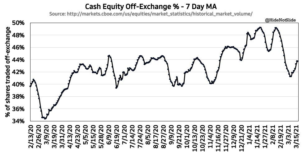
9. Off-exchange equity trading volumes...
Generalization:
more retail participation = more off-exchange trading
more volatility = more on-exchange trading
h/t @HideNotSlide
10. The rise and rise of ETFs Fee pressure, ostensibly better (perceived) liquidity, retail participation (and innovation) are key drivers of this trend
h/t @pearkes

n.b. this is only the third edition of the email version, so let me know if there are any issues in viewing the charts (feedback/suggestions always welcome).
Thanks for following, I appreciate your interest!
oh… that’s right, almost forgot!
BONUS CHART >> got to include a goody for the goodies who subscribed.
The global Momentum/Growth tides are turning: globally, momentum/growth stocks have had an exceptional run - boosted in particular last year as beneficiaries of the pandemic. But on the other side of the coin is value stocks (really what we mean is: old cyclicals e.g. energy, financials, industrials, materials) -- the value/old-cyclicals part of the market is starting to benefit as macro headwinds (falling commodities, weak real activity, low yields) turn to macro tailwinds (rising commodities, rebounding real activity, rising yields). In essence a major and extremely significant rotation is underway. In this respect I would call it a benevolent passing of the torch, vs the more malevolent previous two major episodes that standout in the chart.
Thoughts? (let me know in the comments section)

Best Regards,
Callum Thomas