
Weekly S&P500 ChartStorm - 21 January 2024
This week: new all-time highs, the journey, equal-weighted index, rate cut clues, boom and bust signs, the laggards, fund manager performance, tech vs the rest (valuations)...

Welcome to the latest Weekly S&P500 #ChartStorm!
Learnings and conclusions from this week’s charts:
The S&P 500 reached a new all-time high last week.
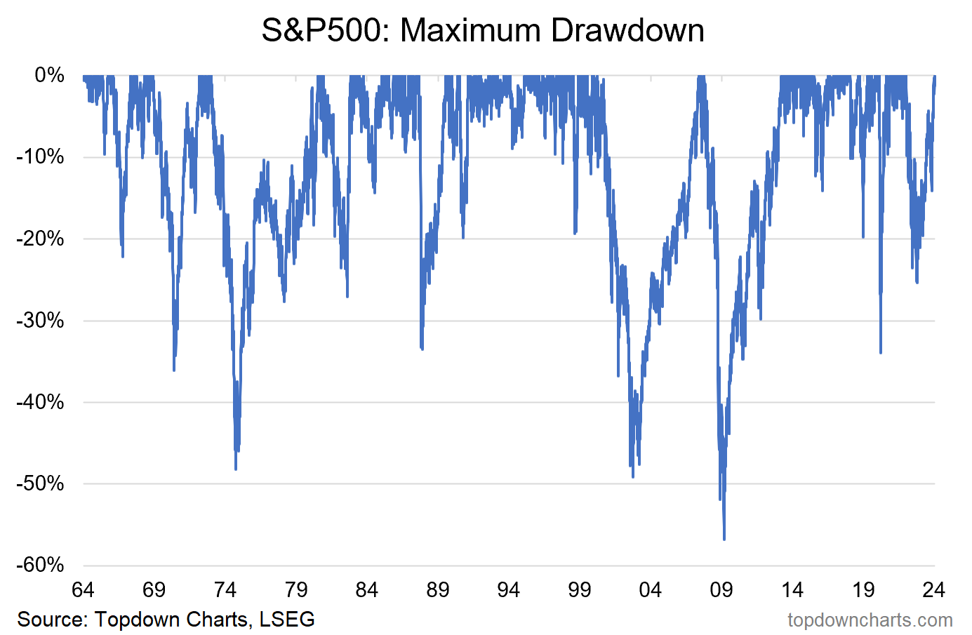
The time and space between new highs was the 5th longest period and the 8th worst max-drawdown.
The equal-weighted S&P 500 is still 5% below its all-time high.
There are effectively 2 distinct and different stock markets in the USA from a valuation standpoint: tech, and the rest.
After a long period of underperformance, active management likely makes a come back in the coming years.
Overall, the clearing of the all-time high (and the 4800-level) is a key moment for markets, and likely unlocks another leg higher. Yet at the same time, the fact that the equal-weighted has failed to make new highs, and has rolled over from resistance is something to be mindful of. Meantime, the music keeps playing and perhaps even a little louder now…
1. New All-Time High: Mission Accomplished.

Source: Topdown Charts Research Services
2. Took a while: Turns out this latest episode was the 5th longest period of time between new all-time highs.

Source: Topdown Charts Topdown Charts Professional
3. Drawdown Zero: Interestingly, in terms of max-drawdown (i.e. the largest downside % movement from the previous all-time high) the latest was only the 8th worst. Still, these last two charts really do put it into perspective in terms of how that really was a bear market that we just went through (in terms of depth and duration).
Source: @topdowncharts Topdown Charts LinkedIn Page
4. What New All-Time High?? If you’d been following instead of the headline cap-weighted index, the equal-weighted S&P500 — it would have been a very different experience. Firstly, the max-drawdown was not quite as bad (-22% vs -25%), but more to the point, the equal-weighted index has *not* yet cleared the all-time high. And if you look at the percentage of stocks making new 52-week highs, it’s not terribly awe-inspiring. It’s at this point you get to find out if you’re glass-half-full or glass-half-empty… half-full says this represents an opportunity for the laggards to play catch-up and drive things higher, half-empty says this represents weakness under the surface, and that the new all-time high on the cap-weighted is illusory.

Source: @Callum_Thomas using Market Charts — Charting Service
5. Rate Cut Ready: One curious development has been the scramble by markets to price in Fed rate cuts — Higher For Longer was a transitory narrative. While I think in lieu of a shock/crisis/recession markets have probably gotten a bit too excited about rate cuts, the chart below provides a useful insight…
