
Weekly S&P500 ChartStorm - 20 May 2024 [free version]
This week: all-time highs, sentiment shifts, cyclical bulls, echoes of 2021, earnings yearnings, global vs US, race to retire, rotation and catch-up...

Welcome to the latest Weekly S&P500 #ChartStorm! [free version] — the Weekly ChartStorm is an easily digestible selection of charts which I hand pick from around the web and my own files. These charts focus on the S&P500 (US equities) with a particular emphasis on the forces and factors that influence the outlook.
The Goal = Stay informed, discover opportunities, and get educated.
Learnings and conclusions from this week’s charts:
Stocks and sentiment are making new all-time highs.
Institutional investors are getting bulled-up.
There are multiple echoes of the 2021 hyper-bull.
Lackluster earnings for ex-tech highlight rotation potential.
A similar split in global vs US earnings highlights the same.
Follow on Social Media for more updates!
Twitter/X: https://x.com/Callum_Thomas (+Topdown Charts)
LinkedIn: https://www.linkedin.com/in/callum-thomas-4990063/ (+Topdown Charts)
1. New All-Time High: After a brief correction during April, we’re back to fresh all time highs… but not just in the index, which is interesting itself, but in this sentiment indicator here. The Euphoriameter (a blend of forward PE, smoothed VIX inverted, and bullish surveyed sentiment) has just reached an all-time high. Sentiment across many measures is increasingly bullish, and well to be fair, the price action entirely justifies that — it is a bull market after-all.

Source: The Euphoriameter Topdown Charts Topdown Charts Professional
2. Sentiment Shift — Exhibit 2: The latest S&P Global investment manager index saw risk appetite surge to the highest since late-2021. In the face of a dematerializing wall of worry, it’s back to bull times.

Source: S&P Global Investment Manager Index
Subscribe to my [Free] Chart Of The Week report
Gain access to original macro/market charts + insights (and tangible investment implications) from my work at Topdown Charts
3. Retail Diamond Hands vs Institutional Paper Hands: A curious thing happened in the chart below whereby institutional investors sharply reduced reported exposure to equities, while retail was by contrast relatively unperturbed. Maybe the standard wisdom messages of buy and hold, time in the market, compounding and so-on have changed retail investors’ behavior.

Source: Daily Chartbook
4. Risk-Seeking Flows: Another example of the shift in mood is actual flows flooding into risk assets and away from defensive assets (at a time where many of my models and indicators say defensive assets look very cheap).

Source: @WallStJesus
5. Cycling Bulls: This chart maps out the path of some previous cyclical bull markets, and the takeaway or bullish suggestion would be that this cyclical bull is relatively normal, and also mid-lower pack… and most of all, looks like it still has time and space to go up to the right if history is any guide.

Source: @TimmerFidelity
6. Again?? One of the most bizarre chapters of the 2020-21 hyper-bull was the rise of “meme stocks” such as GME — much like crypto I would say a lucky few got rich while the majority of those suckered in would have got left holding the bag… and this chart highlights part of that dynamic: the purple line is the VWAP or volume-weighted average price — a proxy for what the average punter bought the stock at. The return of idiotic price action in this stock is another echo of 2021 and perhaps also confirmation of the bull market sentiment themes of this week’s chart storm.
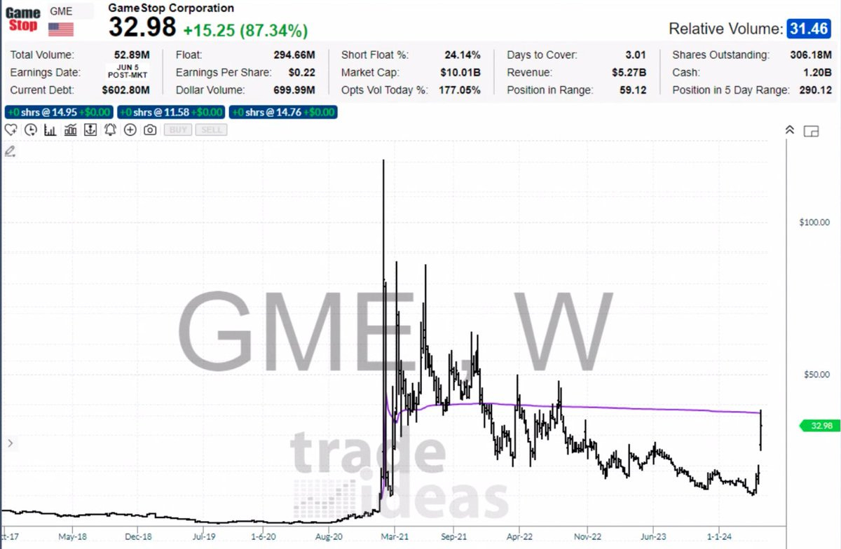
Source: @MichaelNaussCMT
7. Earned: Interesting to note two things here, firstly the all-time highs in price are reinforced by all-time highs in S&P500 earnings (red line). But also, the upswing in earnings over the past 12-months has been entirely driven by Tech. The glass half-full take would be that the ex-tech earnings has scope for catch-up. I would be inclined to agree given the Reacceleration Theme I have been tracking — which is one reason I think we need to be focused on potential for rotation trades.
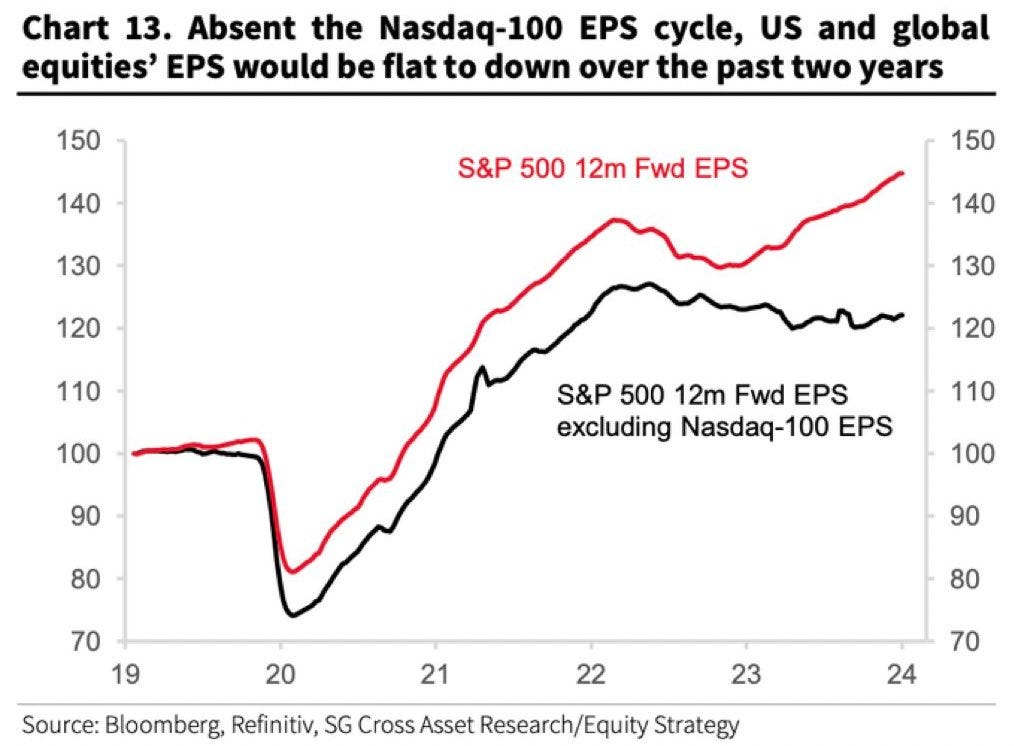
Source: @MichaelAArouet
Speaking of Rotation Trades…
Check out my work at Topdown Charts Professional — in last week’s report I covered some key opportunities (Agri stocks, Japan, China, Emerging Markets).
8. Exponential: Not to get to enthused by the raging bulls, this chart prompts 3 lines of thinking… first: US stocks are expensive vs history (market cap to GDP ratio is sometimes thought of as a valuation indicator), second: global stocks look relatively cheap in comparison (relative value and rotation trade potential), third: it highlights the flow of global capital to the world’s deepest, most liquid, and reliable capital markets (the rise in this ratio in some respects reflects the global stock exchange nature of US markets).

Source: Goldman Sachs via @Schuldensuehner
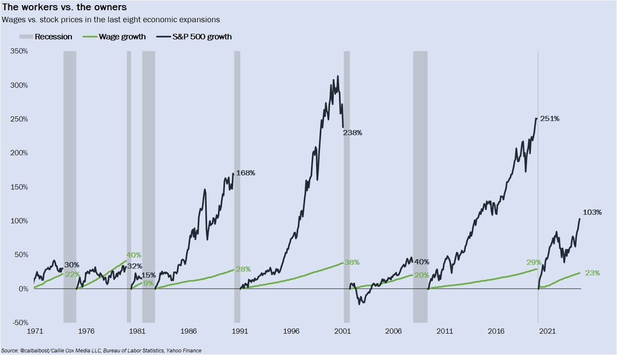
9. Working vs Owning: So first of all, for a more apples-to-apples comparison I would suggest looking at dividend growth vs wage growth in terms of income, but I think the larger point here is that you don’t get rich working for wages, you get rich by building or at least owning companies.
Source: @callieabost
10. Race to Retire: And those who invested wisely are more able to retire faster and fatter. This chart basically tracks retirement intentions by looking at how many people plan to work past the age of 62-years. It is no coincidence in my mind that it kind of looks like an inverted chart of the S&P500. The higher people's stock portfolio and house equity is, the more confident and likely they would be to retire early.

Source: @carlquintanilla Axios
Thanks for reading. Please feel welcome to share this with friends and colleagues.
BONUS CHART SECTION
(upgrade to paid to access)
This week paid subscribers received a mini-blog and chart on the path of global vs US earnings, and the implications for rotation trades…
—> upgrade your subscription to paid now to unlock the full report
Paid Subscriber Benefits:
Access to the Bonus Chart section (exclusive chart/theme/insight)
Access/Participation in the Comments Section (paid subscribers only)
Have your Questions Answered (by email or in the comments)
Quick+Responsive Customer Service (no issues unresolved)
Ad-free (no ads in the way, no marketing emails)
Priority access (no delays in distribution)
All the Charts (no ads: more space)
Upgrade to paid for instant access to these benefits — gain a greater level of insight and join a community of intelligent investors
Thanks and best regards,
Callum Thomas
Founder & Editor of The Weekly ChartStorm
Twitter: https://twitter.com/Callum_Thomas
LinkedIn: https://www.linkedin.com/in/callum-thomas-4990063/