Weekly S&P500 ChartStorm - 20 February 2022
This week: sentiment check, technical tactics, earnings, liquidity, Fed foibles, tech allocations, commodity stocks, home bias, Super Bowl vs S&P
Welcome to the Weekly S&P500 #ChartStorm (by email!)
The Chart Storm is a weekly selection of 10 charts which I hand pick from around the web (+some of my own charts), and then post on Twitter.
The charts focus on the S&P500 (US equities); and the various forces and factors that influence the outlook - with the aim of bringing insight and perspective.
Hope you enjoy!
! NEW ! Sign up to the (free) Chart of the Week over at the new Topdown Charts Substack entry-level service: Subscribe to the Chart of the Week
Each week we send you a chart along with some commentary + context and a key takeaway — so you’re never left guessing on why the chart matters ...and the charts matter! The focus is on illuminating the ever-changing macro-market outlook to help identify incoming risks and opportunities. > > > Subscribe Now
1. Market Mood: To borrow a term, investors are now convinced that the stockmarket has decided to invade into bear market territory. Interesting to note how rare it is for bullish sentiment to drop this low (n.b. this is the combined monthly average of the AAII & Investors Intelligence surveys).
Source: @topdowncharts
2. Best Laid Plans: Chart lines are good and useful, particularly in helping frame decision making/triggers. But the annotations on this chart provide a timely reminder that there is the textbook and then there is the real world. Have a plan (better to have a plan and get confounded than have no plan at all and get washed about in the rivers of fate), but remember Iron Mike’s golden rule of planning.
Source: @FusionptCapital
3. Equity Market Liquidity: This indicator is designed to ‘measure the depth and resilience dimensions of "liquidity" to gauge price impact of flows’ — clearly things are changing, as I’ve noted before the macro risk backdrop is basically permanently different to that which we enjoyed in the last ~2 years… “Regime Change“.
Source: @FadingRallies
4. Earnings Guidance: From boom to gloom. One explainer for this chart is the fact that the pandemic gifted a lot of companies a *one-off* surge/pulling-forward in growth (e.g. zoom, peloton, netflix, etc) — something that could not be repeated. Add to that rising cost pressures and signs of a slip in growth momentum and the picture below begins to seem the obvious outcome.
Source: @C_Barraud
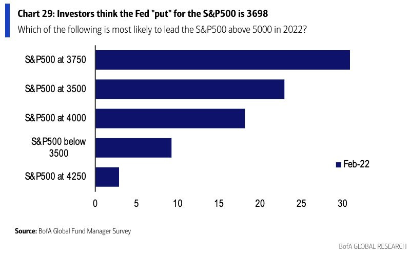
5. Fed Put Where? At least -15% lower, says the consensus… (i.e. with regards to the question, at what point would the Fed abandon plans to hike rates? and perhaps even pivot back into stimulus mode to stop the market fall,., uh, to stop financial conditions from tightening too much).
Source: @LizAnnSonders
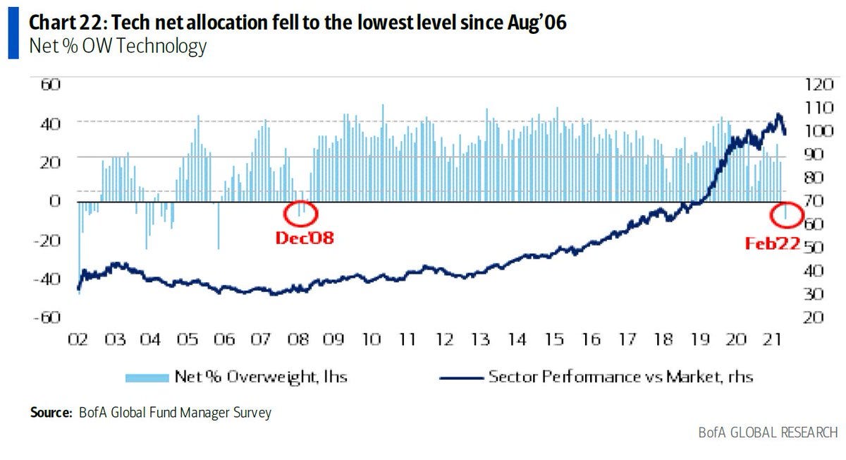
6. Tech Trucked Off: As real yields rise and reality sets in (that point about the one-off earnings surge, not to mention lofty valuations), investors’ love affair with tech appears to be ending/pausing…
Source: @SpecialSitsNews
7. Commodity Stocks: Irrational hatred of commodity stocks (and love of tech) has created a relative value opportunity unseen in centuries. [albeit, n.b. this chart is from Dec, these stocks gone up about 10-15% since then, and tech has fallen by about the same, so I would imagine the discount is less now]
Source: @PlanMaestro
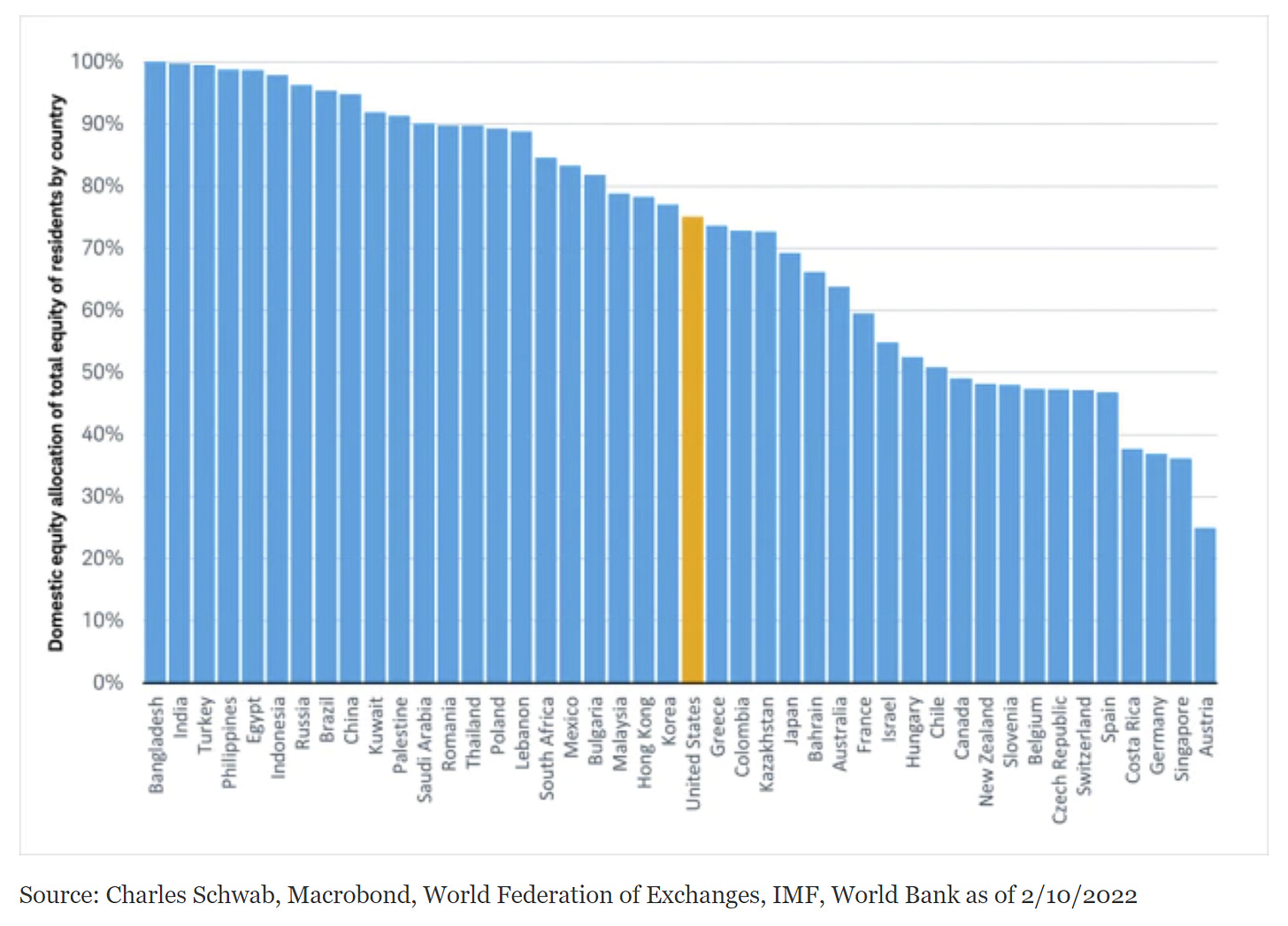
8. Home is Where the Stocks Are: Turns out "investors’ portfolios tend to overweight their home country no matter where they live" — few understand why they should go global, even if tactically vs strategically.
Source: @JeffreyKleintop
9. Fed Sweet Spot Indicator: Wage Growth > Interest Rates = Upside?
Source: Chart of the Week - The Fed vs The Stockmarket
10. Super Bowl vs the S&P: The real momentum play is Super Bowl ad prices.
Kind of astounding: "the price of a Super Bowl ad is up 18% this year" — which is the largest annual % increase since... *2001*
Source: @bespokeinvest
Thanks for following, I appreciate your interest!
oh… that’s right, almost forgot!
BONUS CHART >> got to include a goody for the goodies who subscribed.
Speculation Barometer: bullish risk taking has basically collapsed.
This indicator tracks the volumes traded in leveraged long vs short/inverse US equity ETFs. The higher the number, the greater prevalence of bullish bets being placed.
I’ve shared this chart a number of times before, and noted that it appears to work as a contrarian indicator and in general a barometer of risk-seeking speculative behavior.
It tends to peak around short-term market peaks, and troughs along with the market.
But over the past year it undertook a structural break — pushing far beyond the average of the past decade as speculative fervor underwent a last gasp grasp at gains.
The plunge in this indicator lines up with the charts of surveyed market sentiment and reflect the macro tremors shuddering across markets (geopolitical risk, inflation risk, Fed rate hike risk, post-pandemic realities, growth wobbles).
Macro munted, sentiment shifting…
—
Best regards,
Callum Thomas
SPONSOR: ( …he’s me!)
My research firm, Topdown Charts, has a new entry-level service, which is designed to distill some of the key ideas and themes from the institutional fund manager service to provide the same high quality insights at a more accessible price.
Give it a try and let me know what you think


