Weekly S&P500 ChartStorm - 19 September 2021
This week: corporate tax hikes, fund flows, market breadth warnings, the best days, the index effect, thematic investing, market ownership
Welcome to the Weekly S&P500 #ChartStorm (by email!)
The Chart Storm is a weekly selection of 10 charts which I hand pick from around the web, and then post on Twitter.
The charts focus on the S&P500 (US equities); and the various forces and factors that influence the outlook - with the aim of bringing insight and perspective.
Hope you enjoy!
p.s. if you haven’t already, subscribe (free) to receive the ChartStorm direct to your inbox, so you don’t miss out on any charts (you never know which one could change your whole perspective!)
1. S&P500 vs US Corporate Tax Hike Probability: An interesting milestone was reached last week - by my calculations on PredictIt data - the probability of a corporate tax hike in 2022 rose to 80%. With all that’s going on, and all the back and forward in congress, perhaps this has simply snuck up on investors. It reminds me of what we saw in 2017 - markets were on a euphoric run, and rallied on speculation of the Trump tax cuts. Notably though: the tax cuts were ultimately delivered, but the market peaked shortly thereafter and had a fairly volatile/ranging 2018. Maybe informative for what we should expect from the markets now with tax hikes…
Source: @topdowncharts
2. Global Corporate Tax Rankings: According to analysis by the Tax Foundation, if the currently proposed 26.5% corporate tax rate goes ahead (vs the existing 21%), it would take the total corporate tax rate (including state taxes) to 30.9% - which would place the USA at the third highest tax rate across the OECD economies [of course the effective tax rate is a lot lower]. But as I talked about in my latest weekly report, rising corporate tax rates is not an isolated issue - the UK is set to hike its corporate tax rate from 19% to 25% in 2023 (to help pay for Covid fiscal bills), and the G20 is keen to see agreement on a global minimum corporate tax rate of 21%. The tides seem to be turning on tax - falling corporate tax rates across the past 4 decades was a tailwind to earnings, but likely no-more going forward.
Source: @taxfoundation
3. Equity Fund Flows: Last week saw “monster inflows“ into equities. Perhaps an attempt by investors to “buy the dip”? As a side note, another observation I would highlight is just how unique the current market environment is e.g. compare and contrast the magnitude of flows in 2021 vs the previous two years. It’s a whole different scale.
Source: @ZeroHedge
4. Fund Flows vs the Stockmarket: Carrying it further, this next chart puts fund flows into context with market price action - the current pattern of fund flows looks very familiar… (i.e. the last two times it went like this markets peaked).
Source: @MacroOps
5. Narrow Leadership: Bear with me as this one’s a mouthful - this chart shows the consecutive days where less than 40% of stocks were outperforming the index on a rolling 3-month basis. In other words, it’s basically an indicator of how narrow breadth is (big tech!). Interestingly, it actually made a new record last week. Also of interest: those red dots……
Source: @DeanChristians
6. Missing the 10 Worst/Best days: This chart is quite interesting, first of all noting how if you missed the 10 best days in the market you’d be almost 50% behind a simple buy and hold approach… But also if you managed to still bank those 10 best days AND avoid the 10 worst days you’d be more than double the buy and hold. I think there’s something for everyone in this chart: market timers will focus on the red line, passive fund promoters will focus on the green line!
Source: @DavidTaggart
7. The Index Effect: According to analysis by S&P Global, the “index effect“ has diminished significantly across time. In the 1990's getting added to the index boosted stock returns by around 8% and falling out of the index could drop returns almost -10%. Lately? Basically no impact. The study notes that a big driver is improving liquidity across time. I would suggest that it also may simply reflect growing awareness of this effect, and increasing sophistication of analysts/traders in attempting to front-run index additions/deletions (i.e. perhaps it has simply been arbitraged away, or smoothed out).
Source: @drtimedwards
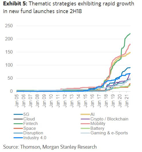
8. Themetastic! This is perhaps another sign of the times - the rapid (opportunistic) rise of thematic fund strategies (specifically: it is the count of new fund launches). The term “Themewashing“ comes to mind…
Source: Morgan Stanley Research via LinkedIn
9. US Corporate Equity Ownership: I always find these types of charts fascinating. We could talk on so many topics related to this chart e.g. the impact on governance, the rise and fall of private pensions and mutual funds, the rise and rise of ETFs, and rising impact of global investors… But perhaps one topical thing would be the turning of the corner in households. The pandemic (stimmy + free time) + fintech + internet + fee pressures/competition have made it a much easier time for individuals to invest than ever before. I wouldn’t quite go as far to say that the playing field has been completely leveled, but it is a lot more level now.
Source: @BJMbraun
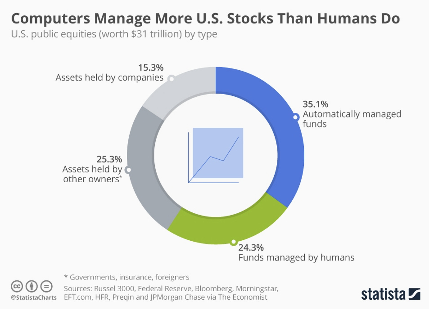
10. Computers vs Humans: Just as the UN released a report warning about AI, we have this curious chart showing that - according to Statista - computers now apparently manage more money than humans do.
(…I wonder if the UN included this in their report!)
Source: @StatistaCharts
Thanks for following, I appreciate your interest!
oh… that’s right, almost forgot!
BONUS CHART >> got to include a goody for the goodies who subscribed.
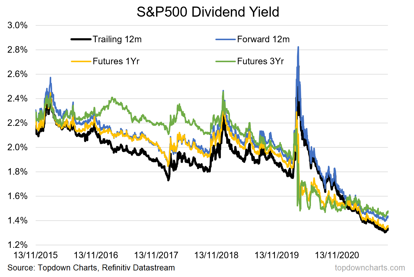
S&P500 Dividend Yield: the flipside of the dream run in stocks is the plunge in dividend yields - down to a 2-decade low (and the same level as 10-year treasury yields!).
I thought I would also show, out of interest, the same but if you use forward estimates or dividend futures (yes there is a market for futures on dividends!). There’s not that much difference between them, so we can’t really write it off as an edifice of abnormal/low trailing dividends.
Another sign of the times, and reminds me of that saying when government bonds first started yielding 0% — “yield-free risk“.
—
Best regards,
Callum Thomas
SPONSOR: ( …he’s me!)
My research firm, Topdown Charts, has a new entry-level Substack service, which is designed to distill some of the key ideas and themes from the institutional fund manager service to provide the same high quality insights at a more accessible price.
Give it a try and let me know what you think


