
Weekly S&P500 ChartStorm - 19 December 2021
This week: market technicals, tech stock supremacy, US vs global, value vs growth, and the sometimes perilous conclusion of long-term investing...

Welcome to the Weekly S&P500 #ChartStorm (by email!)
The Chart Storm is a weekly selection of 10 charts which I hand pick from around the web (+some of my own charts), and then post on Twitter.
The charts focus on the S&P500 (US equities); and the various forces and factors that influence the outlook - with the aim of bringing insight and perspective.
Hope you enjoy!
p.s. if you haven’t already, subscribe (free) to receive the ChartStorm direct to your inbox, so you don’t miss out on any charts (you never know which one could change the whole perspective!)
1. The S&P 500 Sandwich: The market is currently sandwiched between support and resistance (not to mention another touch of that 50-day moving average). As an observation, "buy the dip" still seems to be in play, but "sell the rally" is also working more recently... There is a clear wall of resistance for the market to climb, along with increasingly a wall of worry (Omicron, Fed, geopolitics, inflation).

Source: @Callum_Thomas
2. Tech vs The Rest (pt1): Tech stocks basically doubled the return of the S&P 500 this year…
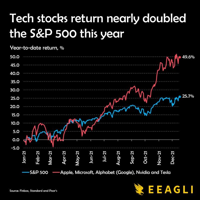
Source: @JamesEagle17
3. Tech vs The Rest (pt2): ...which is all the more meaningful when you realize that "35% of the S&P 500's YTD return has come from (just) five stocks".
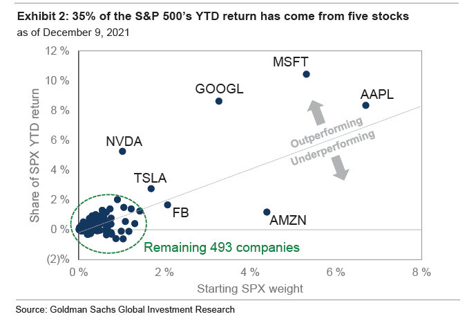
Source: @zerohedge
4. US vs Global: That last chart probably also goes a long way to explaining this one too -- “Since the beginning of 2020, the S&P 500 has outperformed the FTSE index for the world excluding the U.S. by almost 30%”.

Source: @MarketPictorial
5. US vs Global — Longer Term Perspective: US equities utterly crushed global equities the past decade. This chart shows the relative performance line for US vs global excluding-US equities (i.e. the rest of the world). There does appear to be a cycle here, and what a cycle!

Source: (Bonus Chart from last week)
6. Global vs US Earnings: A key reason for that previous chart... (albeit this shows it expressed in the opposite terms i.e. global vs US), anyway — KEY POINT: US earnings have been outgrowing global (i.e. the cycles in price are being underpinned by cycles in earnings).
Source: Chart of the Week - Global vs US Equity Earnings
7. Global vs US Valuations: Although the US has clearly been outpacing global in terms of earnings [previous chart], you might wonder if that news is already “in the price” (and then some?) given the spread in valuations, e.g. as shown in this chart (but also confirmed across a bunch of different indicators — believe me: I have worked almost obsessively on this topic!).

Source: @hkeskiva
8. The Value of Value: This is an interesting broad, composite, adjusted view of the value of value stocks (i.e. value vs growth relative valuations). Simply put, value stocks have never before been this cheap vs growth stocks. I always pay particular attention when valuation indicators show up at extremes like this — maybe it’s not tactically relevant, but when a valuation indicator gets extreme enough experience shows it has a habit of speaking for itself sooner or later.

Source: @CliffordAsness
9. Value vs Growth Correlations: Speaking of Value vs Growth — the two groups of stocks have been on different planets this year. I would actually consider this another extreme, and possibly another indicator of a prospective turning point.
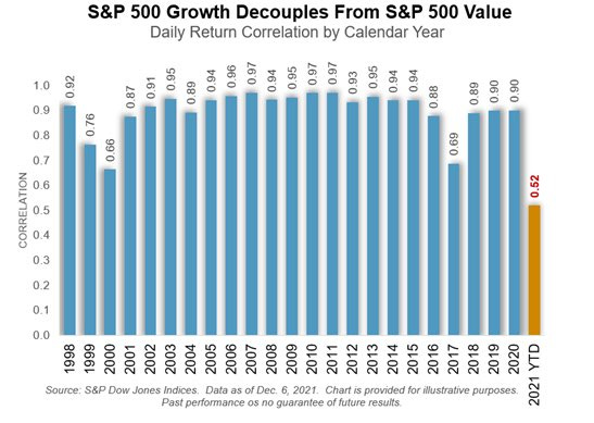
Source: @SPDJIndices via @LizAnnSonders
10. Time in the Market? Just a friendly reminder that the old saying "Time in the Market" doesn't always work out so well... Fascinating table from Ray Dalio’s latest book outlining some simply catastrophic outcomes from being a long-term hodler.

Source: @RayDalio (BOOK: The Changing World Order) via @MebFaber
Thanks for following, I appreciate your interest!
oh… that’s right, almost forgot!
BONUS CHART >> got to include a goody for the goodies who subscribed.
Value vs Growth: speaking of extremes…
This chart shows the relative performance of the S&P 500 Value Index vs the S&P 500 Growth Index in total return terms (i.e. including dividends).

Much as you might expect given the all time high in the value of value chart (no.8) value stocks reached an all-time low vs growth stocks in total return terms last month.
When price and value have reached extremes like this it is very tempting to call a turning point — but also informative to note the numerous times in history where the same was true but only false dawns were found. For instance, even during the previous most extreme instance (i.e. the dot-com bubble) there was an initial false dawn before the ultimate low point.
So pay close attention to this, but also pay attention to technicals for signals/confirmation of an actual turning point.
—
Best regards,
Callum Thomas
SPONSOR: ( …he’s me!)
My research firm, Topdown Charts, has a new entry-level Substack service, which is designed to distill some of the key ideas and themes from the institutional fund manager service to provide the same high quality insights at a more accessible price.
Give it a try and let me know what you think! :-)