
Weekly S&P500 ChartStorm - 18 September 2022
This week: intermarket trends, extreme price moves, allocations, earnings revisions, profit margins, credit ratings changes, price vs earnings, price vs profit, stocks vs bonds, worst ETFs, RoE trends

Welcome to the Weekly S&P500 #ChartStorm — a selection of 10 charts which I hand pick from around the web and post on Twitter.
These charts focus on the S&P500 (US equities); and the various forces and factors that influence the outlook - with the aim of bringing insight and perspective.
Hope you enjoy!
ICYMI: Sign up to the (free) Chart Of The Week over at the new Topdown Charts Substack entry-level service: Subscribe to the Chart of the Week
Each week we send you one of the most interesting charts on our radar, along with commentary/context and a key takeaway — so you’re never left guessing on why the chart matters ...and the charts matter! > > > Subscribe Now
1. The Trend is Your Friend? They say "don't fight the Fed", but another key market aphorism is **don't fight the trend** (which is kind of in many ways driven by the Fed). But either way, as the chart shows, there are clear trends at play across assets as the liquidity tides go out and the cycle progresses…
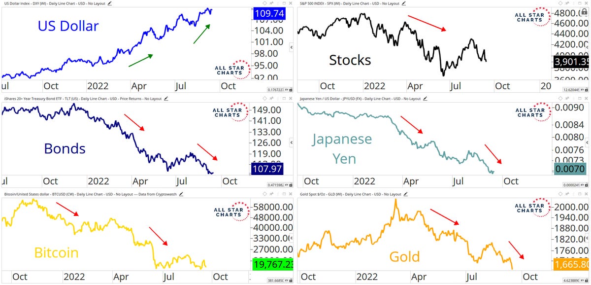
Source: @AlfCharts
2. Extreme Pricing: The S&P500 is down almost -20% YTD but more importantly, the average stock decline % is near the 2 S.D. level "that is often associated with a bounce"
Issue is: it can get worse (e.g. 87, 08, 20), and it can stay bad (e.g. dot com bubble burst).

Source: @strategasasset
3. Exiting the Eurozone: Allocations to Eurozone equities dropped to a record low in the latest BofA fund manager survey. Europe is basically the epicenter of the 2022 macro meltdown, so we should expect this - maybe we can call it rational fear (but at some point it becomes irrational (and a source of opportunity)).

Source: @HumbleStudent
4. Analyst Sentiment Souring.
Logical 🖖: this is what happens in recession.

Source: @GameofTrades_
5. Earnings Recession Incoming: Sure looks that way when you consider the momentum in the previous chart, and then notice that the S&P 500 "Operating Margin Diffusion Index has declined to levels that are typical in recession."
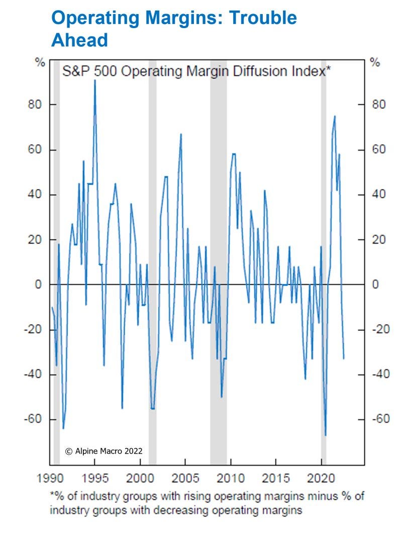
Source: @RealAlpineMacro
6. Credit on Borrowed Time? Similar vibe to the previous 2 charts — credit ratings downgrade cycle looks to be kicking off...
Also logical.

Source: @SoberLook
7. Global Equities vs Global EPS: The market happily front-run the earnings rebound in 20/21 thanks to massive stimulus. But next steps?
From here the stockmarket basically needs earnings to at least holdup, ideally head higher, or find new stimulus. All seem unlikely at this point...

Source: @beursanalist
8. Valuations and Future Returns: Profit depends on Price paid.
The current Shiller PE ratio level is historically consistent with an annualized return of 0% over the next decade.
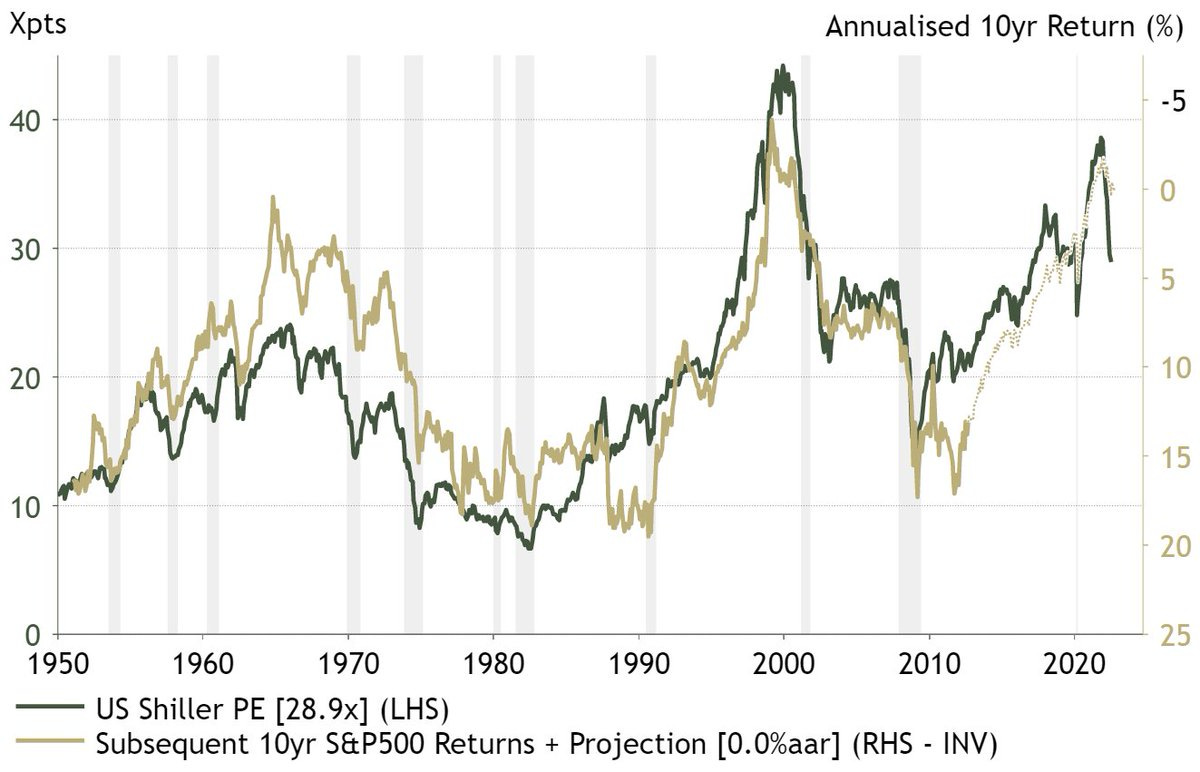
Source: @IanRHarnett
9. Stock/Bond Ratio: Wild.
Kind of speaks for itself, but to spell it out: equities are extremely stretched vs bonds. I suspect this will reverse eventually, and most likely when recession hits, inflation falls, and bonds finally start to fight back.

Source: @AtlasPulse
10. Worst performing ETFs of 2022 (YTD)
AKA — reminder: investing is risky.

Source: The worst-performing ETFs of 2022
Thanks for following, I appreciate your interest!
BONUS CHART >> got to include a goody for the goodies who subscribed.
Return on Equity: we are seeing some fairly stark recent developments in profitability across the major chunks of global equities.
The USA has peaked but remains on top, EM is middle of the pack but accelerating higher, and the rest of developed markets has rolled over from typically mediocre levels.
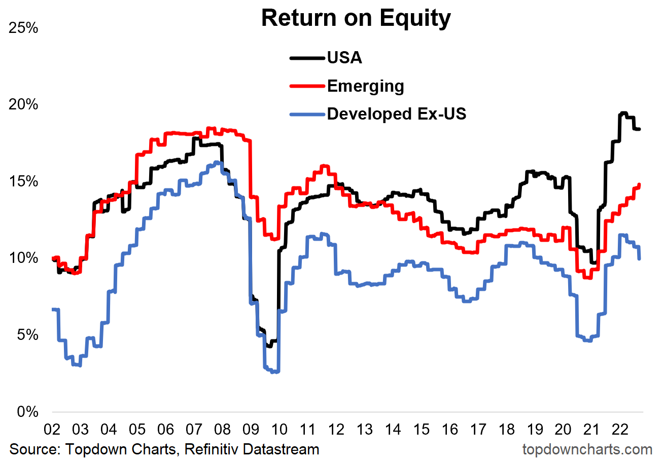
In fairness, RoE is inherently a backwards looking metric, it looks at historical earning in relation to owner’s equity. And in practice it does tend to lag the market.
But that does not mean we should ignore it. RoE trends can help reinforce price trends, we can also at times extrapolate nascent trends in RoE around turning points, and it helps understand price performance and valuation differences.
In this respect, that developed markets are turning down basically gels with the notion that recessionary conditions appear to be developing, and helps understand some of the weakness in the stockmarket.
But Emerging Market equities have not really performed that well this year, and this stands at odds with the *improving* trend in EM RoE.
For those who are curious — the sectors within EM that have seen the biggest lift were Industrials, Energy, and Materials (commodity and manufacturing related). Makes sense given the macro backdrop, and for reference, EM has a larger skew to these sort of “old cyclical“ sectors.
Out of interest, RoE has been rising across most EM sectors (except Healthcare and Consumer Discretionary). It has also been rising across most countries within EM, except China (which faces multiple macro headwinds).
So a curious chart, a curious development, and something to keep in mind as EM equity valuations and sentiment reset further lower.
—
Best regards,
Callum Thomas
My research firm, Topdown Charts, has a new entry-level Substack service, which is designed to distill some of the ideas/themes/charts from the institutional research service to provide the same high quality insights at a more accessible price.
Give it a try and let me know what you think! :-)
Referral Rewards? Refer a Friend to the Weekly ChartStorm… get reward!
Refer 5 people = request a chart
Refer 10 people = get a free trial to Topdown Charts
Refer 25 people = get a free T-Shirt
That first graph is really cool, I never watch at anything else than $NQ and a handful of stocks. Interesting to see that stocks have the least worst downswing in comparison with gold/btc/bonds that have almost no rallies. Thanks for sharing