Weekly S&P500 ChartStorm - 18 July 2021
Your weekly selection of charts...
Welcome to the Weekly S&P500 #ChartStorm (by email!)
The Chart Storm is a weekly selection of 10 charts which I hand-pick from around the web (+some of my own charts), and then post on Twitter.
The charts focus on the S&P500 (US equities); and the various forces and factors that influence the outlook - with the aim of bringing insight and perspective.
Hope you enjoy! SUBSCRIBE [free] to receive this in your inbox each week
1. S&P500 - 50 day Moving Average Breadth: As of Friday over half the market was still trading below their respective 50-day moving averages. This chart was a running feature a few weeks ago, but I revisit it for the fact that it is still soft: the index may be grinding higher, but not everyone is participating…
Source: @Callum_Thomas
2. Value vs Growth: And that brings us to the next chart - the value vs growth rotation has moved back into unrotation. Basically this speaks further to the previous chart about how market leadership has been relatively narrow - focused on tech and tech-related stocks, while value stocks (including defensives like healthcare/staples/utilities, and cyclicals like energy and financials) have lagged behind.
Source: @Callum_Thomas
3. Global Equities - 50 day Moving Average Breadth: Back on breadth — half of the world is also trading below their respective 50-day moving averages.
"All is not quite right out there..."
Source: Weekly Insights Report - Edition 10
4. Bulls vs Bears - Cycle/Smoothed Edition: And yet bullish sentiment continues to drift higher (while bearish sentiment drifts towards the bottom of the range). We’ve seen this type of pattern before: late in the cycle (dot com bubble peak), and early in the cycle (early 2000’s at the start of the credit bubble + EM/Comdty super cycle). So which one is it? Would you say we are early-cycle or late-cycle?
Source: @topdowncharts
5. US Fund Flows: US Fund Flows (all stocks, all bonds, mutual funds & ETFs) went from a state of "sell everything!" to "buy everything!". Now it’s rolling over again... is this a sign of things to come as policy stimulus begins to pivot globally?
Source: @topdowncharts
6. US Asset Class Valuations: A few things are interesting with this chart, first is the procession of bubbles (stock market, then property + commodities, then bonds, and now... everything? Well not quite: commodities still look reasonable. But it is worth noting that even though equities look increasingly expensive, they’ve been higher in the past. It also highlights the point that when people say stocks look reasonable vs bonds, it’s because bonds are just as expensive!
Source: Valuations Rising: Is *Everything* Expensive??
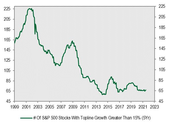
7. Growth Stocks - Supply: This interesting chart from Corner Stone Macro shows the count of “growth stocks“ in the S&P500 (as defined by revenue growth greater than 15% over a 5-year basis). The argument is that because growth stocks only number 67 today, vs over 200 back in 2001, that people should pay higher for growth stocks. I think this is probably a fair argument, but I also remember back in 2000 there were all sorts of reasonable sounding arguments being tabled to justify extremely expensive valuations - so I’m on the fence with this one.
Source: @MichaelKantro
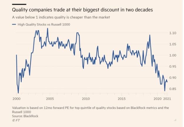
8. Value in Quality? BlackRock defines quality as “stocks exhibiting positive fundamentals (high return on equity, stable year-over-year earnings growth and low financial leverage)“ — but more interestingly, BlackRock finds that “quality“ stocks are trading at the widest valuation gap vs the Russell 1000 (large cap index) since the dot com bubble. You see a similar thing in relative valuations for value vs growth - so I guess we can call this perhaps another bubble barometer.
Source: Animal Spirits podcast
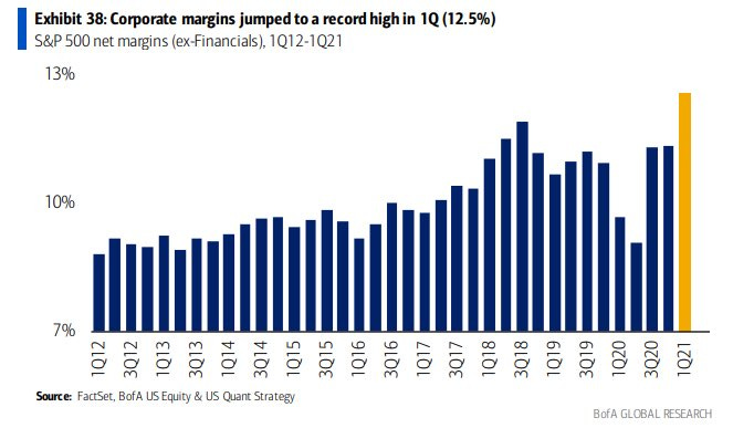
9. Profit Margins: Interestingly, despite (or because of?) pricing pressures, US profit margins running at a record high... Maybe a little inflation ain’t such a bad thing after all. Of course, if pricing pressures go further firms will likely see less ability to run pricing passthrough without rising wage pressure (or rising interest rate pressure for that matter). Certainly a metric to keep an eye on as inflation becomes the hot topic.
Source: @MichaelaArouet
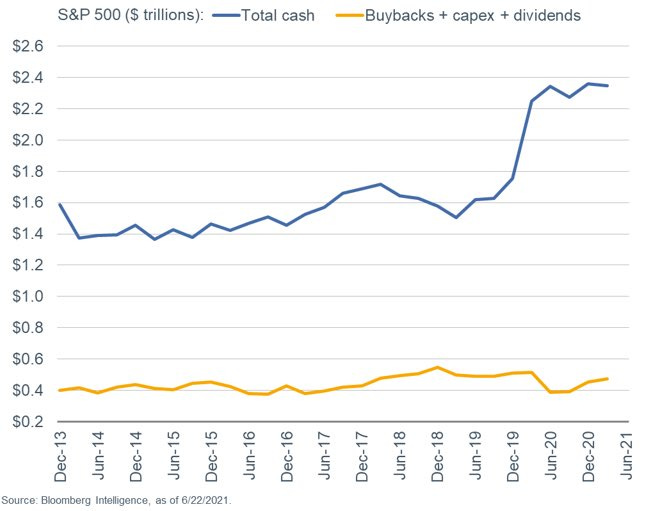
10. Cash Hoarding: S&P500 companies have hoarded a record $2.4 trillion in cash (or 5.5% of assets). It begs a couple of questions: is this just precautionary savings? or is it dry powder waiting to be deployed on buybacks and dividends? The third option would be a possible capex comeback - something I have been doing increasing work on (to me it’s obvious capex rebounds given the years of underinvestment, capacity constraints, cheap funding, and usual cycle lags).
Source: @LizAnnSonders
Thanks for following, I appreciate your interest!
oh… that’s right, almost forgot!
BONUS CHART >> got to include a goody for the goodies who subscribed.
Wine vs Stocks: something a little different - this week the bonus chart looks at the Liv-ex Fine Wine Index vs the S&P500.
Since inception, it seems wine has outperformed stocks as an investment. This is quite interesting to look at in an age where just about every asset is getting a bid as the global pandemic stimmy response has flooded the world with waves of liquidity…
But it would be disingenuous of me to leave it there, the next chart shows the *relative performance* line of wine vs stocks. Here we can see that much of the outperformance happened during the commodities super-cycle of the 2000’s. Indeed, the peak in relative performance was roughly around the same time commodities peaked.
Since then, wine has actually been in a decade-long relative bear market vs stocks. So maybe actually wine has some catching up to do?
Maybe something to contemplate on your next trip to the bottle shop!!
—
Best regards,
Callum Thomas
>> SPONSOR: ( …he’s me!) My research firm, Topdown Charts, has a new entry-level Substack service, which is designed to distill some of the key ideas and themes from the institutional/fund manager service to provide the same high quality insights at a more accessible price.
Give it a try and let me know what you think :-)


