Weekly S&P500 ChartStorm - 18 April 2021
Your weekly selection of charts...
Welcome to the Weekly S&P500 #ChartStorm (by email!)
The Chart Storm is a weekly selection of 10 charts which I hand pick from around the web (+from my own chart library), and then post on Twitter.
The charts focus on the S&P500 (US equities); and the various forces and factors that influence the outlook - with the aim of bringing insight and perspective.
Hope you enjoy!
1. Earnings Season: Just a friendly reminder that earnings reporting seasons heats up over the next few weeks - good source of volatility!
Source: @bespokeinvest
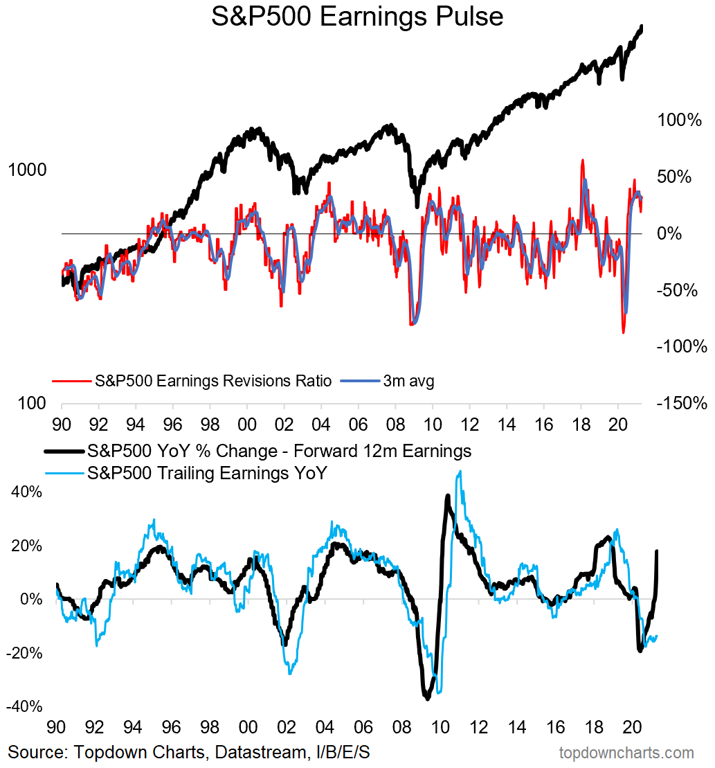
2. Earnings Revisions Pulse: This chart tracks the S&P500 earnings revisions ratio (tracks upward vs downward revisions) and also shows YoY growth of forward & trailing EPS. As you can see, analysts have been very busy revising up estimates.
Source: @topdowncharts
3. Rydex Assets Ratio: This indicator is based on flows in/out of bullish vs bearish funds - basically a sentiment indicator driven by actual activity. As we can see on the chart, it seems extreme highs in this indicator tend to occur at/near market peaks.
Source: @chartprofit
4. Equity Allocations: This is another sentiment/positioning chart based on actual portfolio data (as opposed to surveyed sentiment). It shows investors are running record high exposure to equities (albeit n.b. it only goes back to ‘05 — would suspect the dot-com bubble readings would have been higher).
Source: @CapitalObserver
5. Discretionary vs Systematic Equity Positioning: Another activity based measure of sentiment, and it shows discretionary investors are all-in. Quant based strategies middle of the road for now, but suspect that will rise in time.
Source: @TN & @modestproposal1
6. Upside-down Volatility Indicator: This unusual indicator (my own) tracks the rolling annual count of moves greater than +1% vs moves worse than -1%. Basically tracking upside volatility vs downside volatility. In recent history, surges in this indicator appear to be bullish.
Source: @topdowncharts
7. Short Interest Ticking Higher: After reaching an all time low earlier this year, the median short interest indicator has begun to tick higher. Short sellers are clearly starting to see more opportunities.
Source: @PriapusIQ
8. Breadth vs Breadth: Interesting to see that while S&P500 market breadth is running at multi-year highs, small caps & tech look decidedly less convincing. Will this be a problem for the S&P500? (or will the others catch up?)
Source: @LizAnnSonders
9. Average Pairwise Correlations: This indicator tracks the degree to which stocks are moving in tandem. It spiked during the peak of the pandemic panic as folk sold everything. Since then it’s come back down as a series of rotations have made for more of a sector/stock pickers market.
Source: @MrBlonde_macro
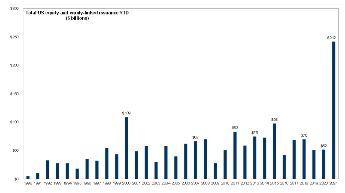
10. Record High Equity Issuance: As I noted last week with a similar chart, it’s the perfect time to raise equity capital: “valuations are at cycle highs, the system is awash with liquidity, and there are clear signs of excess optimism“.
Source: @DavidSchawel
Thanks for following, I appreciate your interest!
oh… that’s right, almost forgot!
BONUS CHART >> got to include a goody for the goodies who subscribed.
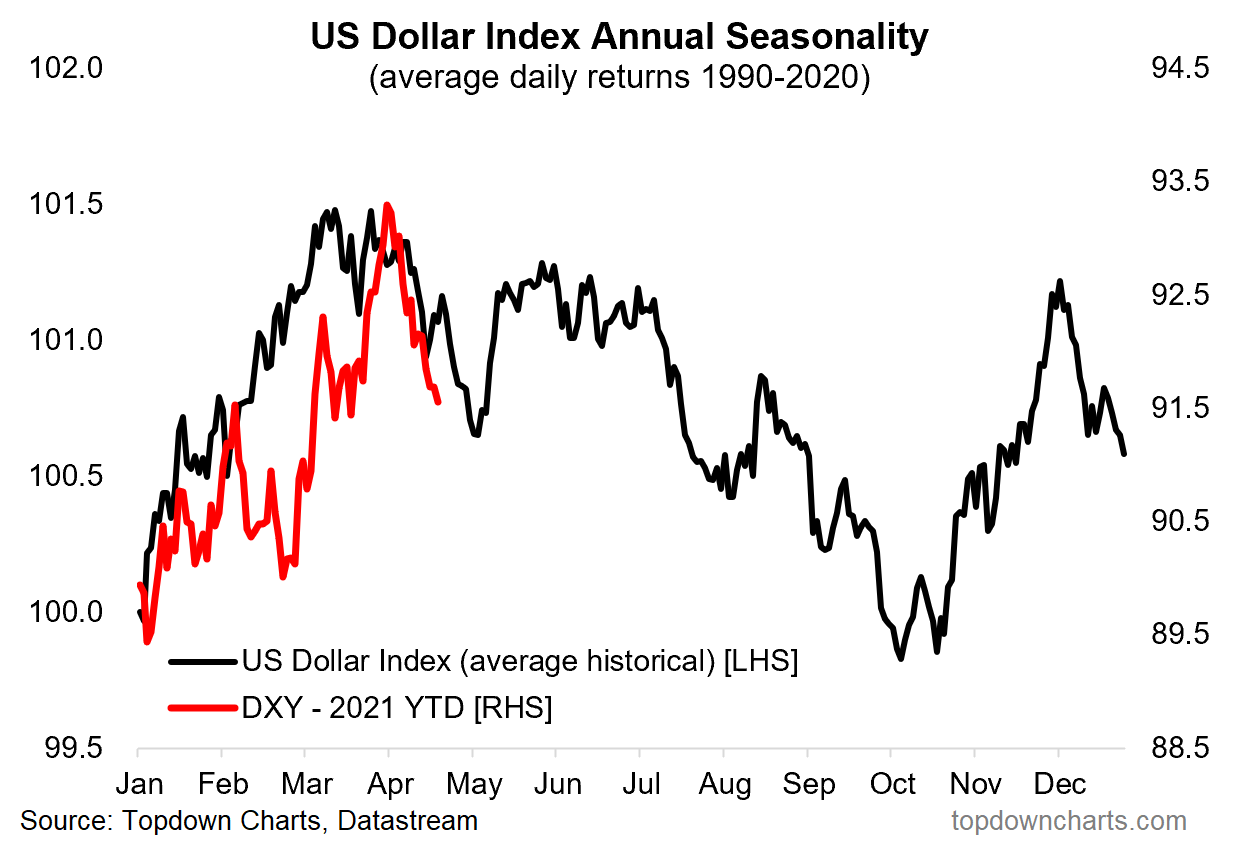
US Dollar Seasonality: seasonality in the stockmarket is fairly well understood and widely documented, but here’s a look at seasonality for the US dollar.
As we can see the upward seasonal bias in Q1 certainly helped the USD rally (along with oversold technicals and crowded bearish bets).
On that note, technicals have now reset (actually slightly overbought), and the consensus sentiment/positioning situation has seen a partial shakeout also.
Meanwhile, I would say the medium-term bearish case remains intact. So a bearish seasonal bias over the next few months (as indicated by this chart) probably helps the bear case at the margin.


