Weekly S&P500 ChartStorm - 17 July 2022
This week: earnings revisions, cyclicals vs defensives, transports, investor sentiment, energy/resources, correlations, valuations, and economic sentiment...
Welcome to the Weekly S&P500 #ChartStorm — a selection of 10 charts which I hand pick from around the web and post on Twitter.
These charts focus on the S&P500 (US equities); and the various forces and factors that influence the outlook - with the aim of bringing insight and perspective.
Hope you enjoy!
NEW: Sign up to the (free) Chart Of The Week over at the new Topdown Charts Substack entry-level service: Subscribe to the Chart of the Week
Each week we send you one of the most interesting charts on our radar, along with commentary/context and a key takeaway — so you’re never left guessing on why the chart matters ...and the charts matter! > > > Subscribe Now
1. Earnings down-and-Outlook: Clear downward momentum in earnings revisions, only 33% of analyst earnings estimates have been revised upward (i.e. the rest downward) -- matches the worsening macro.
Source: @LizYoungStrat
2. Cyclicals vs Defensives: That earnings revisions path (previous chart) looks suspiciously similar to the path of cyclicals vs defensives...
In other news, defensives have been having a dream run (in relative terms) this year — goes to show: “there’s always a bull market somewhere“.
Source: @MrBlonde_macro
3. More Malign Macro: Transports IYT 0.00%↑ vs S&P 500 SPY 0.00%↑ relative performance line is trailing down to the right... basically a signal of weakening economic activity in that transport sector is heavily exposed to the ebb and flow in economic activity.
… and or all the nGDP and Labor Stat warriors out there saying things still look good, the market almost always knows the real story *well in advance* of those lagging and low frequency indicators!
Source: @MosaicAssetCo
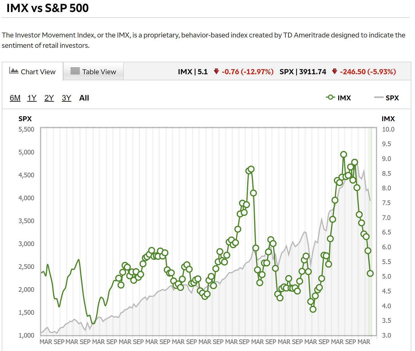
4. TD Ameritrade Investor Movement Index
(not to be confused with the bowel movement index!)
The June reading dropped to the lowest point since 2020, that’s a big round trip in investor sentiment right there...
Source: TD Ameritrade Investor Movement Index
5. Investment Manager Index: US equity investors became more risk averse in July according to S&P Global (used to be Markit, but they bought em). According to the survey details, macro issues were overwhelmingly cited as the main downside driver for markets in the near term. We are all macro investors now.
Source: S&P Global — Investment Manager Index
6. Energy Earnings Margins: Apparently S&P 500 expected Operating Margins are being entirely propped up by the Energy Sector...
Thus the energy (and materials) sector is going from a driver of strength to driver of weakness as the commodity bubble bursts.
Source: @GinaMartinAdams
7. Run on Resources: Investors are dumping Resources equities (energy + materials) as the commodity bubble begins to burst.
Source: @MikeZaccardi
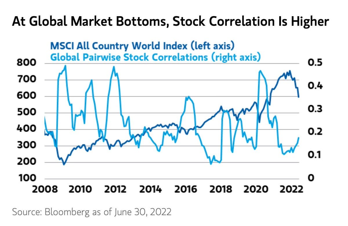
8. Global Equity Correlations: How to tell when global equities bottom?
(when everything turns to sh..🤫)
Correlations usually spike at that cathartic moment where everything goes to the wall, when the last bastions of strength get broken, when everything is at its worst. “Darkest before dawn” and things of that nature. Across the various macro/cross-asset indicators I watch, we are getting closer, but I still get the sense that we need another cathartic wave down before it’s going to be safe to get back in the water.
Source: @acemaxx
9. Correlations Again: Given the previous chart, it is interesting then to see correlations among S&P 500 stocks on the rise...
The market is becoming more and more macro-driven by the day, especially as policy screws tighten, commodities crumble, and cracks increasingly start to show in the economy.
Source: @SoberLook via @SnippetFinance
FYI: Snippet Finance delivers a great regular email with snippets on stocks, macroeconomics and investing presented in a short easy-to-digest way.
10. Valuation Situation: This chart is a great illustration of what I have been stressing — the question we need to ask is not how far *have* valuations come down… it's how far do they *have to* go before investors are sufficiently compensated for the bad macro? (i.e. for the risk of excessive monetary tightening and recession) This chart (link to the research note below) suggests quite a bit lower yet.
Source: GMO Research Library
Thanks for following, I appreciate your interest!
BONUS CHART >> got to include a goody for the goodies who subscribed.
Investor Sentiment vs Economic Sentiment: I first flagged this emerging divergence back in February, where surveys of investor sentiment had plunged, but back then surveys of economic sentiment were still holding up.
Since then, investor sentiment has gone from bad to worse, and economic sentiment has started to “catch down“.
For reference, the Investor Sentiment indicator combines data from the AAII and Investors Intelligence surveys, while the Economic Sentiment indicator combines data from surveys of manufacturers, small business, consumer, housing, and general industry.
The intention is to maximize signal in each respects, so we can be confident we are measuring what we are trying to measure.
While investor sentiment is clearly more erratic and manic-depressive than economic sentiment (which is kind of what you would expect), I think it is fair to argue for further downside in economic sentiment given the headwinds facing the economy.
But it does bring us back to that open question: how bad and how long is the recession going to be? If you ask investors, going off this chart, they might say it’s going to be as bad as 2008!
It is inherently an open question, because even if you know a recession is coming, it is hard to tell what the response by policymakers will be or what the unintended consequences and crisis-factors could be.
For instance, 2008 was a downturn that turned into a global financial crisis, while 2015/16 was a genuine global growth scare — but recession-averted by stimulus (Europe and China). This time it is a bit harder for policymakers to pivot to stimulus given lingering inflation pressures, so hence my comments earlier — you probably need a bit more disruption, catharsis, and another wave down in markets before this is all over.
For now, what we do know is that investors fear the worst, and back in the real world economic sentiment is starting to come around to this view…
—
Best regards,
Callum Thomas
My research firm, Topdown Charts, has a new entry-level Substack service, which is designed to distill some of the ideas/themes/charts from the institutional research service to provide the same high quality insights at a more accessible price.
Give it a try and let me know what you think! :-)
Relevant Tickers Discussed: IYT 0.00%↑ SPY 0.00%↑ VOO 0.00%↑ IVV 0.00%↑ XLE 0.00%↑ XLB 0.00%↑ ACWI 0.00%↑


Hi, where do you obtain Economic Sentiment from? Is it public? Thanks