Weekly S&P500 ChartStorm - 16 January 2022
This week: technicals check, meme stocks, arc of ARK, liquidity tides, pandemic disruption, relative valuations, cross-asset valuations, sentiment shifts...
Welcome to the Weekly S&P500 #ChartStorm (by email!)
The Chart Storm is a weekly selection of 10 charts which I hand pick from around the web, and then post on Twitter.
The charts focus on the S&P500 (US equities); and the various forces and factors that influence the outlook — with the aim of bringing insight and perspective.
Hope you enjoy!
p.s. if you haven’t already, subscribe (free) to receive the ChartStorm direct to your inbox, so you don’t miss out on any charts (you never know which one could change your whole perspective!)
***ALSO: check out my (Topdown Charts) 2021 End of Year Special Report (includes 50 of my best, worst, and favorite charts of 2021 + the must-see macro/market charts to have on your radar in 2022…)
1. Hoverbored: The S&P 500 is hovering below that key overhead resistance level (which as previously noted saw a failed breakout in recent weeks) — and below its 50-day moving average... that's almost 3-months of basically range-trading now.
Source: @Callum_Thomas
2. The 200: (but) The S&P 500 index is still about 5.5% above its 200-day moving average (which is also still upward sloping at this point). So at least we can observe that the trend still seems to be intact for now...
Source: @ArthurHill
3. The Arc of ARK.
Source: @PrattyCharts
4. Meme Stocks: "To the moon!“ (and back again). Stocks that were jumped on by the hoards of newly minted traders and the reddit crew early last year (e.g. AMC, GME) have given back virtually all of their gains.
Source: @SoberLook via @WinfieldSmart
5. Liquidity Tides Turning: This interesting chart shows in the red the “Advance-Decline Line“ for closed end bond funds. The logic is bond CEFs “give a really good message about the health of the liquidity stream that affects the entire stock market“ — in that respect, it kind of helps put the previous 2 charts into context!
Source: @McClellanOsc
6. Pandemic Pressures: Judging by the comments in earnings calls, tight labor market, covid disruption, pricing pressures, shortages, logistics challenges… are all still major issues for business.
Source: @FactSet
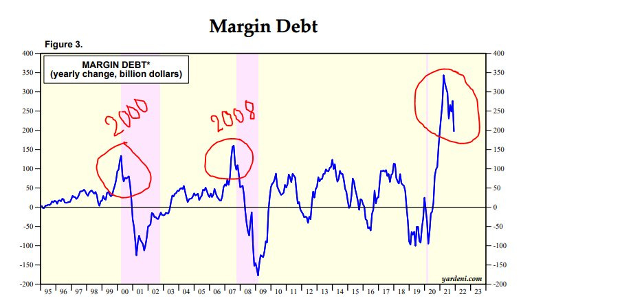
7. The Waves of Speculation: Some perspective on the ebb and flow of speculation. (however 2 things to add: 1. anecdotally a lot of people used margin debt to buy houses rather than more stock, and 2. the surge in options market activity means this chart kind of belies the true extent of leverage deployed)
Source: @MFHoz
8. Relative Value: US stocks that sit outside the S&P500 look historically cheap vs the index — basically anything that didn't ride the colossal wave of passive flows into US Large Caps now looks cheap by comparison...
Source: @SoberLook
9. Sensational Sales: The Price to Sales ratio as a valuation metric has its drawbacks (e.g. doesn't factor in the level of margins, earnings, etc), BUT still, fascinating to see this shift in the index. And arguably another sign of the stage of the bull market.
Source: @LizAnnSonders
10. Cross-Asset Valuations:
Stocks = expensive
Bonds = expensive
Property = expensive
Fed balance sheet at $9T = priceless
Source: @topdowncharts from: The 12 Charts to Watch in 2022
Thanks for following, I appreciate your interest!
oh… that’s right, almost forgot!
BONUS CHART >> got to include a goody for the goodies who subscribed.
Leveraged US Equity ETF Trading: it looks like we may be witnessing the early stages of a shift from greed to fear as one measure of speculation tapers from the peak.
This chart shows the ratio of trading activity in leveraged long US equity ETFs vs the same for leveraged short/inverse US equity ETFs. As you can see on the chart there are clear peaks and troughs in relative trading activity which generally correspond to short-term market peaks and troughs.
I’ve previously highlighted it as a contrarian sentiment indicator.
Looking specifically at trading action in short/inverse equity ETFs we can see something stirring after a period of slumber. To be fair, it has been a buyers market since the pandemic panic and ensuing policy response.
It might just be a reaction to the more volatile price action of the past few weeks - especially in tech (and those noted in charts 3&4 this week).
But there is a risk that it marks a shift in sentiment and behavior from FOMO to FONGO as the liquidity tides begin to go out…
—
Best regards,
Callum Thomas
SPONSOR: ( …he’s me!)
My research firm, Topdown Charts, has a new entry-level Substack service, which is designed to distill some of the key ideas and themes from the institutional fund manager service to provide the same high quality insights at a more accessible price.
Give it a try and let me know what you think


