
Weekly S&P500 ChartStorm - 16 February 2025
This week: investor sentiment slide, fun flows, valuation heights, passive vs active, idiosyncrasies, cap-weights, IP(n)O(!), bears mentioning...

Welcome to the latest Weekly S&P500 #ChartStorm!
Learnings and conclusions from this week’s charts:
Sentiment is shifting; from euphoria to doubt.
Valuations are at the upper end of a new higher range.
Passive/index funds dominate vs active funds.
The US overwhelmingly dominates in global equities.
The bar is high for US vs low for global equities (opportunity).
Overall, the evidence continues to show a shift in sentiment from previous extreme bullishness and frenzied flows to now increasing skepticism and concern as Trumphoria subsides and a new challenging reality sets in…
1. Waning Euphoria: The mood on the market sure seems to be turning. My “Euphoriameter” indicator below (which combines: forward PE ratio, smoothed surveyed sentiment, and equity risk pricing) peaked in November last year… basically I would call that peak-Trumphoria as markets anticipated a repeat of the upside we saw coming out of 2016. But reality is starting to set in as a rapid reform agenda, return to trade wars, and background setup of expensive valuations makes for a more volatile and maybe less immediately up-sloping experience vs back then.

Source: The Euphoriameter from Topdown Charts
2. Manic Markets: And if you want proof of that, the latest Investment Manager Index survey showed a sharp lurch to the risk-aversion side as investment managers reassess the political/fiscal backdrop and US/global macro outlook.
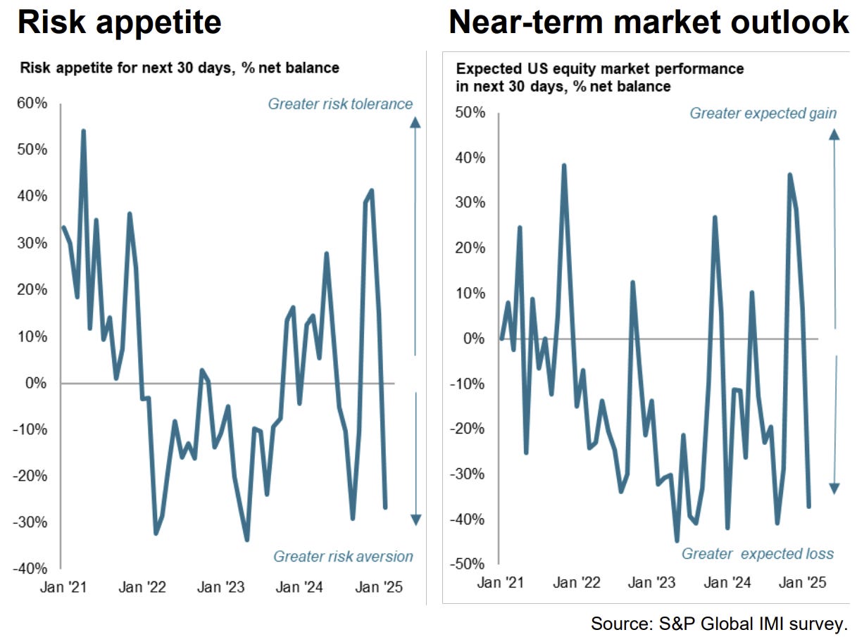
Source: S&P Global Investment Manager Index
3. Furious Flows: Two things come to mind on this chart. First is how the above change in heart comes following a frenzy of flows into US equities (same message as the first chart: things are turning as doubt begins to replace optimism).
But perhaps more interesting is how Developed Market flows are turning up — pay special attention to the 2014-16 period where DM ex US flows surged while US flows slumped. This could be a playbook for 2025/26 as the outlook brightens for Global equities (e.g. as I recently noted on Chinese equities, European equities).

Source: @ISABELNET_SA
4. New Higher Range: Indeed, the US faces a high hurdle of high valuations. Even if we acknowledge the reality of a new higher range in PE ratios for the US stockmarket, it’s still sitting at the upper end of that range.
