Weekly S&P500 ChartStorm - 15 May 2022
This week: leveraged speculation, retail profits, rebound redux, credit/financial conditions, distressed debt, bear market history, inflation citations, tooth fairy index...
Welcome to the Weekly S&P500 #ChartStorm — a selection of 10 charts which I hand pick from around the web and post on Twitter.
These charts focus on the S&P500 (US equities); and the various forces and factors that influence the outlook - with the aim of bringing insight and perspective.
Hope you enjoy!
NEW: Sign up to the (free) Chart Of The Week over at the new Topdown Charts Substack entry-level service: Subscribe to the Chart of the Week
Each week we send you one of the most interesting charts on our radar, along with commentary/context and a key takeaway — so you’re never left guessing on why the chart matters ...and the charts matter! > > > Subscribe Now
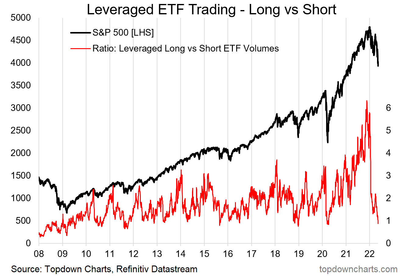
1. Bullish Speculation Evaporation: My leveraged ETF activity indicator has collapsed (the indicator shows the degree of activity in leveraged long vs short equity ETFs). Basically it amounts to a sort of bullish speculation evaporation, but also increasingly a surge in activity on the short side (more than 10x increase vs late last year). I would note that when the market gets a bit lopsided like this the odds of a short-term bounce are good, but strictly speaking with these types of indicators you want to see them stabilize or turn before taking a strong signal.
Source: @topdowncharts
2. Rebound Redux? According to S&P Dow Jones analysis: "going back to 1957: a decline of 15% or more for the S&P 500 has been followed by positive returns in the ensuing 12 months in all but two occasions over the past 65 years"
Feeling lucky? (a lot of if’s and but’s for this one with regards to the broader setup e.g. rising rates, QT, inflation, etc!)
Source: @lhamtil
3. Retail Back to Square One: The monetary gods giveth, and the monetary gods taketh… Estimated retail PnL neutralized.
Source: @WallSt_Dropout
4. Correlation or Causation: The stock market generally has a bad time when banks are tightening up on lending. Part of this *is* correlation, i.e. tighter monetary policy, worsening economic outlook, deteriorating credit quality …are among the things that trigger banks to tighten up… but are also things that make stocks go down. But there is also causation in that lower availability of credit accentuates downturns, damaging fundamentals and limiting debt-driven speculation.
Source: @topdowncharts
5. Correlation vs Causation pt2: Shifts in bank lending standards point to upside risk for credit spreads...
Source: Credit Spreads vs Lending Conditions
6. Financial Conditions: And another perspective — financial conditions are rapidly and drastically tightening (= bad 4 stocks).
n.b. this FCI does include equities (valuations) as one of its components, but it is clear/confirmed elsewhere that broader financial conditions have tightened a lot [higher bond yields, commodities, credit spreads, etc]. Also, as equities fall the cost of equity goes up and you also get negative wealth effects.
Source: @MichaelMOTTCM
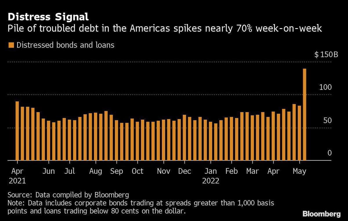
7. Dis Stress: Similar note, value of distressed bonds and loans spiking in May.
Source: @keyeventrisk
8. Perspective: Not a prediction as such, but certainly some perspective.
Source: @joefrancis505
9. Pique Inflation: Whether or not we are at “peak inflation“ we are definitely at “pique inflation” given the amount of people talking about it!
Source: @FactSet
10. The Tooth: Delta Dental’s "Tooth Fairy Index" reached a record high of $5.36 per tooth this year, up 4x since inception (1998).
Source: Tooth Fairy Index
Thanks for following, I appreciate your interest!
oh… that’s right, almost forgot!
BONUS CHART >> got to include a goody for the goodies who subscribed.
Margin Debt Accelerometer: Every now and then you see various charts showing the level of margin debt or margin debt as a percentage of market cap etc, but I find — like many data sets — you need to transform it to get the real insights.
This chart shows the rate of change in the level of margin debt outstanding, or as I like to call it margin debt acceleration. The thing to watch for is outsized growth, and subsequent declines…
Indeed, it seems the signal to be wary of is a big spike in margin debt growth followed by a drop into contraction. The most notable examples in this chart are the dot com bubble peak and the 2008 financial crisis.
But there are some false signals (i.e. 2012, 2015/16, 2018). Having said that, you could argue that the 2015/16 period was a stealth bear market (and an actual bear in EM), while both 2012 + 2018 saw an extended period of volatility… or at least a transition from smooth straight up bull market to more chopping and ranging.
Given what we know about the rest of the situation (expensive starting point valuations, tightening monetary policy, runaway inflation, rising bond yields, geopolitics, etc), I think we could argue that this is not a signal to ignore.
If anything it confirms the bleakening backdrop.
—
Best regards,
Callum Thomas
My research firm, Topdown Charts, has a new entry-level Substack service, which is designed to distill some of the ideas/themes/charts from the institutional research service to provide the same high quality insights at a more accessible price.
Give it a try and let me know what you think! :-)


