
Weekly S&P500 ChartStorm - 15 January 2023
This week: technicals, sentiment, flows, market cycles, stockmarket stats, (smaller)Big tech, global vs US equities, and a new bull market signal for global equities...

Welcome to the Weekly S&P500 #ChartStorm — a selection of 10 charts which I hand pick from around the web and (used to) post on Twitter.
These charts focus on the S&P500 (US equities); and the various forces and factors that influence the outlook, with the aim of bringing insight and perspective…
NOTE: The Weekly ChartStorm is going paid (read announcement here) — subscribe so you can receive the charts ongoing…
1. Make or Break Time: Yes that’s right it’s everyone’s favorite downward sloping trendline chart updated again to the latest price developments. At this point it is literally right on the cusp of a potential breakout (…or fakeout! -- not a done deal, and not meaningful until a clean+clear break is established).
(also n.b. the symmetrical triangle at the end there — the textbook says symmetrical triangles are continuation patterns, so in this case it would be continuation of the largely bearish price action that preceded it)

Source: Topdown Charts @TopdownCharts
2. Earnings as a Catalyst? With earnings season set to kick into full-swing in the next few weeks (concentrated around the last week of Jan + first week of Feb), it's interesting to note how deeply pessimistic earnings sentiment has become.
Bull take: easy to surprise against (even if mediocre).
Bear take: if confirmed = bad news, recession, bear down.

Source: @zerohedge
3. Retail Sentiment: On a similar note, retail have already come to terms with the bear market... The TD Ameritrade Investor Movement Index is plumbing the lows of 2020 (sentiment indicator based on retail trader account activity).

Source: @ukarlewitz
4. Retail Round Trip: Seems like retail have dumped everything they bought during the heady pandemic stimulus bull/bubble(s). It goes to show, that without a decent process or overarching strategy it often ends up a situation of "buy high, sell low". A timely reminder to take a step back and think about what you’re actually trying to do and how you’re going to go about it (set up well thought-out rules and policies in advance vs just chasing the latest fad and running with the crowd).
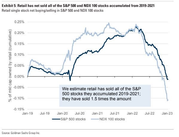
Source: @MikeZaccardi via @MichaelAArouet
5. Sentiment Cycles: This chart shows the combined Bulls vs Bears readings from the Investors Intelligence and AAII surveys, with 12-month smoothing — it let's you see the longer-term cycles in sentiment at play.
If you looked at this chart and nothing else, you'd probably have to say we are getting "close" (at least based on how the market moved following similar conditions in the past e.g. 1991, 1995, 2009).

Source: Topdown Charts @TopdownCharts
6. Speaking of Cycles: The stylized textbook market cycle says bonds rally first, then stocks, then commodities (and so-on). So far markets have been following that script near perfectly in this chart — so you know what that means right? (textbook would say: bonds down (tick), then stocks down (in progress), then commodities down (also in progress)… and then back to the start!)

Source: @WillieDelwiche
7. Double Down? “Last year was down so this year will be up, right?”
Not so fast, there are multiple examples of stocks falling 2 or more years in a row... Not a forecast as such, but a reminder that while yes stocks go up most of the time and over the long-term (historically) — they don’t go up in a straight line!

Source: @IanRHarnett
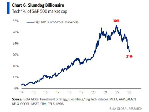
8. Big Tech Bubble: Big Tech is smaller now.
(but still big)
Source: @DisruptorStocks
9. US vs Global Equities: Global equities are gaining the upper hand vs US equities — is this *the* turning point for US vs global? (…after about a decade-long run of US beating the rest of the world, by almost 3x!)

Source: @DLineCap
10. Deep (relative) Value: Important context to add to the previous chart — Rest Of World is trading at the deepest discount vs the US since around the heights of the dot com bubble.
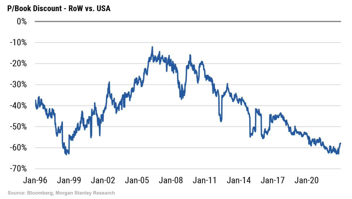
Source: @Schuldensuehner
REMINDER: The Weekly ChartStorm is going paid (read announcement here) — subscribe so you can receive the charts ongoing…
BONUS CHART >> got to include a goody for the goodies who subscribed.
New Bulls: An intriguing pattern is showing up in my global equity breadth charts. The chart below shows the proportion of countries whose main benchmark is up at least 20% off the low point… or aka what some people call a “bull market“.
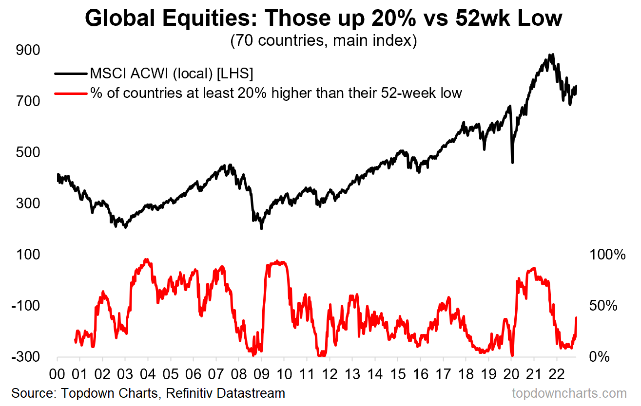
By itself it is an interesting observation, and it’s quite a mix of countries too (from LatAm, Europe, Middle East, Asia). But what is especially intriguing is how this type of pattern in the indicator has historically flagged the beginning of new bull markets in global equities.
For example in 2009 the indicator turned sharply higher off washed-out levels — signaling a turn in prospects for the market, and same again in 2020. It also worked perhaps slightly less obviously in 2011 and 2016.
The problem is it also worked in 2003… but that came after a false/early signal in 2001. And the problem is there are several parallels between today’s macro backdrop and that which prevailed back then.
Hence in the end all I could do was make a meme out of this.
—
Best regards,
Callum Thomas
My research firm, Topdown Charts, has a NEW entry-level service, which is designed to distill some of the ideas/themes/charts from the institutional research service to provide the same high quality insights at a more accessible price.
Give it a try and let me know what you think! :-)
For more details on the service check out this recent post which highlights: What you get with the service; Performance of the service; and perhaps most importantly: What our clients say about it…
Remember that flow into global equities is primarily driven by investors seeking to capture currency return as the dollar weakens. Global investors have made a ton of money in recent years capturing the translation gains of a strong dollar. I ran a global fund in the 80’s and 90’s and currency was a huge factor in cash flows in to the fund. Most American investors are quite clueless about the impact of currency on earnings and most companies do not disclose much about their hedging strategies.
Like the earnings chart a lot. Exhibit 3. Why are my eyes attracted to the VERTICAL GREY lines showing further significant earnings deterioration DURING recession whereas ‘23 we’ve yet to see any VERTICAL GREY line😳😂…even a mild one into ‘24 takes S&P EPS < $180 not what analysts pencil in w/ co. approval @ $230🤷🏻