
Weekly S&P500 ChartStorm - 15 December 2024
This week: euphoria, flows, expectations gaps, foreign flows, rate cut trading, bull markets, deleveraging, NVDA, Moore's law, long-term equity risk premium...

Welcome to the latest Weekly S&P500 #ChartStorm!
Learnings and conclusions from this week’s charts:
Seeing further signs of bullish euphoria.
Stocks are trading to the non-recession-rate-cut script.
The current type of bull market is statistically close to maturity.
Household debt-to-asset ratios have massively deleveraged.
The realized equity risk premium looks stretched (late-cycle).
Overall, it’s more of the same frothy sentiment, euphoria, and bullish expectations on the stockmarket outlook. The trouble is the crowd is often wrong at extremes —but the crowd also represents a self-reinforcing consensus that flows until it goes. Caution is the easy keyword; caution both in terms of rethinking asset allocation and managing risk, but also caution in not getting too bearish too early without technical and/or macro confirmation. So again, keep watching the charts…
NEW: follow The GoldNuggets Digest for updates on gold/macro over at the Monthly Gold Market Chartbook
1. Peak Euphoria: Starting off with everyone’s favorite weird indicator —but a key difference this time… after a string of back-to-back new all-time highs in this indicator, the flash December reading has come in ever so slightly lower than the November reading. One thing to note with indicators like this is that they send the most powerful signals when they reach an extreme and then turnaround — was November a climax in stockmarket euphoria?

Source: “What is the Euphoriameter?”
2. Fun Flows: Trumphoria saw record inflows into US equity ETFs during November. The crowd is voting with its feet in terms of the market outlook.
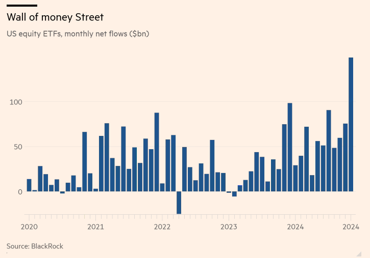
Source: @Barchart
3. Expectations Gap: As I’ve previously documented, consumer expectations for the stockmarket are running at record highs. However, interestingly this stands at odds with consumer expectations for their own incomes. Makes you wonder how this expectations gap is going to close (are stockmarket expectations too frothy, or is the real economy about to surge?).
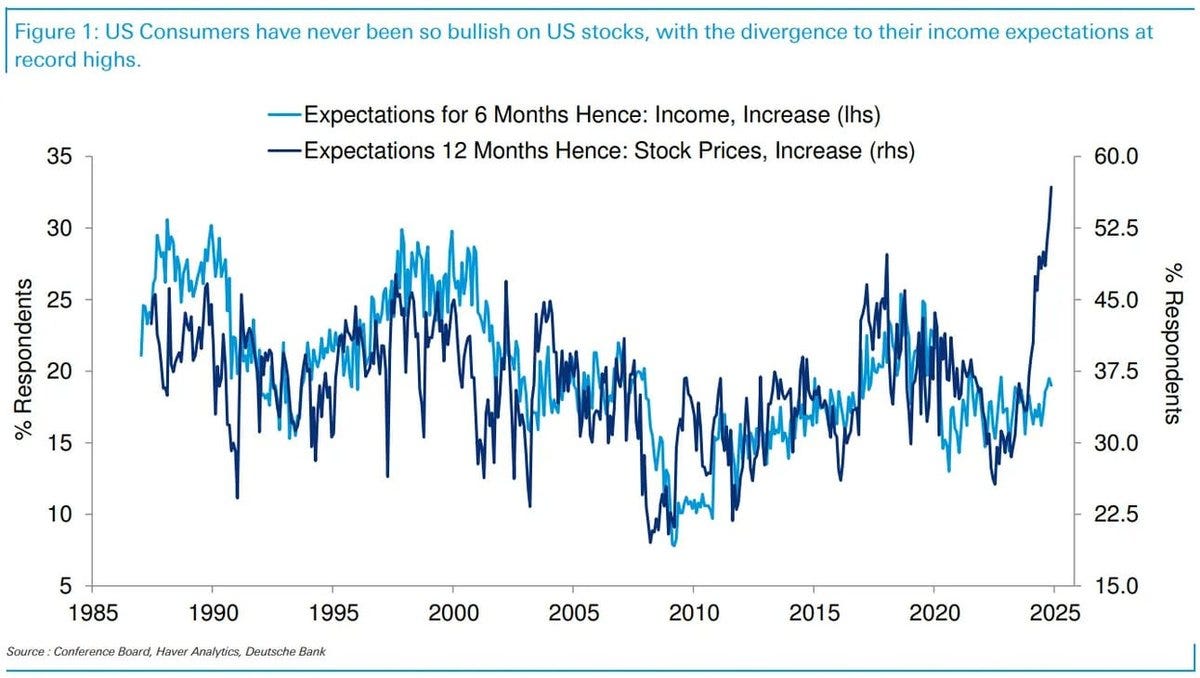
Source: @dailychartbook
4. Foreign Fervor: Foreigners are rotating more and more into US equities. Another record high on this indicator in Q3. Compare and contrast the heights of the dot com bubble vs the depths of the financial crisis in terms of what this chart means.
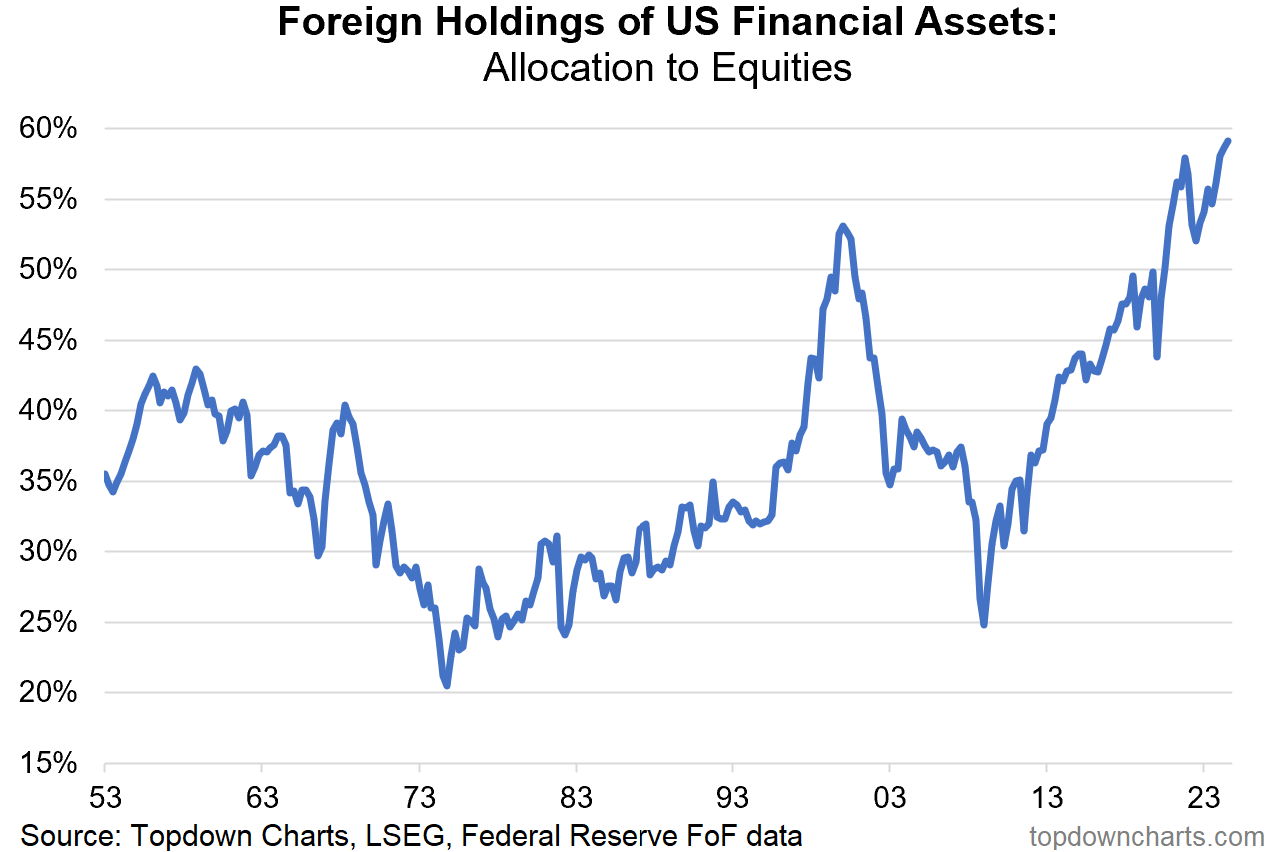
Source: Topdown Charts + Topdown Charts Professional
5. Rate Cut Trading: This chart shows the average path of markets before and after the first Fed rate cut when a recession happened (red line) and when one did not happen directly after the Fed began rate cuts (green line). For now the current path of markets is consistent with the “no recession” line. In other words, the market is trading as if this is a non-recessionary rate cut. And if true, that’s bullish, it would mean more upside to come.
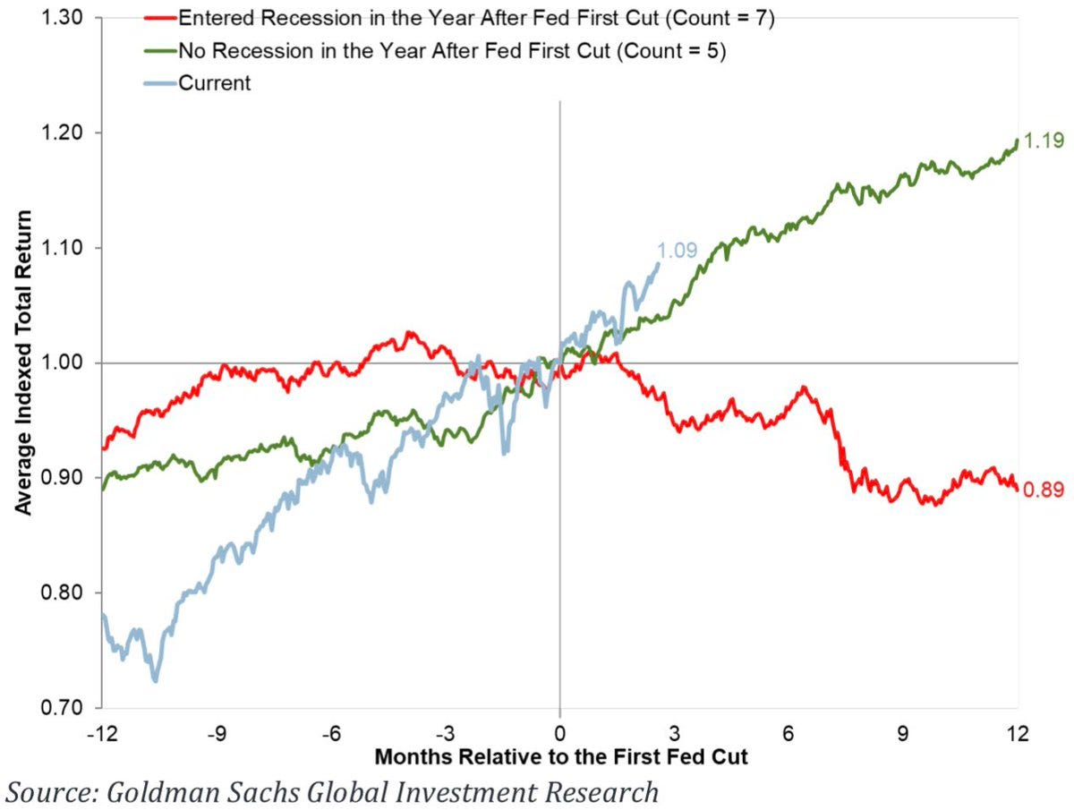
Source: @Marlin_Capital
6. Recession Watch: While there are no glaring obvious signs of recession right now, there are some indicators alerting us to stay on guard, for example the chart below which shows the relative performance of Walmart vs global luxury stocks. The idea is that staples like Walmart hold up during recession, while luxury stocks suffer from cutbacks in consumer spending. I would point out though some of the weakness in global luxury stocks may be more of a reflection of the economic slowdown in China (and Europe, not to mention Russia); also it may be another echo of US stocks’ smashing run against global stocks (wrote about this last week). So maybe not presenting the traditional true signal, but still something to note…
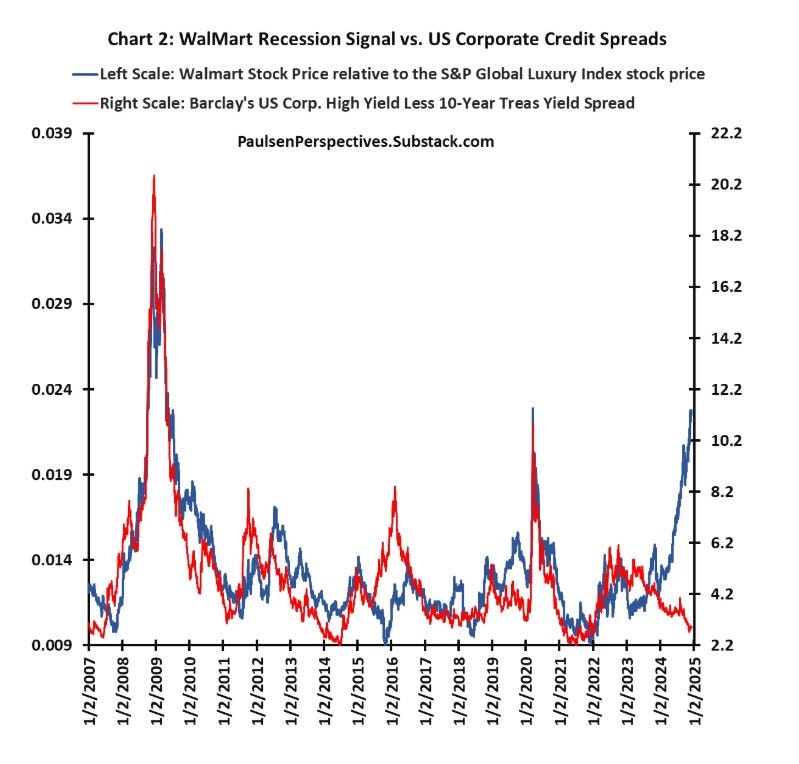
Source: Jim Paulsen via @albertedwards99
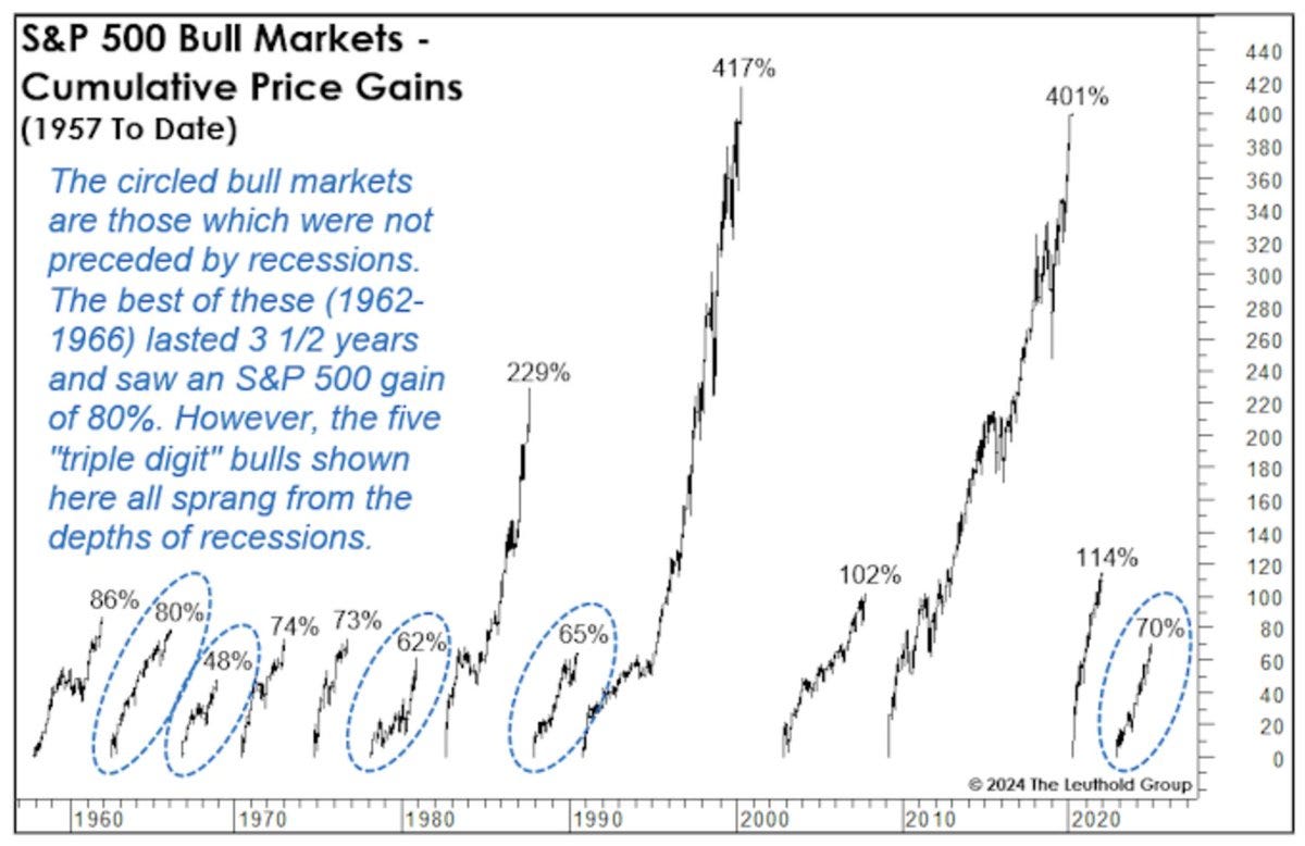
7. Non-rec Bulls: This chart shows the history of bull markets coming out of recession (most often large, triple digit gains) vs those not preceded by recession circled in blue (still significant but shorter, smaller by comparison). One implication is that the current one looks about fully-cooked.
Source: @SethCL
8. The Great Deleveraging: Thanks to scars of the financial crisis spurring folk to be more prudent with debt (and the regulatory response clamping down on past lending practices), and of course — more-to-the-point: the dream run in stocks and property on the asset side, US household leverage (as measured by debt as a % of assets) has dropped to multi-decade lows. It’s basically been cut in half since the credit bubble of the 2000’s. Positive development I would say. Doesn’t incorporate incomes or types of debt, and is dependent on value of stocks and real estate staying high to stay good, but still very interesting.

Source: The Real Economy Blog
9. No NVDA, No Numero-uno: Turns out if you exclude NVDA return contributions (which have been significant — NVDA was a 10-bagger over that time, and eventually grew to more than 6% of the index market cap), the S&P500 ex-NVDA was pretty much on par with European equities coming out of the 2022 low.
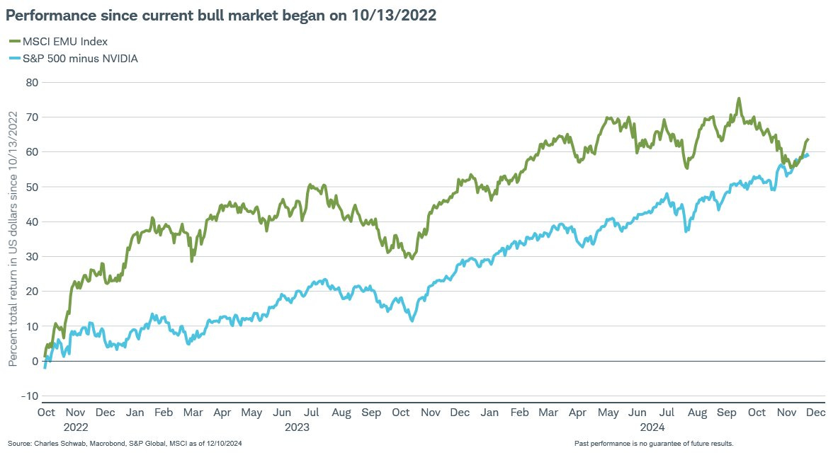
Source: @JeffreyKleintop
10. Most Important Chart Ever? Speaking of NVDA, here’s a candidate for most-important-chart-ever — the ongoing upward exponential march Moore’s Law of computing power… particularly interesting given we are just at the dawn of the quantum computing age (e.g. Google announced a breakthrough last week with its Willow chip). Don’t bet against Moore’s Law it seems, particularly as AI, robotics, AR/VR, health, space, and geopolitics, etc likely add further demand, impetus and urgency to progress.
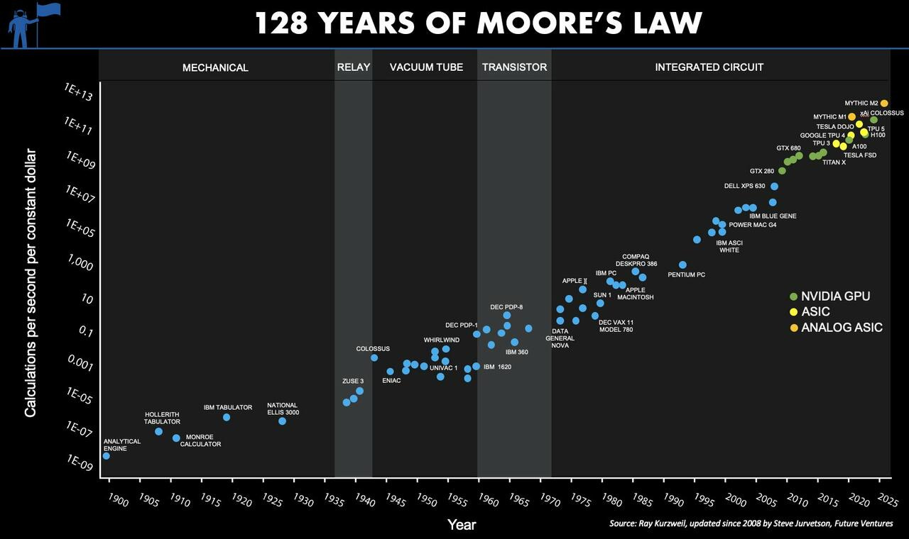
Source: VC Head Reveals "Most Important Graph Ever Conceived"
Thanks for reading, I appreciate your support! Please feel welcome to share this with friends and colleagues — referrals are most welcome :-)
BONUS CHART >> got to include a goody for the goodies who subscribed.
Stocks vs Bonds for the Long-Run: The other day I wrote a piece outlining how the prospective or forward-looking Equity Risk Premium had gone deep into negative territory. But today I wanted to share a chart showing the historical path of the realized equity risk premium (spread of equity vs bond returns).
A couple of things stand out…
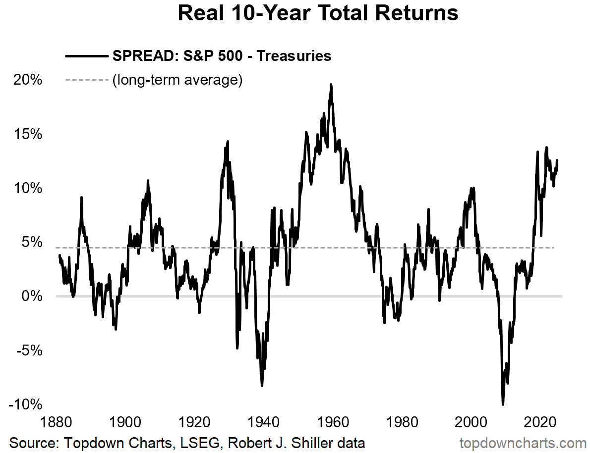
First, over the long-run the realized equity risk premium (return on equities over and above that of ‘risk-free’ treasuries) has averaged around 5%. Second, there has been considerable variation over time, including significant negative numbers e.g. -10% over the 10-year period to March 2009. And perhaps most of all; there seems to be a cycle here (and mean reversion from extremes).
On that note, going back to my comments on the forward-looking prospective equity risk premium being negative, it’s interesting to note how the latest numbers in the chart above look kind of stretched, and late in the cycle. Again, another prompt to have a re-think about asset allocation and risk management for the coming years.
—
Best regards,
Callum Thomas
Follow me on Twitter or Bluesky
Connect on LinkedIn
Hi Callum, excellent summary of charts. I do like especially No. 9 and re-constructed it with TradingView: taking SP500 - deducting Mag-7, chart starting Oct22 (note ChatGPT became popular Nov22, SP500 bottom in Oct22). Result: SP500 +66%, SP500EW +40% and SP500 - Mag7 +19%. and since 17Oct this one has been declined by -11%. "Market breath" is strongly declining. Technical analysis: "SP500-Mag7" is now below SMA200 and at the level of some recent ATHs like Apr22 and End22 (Support??). Currently weekly MACD still negativ. For „Mag7“ I took: NVDA, GOOG, GOOGL, MSFT, META, TSLA, AAPL, NFLX (accidentally forgotten AMZN, but took NFLX)