Weekly S&P500 ChartStorm - 15 August 2021
Your weekly selection of charts...
Welcome to the Weekly S&P500 #ChartStorm (by email!)
The Chart Storm is a weekly selection of 10 charts which I hand pick from around the web (+some of my own charts), and then post on Twitter.
The charts focus on the S&P500 (US equities); and the various forces and factors that influence the outlook - with the aim of bringing insight and perspective.
Hope you enjoy!
1. Dow Transports Index: One recent sign of weakness in the markets has been the steady drift downwards in the Dow Jones Transportation index - the logic goes that this index (being focused on logistics) provides a sense for how real economic activity is tracking. So it is an interesting promising sign that it’s starting to tick upwards - similar to what I talked about last week with the Equal Weighted S&P500.
Source: @Callum_Thomas
2. TD Ameritrade Investor Movement Index: A few weeks ago I highlighted how this interesting indicator (tracks retail investor confidence) had cracked a record high in June. Interestingly though, the July update showed the indicator ticking *down* — this is exactly what you *don’t* want to see if you are bullish! Sentiment indicators provide the best signal when they reach an extreme and then turn.
Source: TD Ameritrade Investor Movement Index
3. Bearish Sentiment: In this chart I’ve combined the bearish responses for both the AAII and Investors Intelligence surveys - the key point is, after reaching the bottom end of the range, bearish sentiment is bouncing. Just a blip? (or a harbinger of the return of the bears?)
Source: @topdowncharts
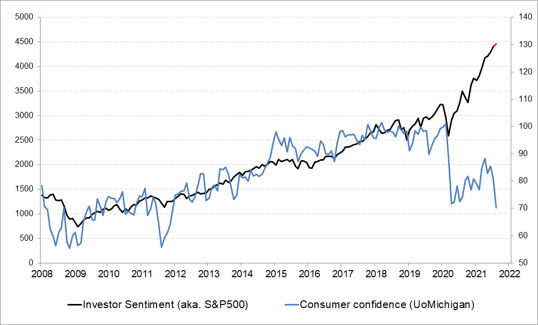
4. Investor Confidence vs Consumer Confidence: First things first, it has to be acknowledged that we are comparing oranges and bananas in that one of these series (consumer confidence) is stationary - i.e. rangebound, and the other is non-stationary - i.e. trending. So at some point they will naturally diverge anyway. But still, it is interesting to see stocks zigging while consumer confidence is zagging.
Source: @takis2910
5. Global Equities vs Global Consumer Sentiment: Similar thing at a global level, albeit the chart looks a little less dramatic. I would highlight that the blip down in consumer sentiment that we saw in August probably reflects the rise of the delta variant of covid - so there could be some information in this if/when delta becomes a market relevant issue.
Source: @topdowncharts
6. S&P500 “Real Earnings Yield“: To be honest I’m not sure about this one - there are no details on what it is, but as a guess it’s probably trailing earnings yield minus CPI YoY. The problem with that is on both counts the numbers are a bit distorted by the pandemic (e.g. base effects have blown out the CPI annual rate of change). Interesting, but we need to try a couple of different takes…
Source: @LizAnnSonders
7. Real Earnings Yield - version 2.0: I had a go at making my own version of it - this one looks at the forward (consensus estimates EPS) earnings yield vs 10-year TIPS breakevens (market inflation expectations). It’s not as dramatic as the previous chart, but it is still quite extreme.
Source: @topdowncharts
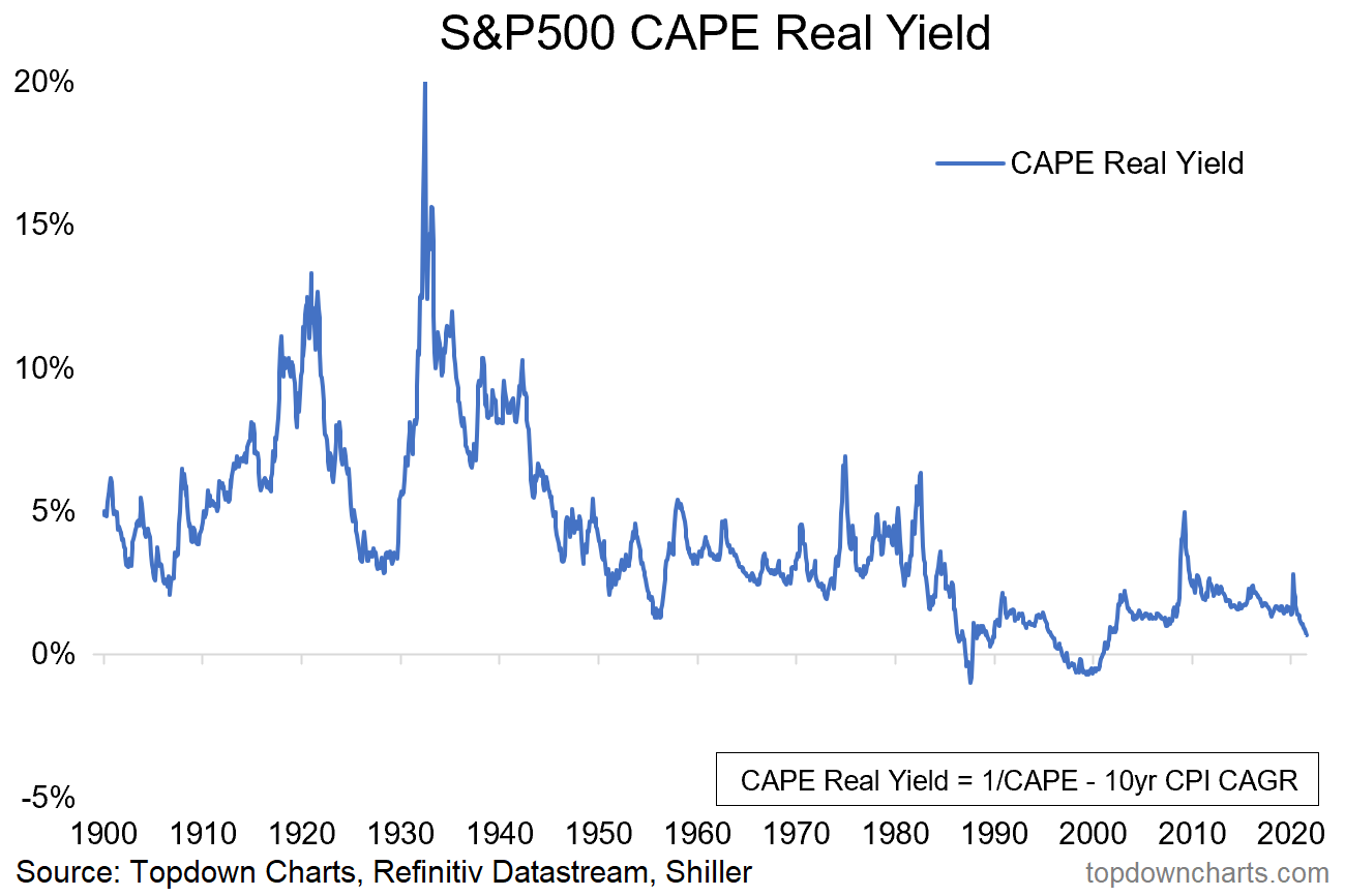
8. CAPE Real Earnings Yield: Not to get too hung up on this whole real earnings yield thing (which I think is the wrong thing to look at anyway - we should adjust it to real risk free yields to get a sense for the equity risk premium… but that’s a topic for another time), but this one smooths earnings and CPI in order to avoid common avoidable and inevitable distortions. Again it’s not quite as dramatic, but it certainly is in rarified territory.
Source: @topdowncharts
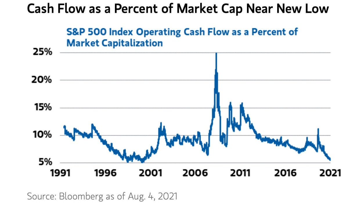
9. S&P500 Cash Flow Yield: Yet another S&P yield chart - this one looks at the ratio of operating cash flow to market cap. Again these are all measuring kind of similar things, and to a greater or lesser extend all showing things are looking fairly extreme.
Source: @RadicalAdem
10. China vs US - Equities Showdown: Where-to next for this capitalism vs communism showdown? Quite an interesting chart really - to me what stands out is not so much that they are basically on an even-footing since 1992, but the wild gyrations (I smell opportunity). Makes me wonder if/when there will be another gyration on this otherwise long flat road.
Source: @mark_ungewitter
Thanks for following, I appreciate your interest!
oh… that’s right, almost forgot!
BONUS CHART >> got to include a goody for the goodies who subscribed.
EM vs DM Equities: I thought this would be a good follow-up to the last chart - this time looking at all of Emerging Markets vs all of Developed Markets.
For the pattern-recognizers, there appears to be a tendency for the relative performance line here to undergo circa-decade-long cycles. Like many, I got a bit excited when I saw what appeared to be a repeat of history getting underway in recent years (denoted by the yellow arrows).
But rather than a turning point, the relative performance line went on to make new lows - so if we’re trying to pick a turning point, the trend is not our friend just yet!
Rule one of picking turning points: wait for it to stop falling first.
One to keep watching.
—
Best regards,
Callum Thomas
>>> SPONSOR:
( …he’s me) My research firm, Topdown Charts, has a new entry-level Substack service, which is designed to distill some of the key ideas and themes from the institutional service to provide the same high quality insights at a more accessible price.
Give it a try and let me know what you think :-)


