Weekly S&P500 ChartStorm - 14 November 2021
This week: investor sentiment, consumer sentiment, real earnings yield, valuations, portfolio allocations, market stats, and the biggening of the biggest stocks
Welcome to the Weekly S&P500 #ChartStorm (by email!)
The Chart Storm is a weekly selection of 10 charts which I hand pick from around the web (+some of my own charts), and then post on Twitter.
The charts focus on the S&P500 (US equities); and the various forces and factors that influence the outlook - with the aim of bringing insight and perspective.
Hope you enjoy!
p.s. if you haven’t already, subscribe (free) to receive the ChartStorm direct to your inbox, so you don’t miss out on any charts (you never know which one could change the whole perspective!)
1. Vacciversary: Can you believe, an entire year has passed since the Pfizer vaccine announcement. Markets had a strong immediate reaction, and since then have chalked up some 34% in gains. Of course a bunch of other factors are also at play, and we also had delta along the way, but you have to think at some level if there were no vaccine that the ride in markets might have been a little rougher.
Source: @LarryAdamRJ
2. Investor Movement Index: The IMX moved down slightly in October - this continues the pattern of movement downwards from the peak in optimism of a few months ago. This is typically not a healthy sign for sentiment indicators i.e. reaching an extreme and then leveling off.
Source: TD Ameritrade
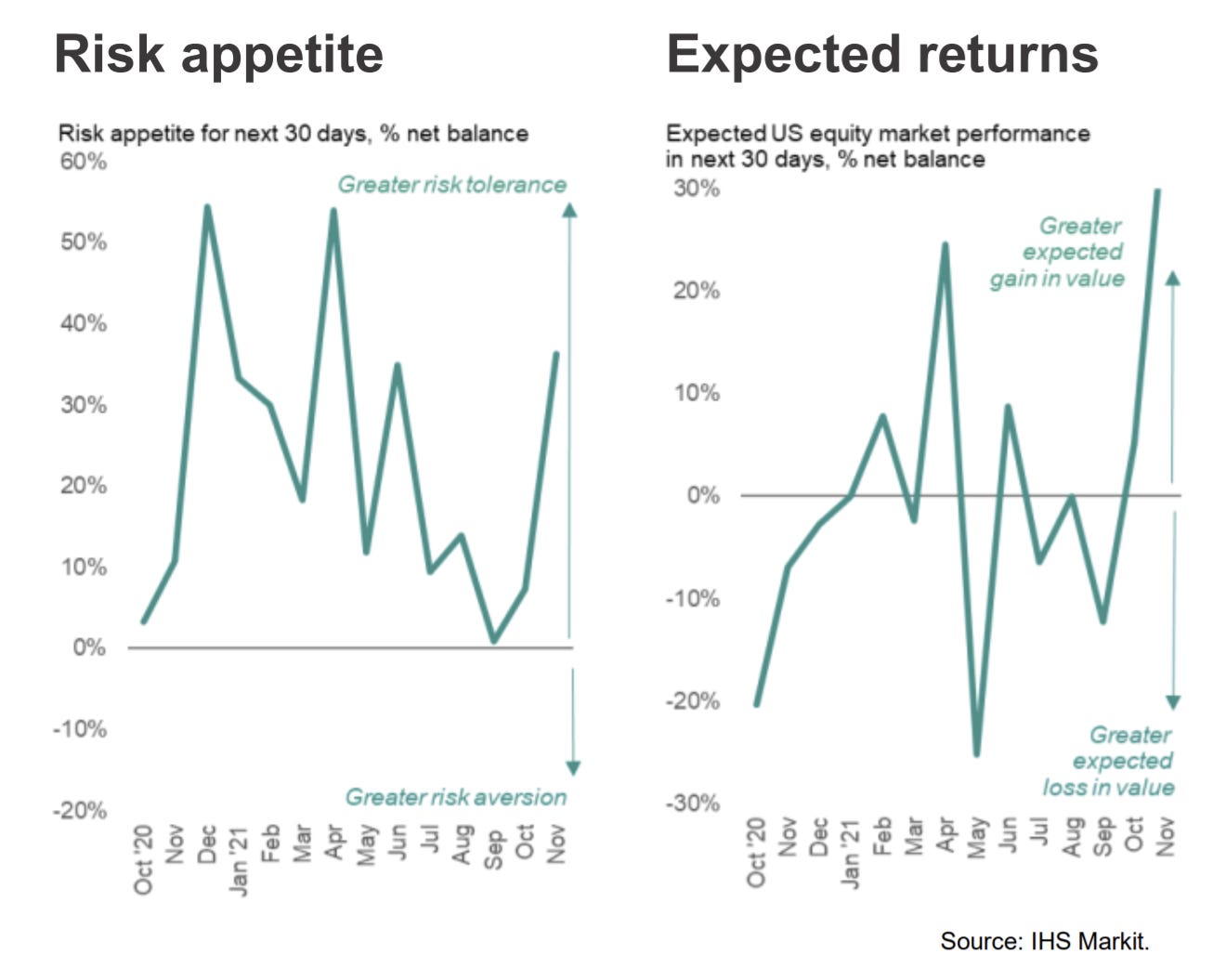
3. Investment Manager Index: On the other hand, the Markit IMI rebounded further in November with risk appetite surging to multi-month highs and expected returns reaching a new (albeit short history - newish survey) high.
Source: @IHSMarkitPMI
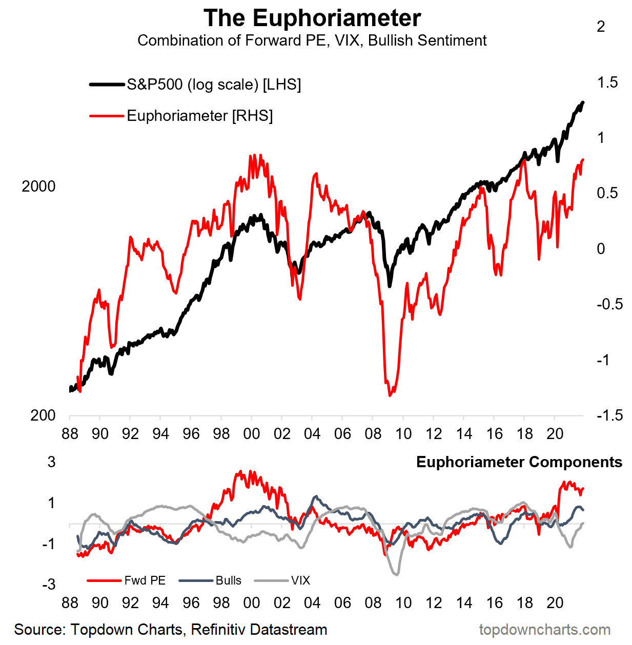
4. Euphoriameter: Even my own Euphoriameter composite sentiment indicator has ticked higher so far in November as valuations and bullish surveyed sentiment remain high and volatility lulls back towards complacency.
Source: @topdowncharts
5. Investor Sentiment vs Consumer Sentiment: But not all sentiment indicators are at the highs: consumer sentiment has been decidedly less optimistic. I mentioned in a recent video that the UoM consumer sentiment indicator was perhaps overstating the extent of the decline, but the other 2 consumer confidence indicators I track for the USA have also started to drop off recently. This has left quite the divergence between consumer sentiment and investor sentiment.
A large part of this is probably down to the inflationary shock that is currently facing the global economy due to pandemic disruption to the global supply chain *and* unprecedented monetary + fiscal stimulus (remember: supply shortages/backlogs and the associated inflation surge don’t exist if there is no demand —> demand has been boosted by stimulus —> and stimulus helps stocks ——> gap explained).
Source: @takis2910
6. Real Earnings Yield: Another effect of the surge in inflation has been a plunge in the real earnings yield: again this can be squared up by noting that stimulus has been a key driver of the inflation shock and a key driver of the surge in asset prices —> surging asset prices (stock prices) leads to a lower nominal earnings yield (again: gap explained). So is this a problem? Perhaps, but one way or the other it will probably be transitory (if you can read between the lines a little there!!).
Source: @LizAnnSonders
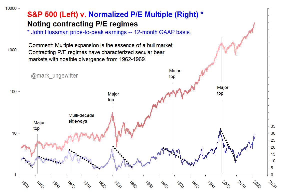
7. Valuations: Valuations rising = risks rising... but then again it's a bull market, so POLR is higher (for now).
n.b. “POLR” = path of least resistance: basic notion that in markets and life when a force is set in motion an object will not change its motion/trajectory unless another force acts on it... That means a bull market will carry on until something changes e.g. a crisis, monetary policy tightening, recession, regulations/politics, (or a combination of all of those!).
Source: @mark_ungewitter
8. Household Financial Asset Allocations: We all know by now that equity allocations by households is at/near record highs. But one surprise: cash holdings have jumped and are apparently on par with debt (bonds etc) ...even as cash rates suck (and are even suckier when you consider the real interest rate). Probably an element of booking gains, stimulus payments, and precautionary savings. Recall though: the job of cash is preservation of capital (and optionality) vs generating returns, as such.
Source: @MikeZaccardi
9. S&P500 Constituents Return Distribution: I thought this was interesting - especially the tails of the distribution - a lot of heavy lifting being done at the tails. But also that ”s” — tails (i.e. big dispersion between left and right tails).
Source: @spglobal via @bernardiniv68
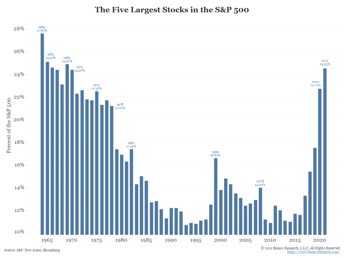
10. The Five Biggest Stocks: The bigness of the biggest stocks in the index is biggening more bigly. Serious though: the market is increasingly lop-sided, this means diversification may be diminishing as systematic risk will be increasingly driven by specific risk.
Source: @biancoresearch
Thanks for following, I appreciate your interest!
oh… that’s right, almost forgot!
BONUS CHART >> got to include a goody for the goodies who subscribed.
Trading of Leveraged Equity ETFs: speculation is heating up even further.
This chart shows the ratio of trading volumes of leveraged long vs leveraged short US equity ETFs. It’s basically a sentiment indicator where spikes indicate excessive risk taking on the long side, and plunges indicate a pivot to the bearish side.
Like most sentiment indicators we can interpret it as having contrarian information at extremes: e.g. in March 2020 the indicator plunged as traders lurched to the bearish side, whereas we can count numerous instances where a short-term market peak was foreshadowed by a spike in the indicator.
Problem with that last note is that lately it just keeps going higher. Maybe we’ve just entered into a whole new even more frenzied phase of the bull market.
A related chart also lays it out: leveraged long equity ETF assets under management have shot up 6x since the lows in 2020.
Again it represents a break:: a step-change in speculation.
And all this comes as the Fed begins the process of pulling back on stimulus in the path towards tightening.
Back on that POLR concept, maybe we can add something like: if an object is moving VERY fast then it may only take a slight flick to significantly shift it’s path!
Certainly stuff to ponder as we progress later in the cycle.
—
Best regards,
Callum Thomas
SPONSOR: ( …he’s me!)
My research firm, Topdown Charts, has a new entry-level Substack service, which is designed to distill some of the key ideas and themes from the institutional investor service to provide the same high quality insights at a more accessible price.
Give it a try and let me know what you think


