
Weekly S&P500 ChartStorm - 13 July 2025
This week: late-cycle resets, speculative mood, sentiment and positioning, buy the dip, small caps, Fed rate cuts vs stocks, Space X, IPO market trends...

Welcome to the latest Weekly S&P500 #ChartStorm!
Learnings and conclusions from this week’s charts:
We appear to be going through a “late-cycle reset”.
Institutional sentiment is healing, risk appetite resurgent.
Private investors are running very high equity allocations.
A return to rate cuts might *not* be a good thing.
The IPO market is booming again.
Overall, there seems to be mounting evidence for the “late-cycle reset” hypothesis —where much like the late-90’s you see a frothy market with pressures building up getting an extension via a healthy correction (one which shakes out sentiment, but does little fundamental or enduring damage, and hence allows the cycle to continue on a little further; melting up into a potential later larger blow-off top).
n.b. check out the “Getting Started” section for tips on how to make the most of your subscription to the Weekly ChartStorm.
1. The Late-Cycle Reset Hypothesis: This is something I’ve examined in the last few editions of the Weekly ChartStorm, and here’s another angle on it — using the 1998 late-cycle reset as a direct analog. I think there is some merit in this comparison (remember, for analog charts there ideally needs to be some rhyme/reason for using the analog, otherwise it’s just fun with chart scales), because there is the similar type of high valuations, frothy sentiment, and big scary reset going on now as then.
If we take this one literally we probably do go higher, and probably in a more ranging volatile fashion from here, and probably with some surprises yet to be known.

Source: @NautilusCap
2. New Highs, Renewed Sentiment: This one also captures an element of the late-cycle reset theme because these two relatively high-speculation markets have broken out to new highs following the tariff tantrum shakeout. This tells us that speculative risk appetite is alive and well, no major damage was done during the corrections, and fear of downside is likely set to give way to FOMO with the advent of new highs and eventual chasing.
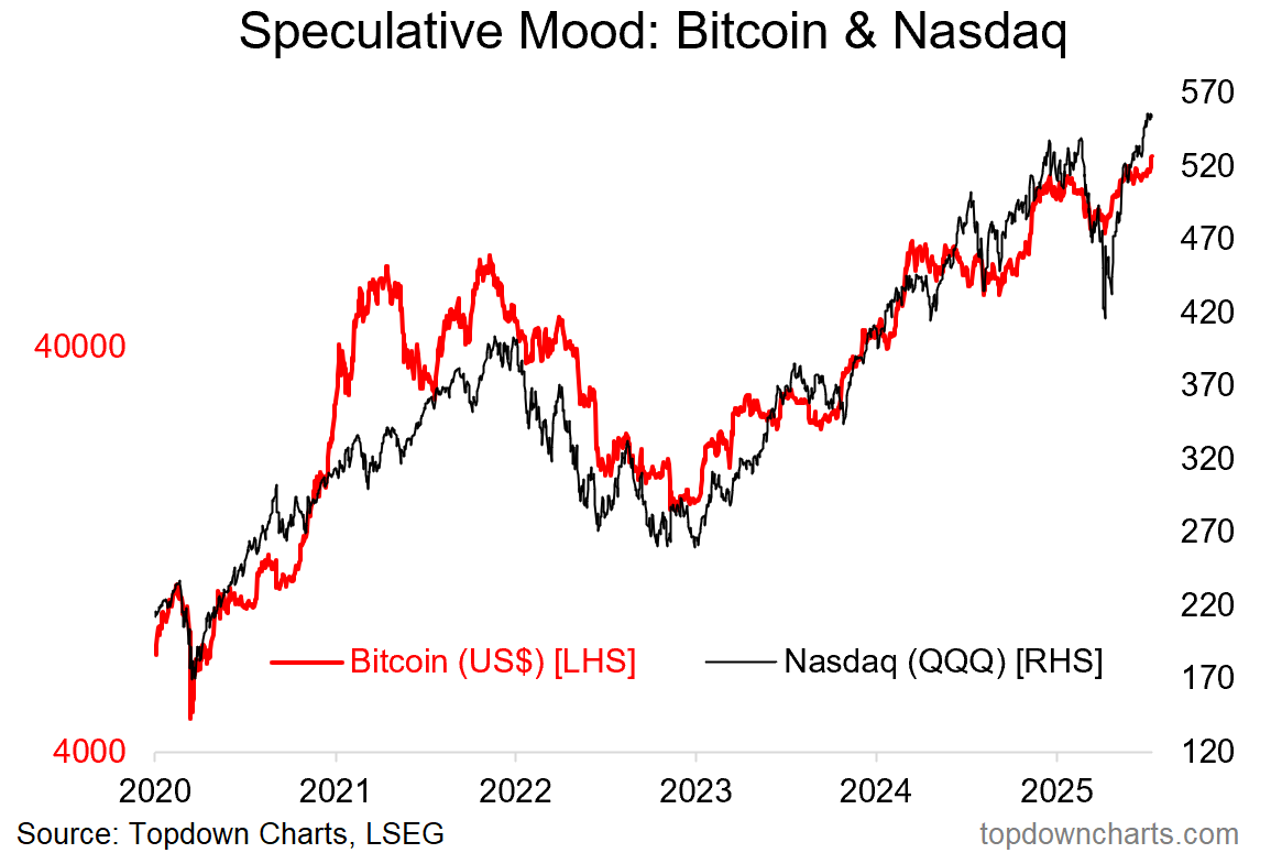
Source: Topdown Charts
3. Sentiment Reset: This dynamic is also illustrated in the investment manager surveys — after a big crash in risk appetite, folk are getting back in the pool given the absence of new bad news and a set of less bad than expected news (+desensitization) eroding the wall of worry.

Source: Investment Manager Index
4. Late-Cycle Partial-Reset: And another one for the late-cycle reset, we can see my Euphoriameter taking a material move lower (from record highs, might I add) — but refusing to rollover into a down cycle as I thought could happen. But all of this is to say that it looks like the events of H1 were a late-cycle reset, and while there are still pressures and risks building up in the system, it looks like we still squeeze a few drops of juice out of this orange yet.

Source: Topdown Charts Professional
5. Allocation Heights: Another sign of being well-progressed in the market cycle is how BofA private clients are still running very high allocations to stocks (and a very low 10.7% to cash; the lowest since 2021). This maps to multiple other datapoints revealing similar e.g. the Fed flow of funds dataset showing record high allocations to stocks by US households in aggregate.
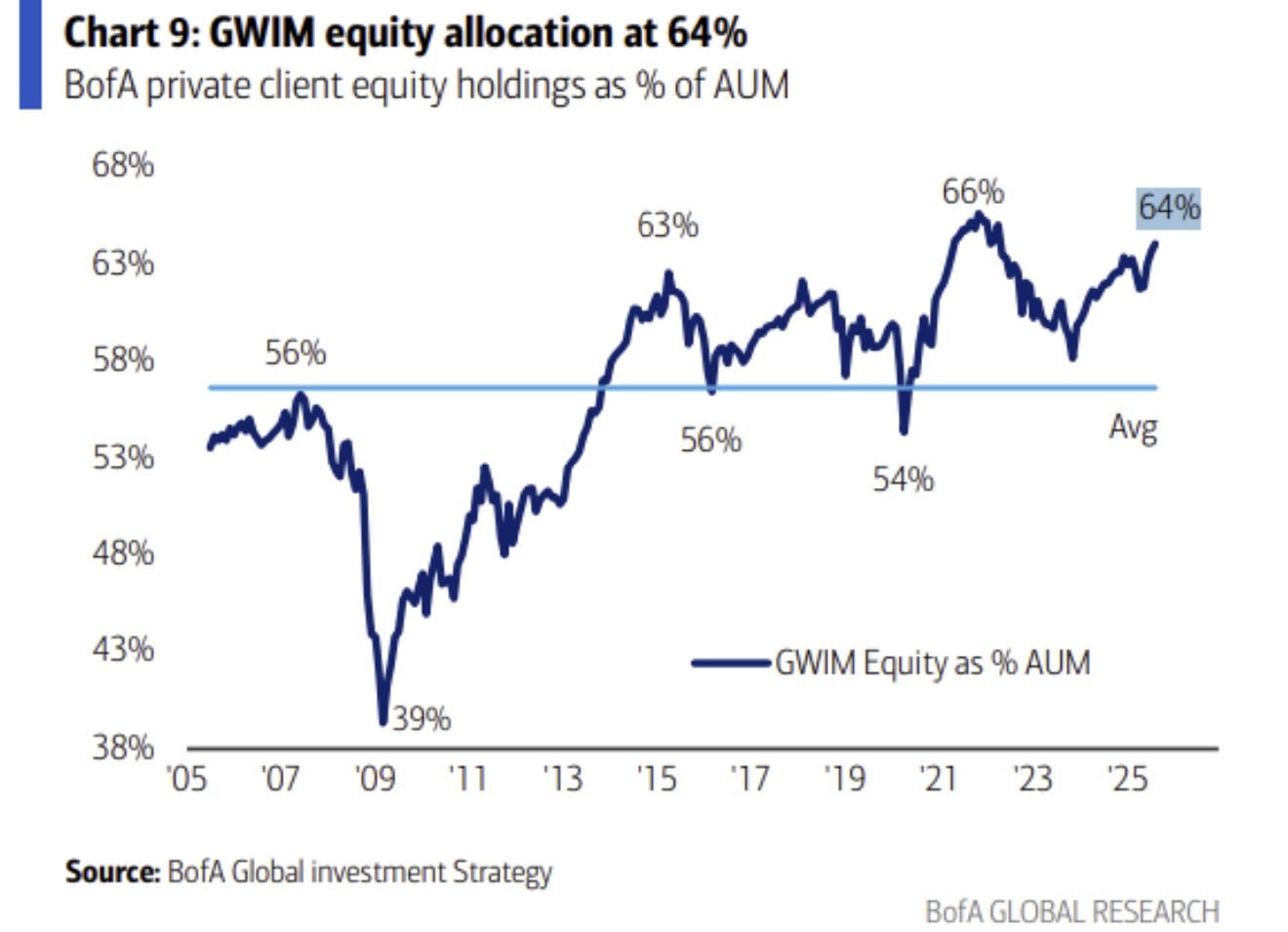
Source: @MikeZaccardi
6. Dip Buying Success: But hey, why not? And why not buy the dip? — the "Buying the Dip" strategy is on track for its 2nd best year 40 years. That’s the thing, for most people and through most of the history of US markets, the best path has been just to stay mostly long; maybe with a bit of diversification, a bit of cash/dry powder, and just keep buying dips and DCA. For those who can stomach or ignore the occasional large and drawn-out drawdowns, it’s probably a decent way to go…
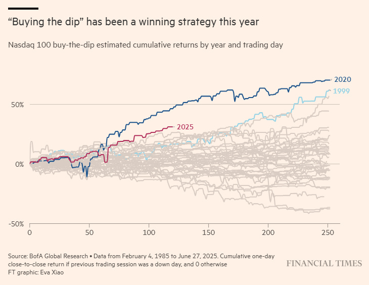
Source: @Barchart
7. Small Exposure to Small Caps: Speaking of buying the dip, asset managers did *not* buy the dip in small caps — futures positioning data suggest that asset managers as a group were underweight smalls through the rally. As noted before, it does raise the prospect of chasing (e.g. if macro data holds up OK, if stocks keep making new highs, and if many participants are still underweight; then that adds up to further upside from chasing flows).
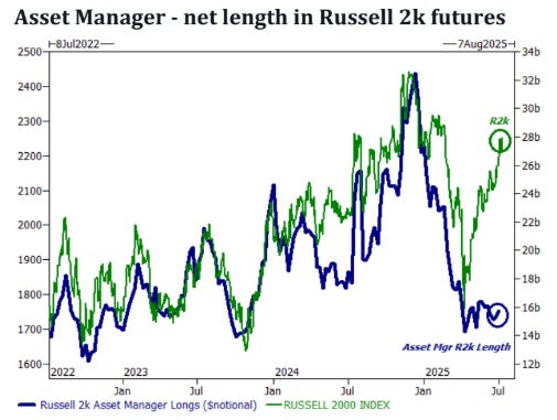
Source: @neilksethi
8. If the Fed is Done on Cuts: Here’s an update to a chart I made last year, one which was not really taken seriously by most people, because no one thought the Fed would be one-and-done (or more specifically: on a short/small cutting cycle). By now it’s no debate — that cutting cycle is done with for now, and history shows most of the time that’s not necessarily a bad thing for stocks.
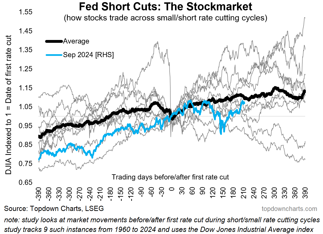
Source: Chart of the Week - One and Done
9. If the Fed gets Back to Cuts: But because it’s topical, here’s how it looks if the Fed gets back to rate cuts… i.e. if Trump gets his wish, and either the Fed caves into pressure to cut, or macro data makes it clear that cuts are possible/required.
The issue is, as with many things, you have to be careful what you wish for — the reality is, if the Fed gets on with rate cuts… there’s probably a good (bad) reason for that (i.e. recession/bad macro).
If rate cuts restart, one of two things happen: a. the rate cuts were big enough and fast enough to help offset downdrafts and the economy goes on growing; or b. the rate cuts come too little, too late, or simply unable to offset the downdrafts; and recession sets in. Ultimately the thing that most reliably makes stocks go down is recession, and so a recessionary return to rate cuts would disappoint many.
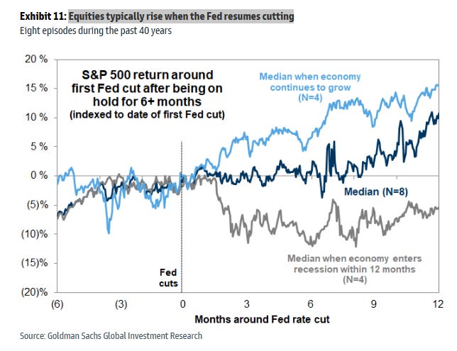
Source: @MikeZaccardi
10. The rise of Space X: In other news, this chart caught my eye. Being a space fan, it’s cool to see the rise of the commercial space sector. Space X is by far the biggest player and has paved the way for a lot of other new space companies over the years, and for those lucky enough to have been able to invest in this (private) company early on, they would have done well. But it’s not the only game in town; probably the next best (and publicly traded) launch company RKLB is up almost 10x off the 2024 lows. There’s going to be cycles of boom and bust in the space sector, but in the larger scheme of things it has astronomical potential.
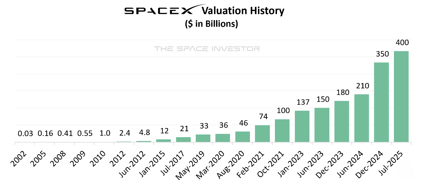
Source: The Space Investor
Thanks for reading, I appreciate your support! Please feel welcome to share this with friends and colleagues — referrals are most welcome :-)
BONUS CHART/THEME
IPO Market Trends: something interesting is happening in IPO land — after a period of slumber and indigestion following the SPAC bubble burst of 2021/22, things are heating up again. In H1 alone this year we’ve seen almost as many IPOs in the USA as all of 2024 (and twice as many as in H1 2024). This again is another sign of a well-progressed market cycle.
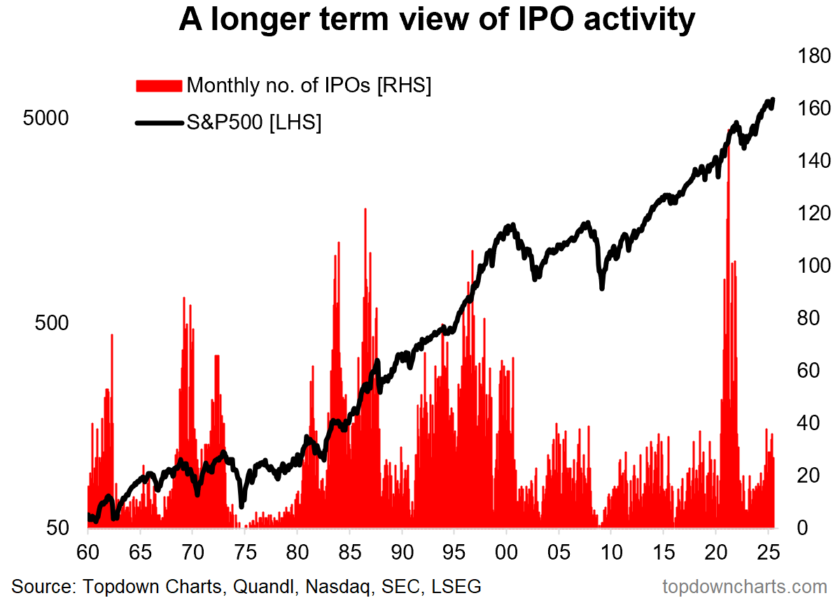
Historically the ebb and flow in IPO activity can be more or less directly traced to the ebb and flow of the stockmarket cycle. You see surges in IPO activity during times of speculation, confidence, and high valuations. You see slumps during times of fear, pessimism, and low valuations (i.e. when equity financing costs are higher).
That all makes sense —and hence tracking IPO activity is basically yet another barometer and indicator of the stage of the market cycle.
—
Best wishes,
Callum Thomas
Founder & Editor of The Weekly ChartStorm
and Head of Research at Topdown Charts
Twitter/X: https://twitter.com/Callum_Thomas
LinkedIn: https://www.linkedin.com/in/callum-thomas-4990063/
NEW: Other services by Topdown Charts
Topdown Charts Entry-Level — [TD entry-level service]
Topdown Charts Professional — [institutional service]
Monthly Gold Market Pack — [Gold charts]
Australian Market Valuation Book — [Aussie markets]
Ratio BRK.B vs SPY: I have found somewhere a comparison between "Berkshire Hathaway" (BRK.B) and the "SP500" (SPY). It seems that for some kind of SP500 drawdowns, BRK.B could be a good hedge...at least for some time. Example: at the ATH of the Dot.com bubble (SP500), the BRK.B price hit an ATL. But BRK.B started to recover, when the Dot.com bubble began to burst.This comparison adding to yor chart 1 (SPX 1998 vs today). Would be grateful for your comments. Many thanks. Link - TradingView chart = https://www.tradingview.com/x/XmpW8SPi/