
Weekly S&P500 ChartStorm - 13 August 2023
This week: correction check, tech stock troubles, valuations, seasonality, concentration risk, unicorns, isolation, and leveraged ETF signals...

Welcome to the latest Weekly S&P500 #ChartStorm! (slightly delayed this week due to just returning from family holiday)
Learnings and conclusions from this week’s charts:
The S&P500 is correcting from a technically ready position (failed break through 4600, overbought technicals, bearish divergence).
Tech is the key driver and still looks vulnerable with a key test ahead (whether it can hold support), and with valuations still close to 2021-peak levels.
The correction comes as valuations began to look expensive from a number of angles, and seasonality turned negative.
Keep an eye on risk levels and timing indicators for next steps.
Big Tech has grown to dwarf some of the largest countries in the major global equity benchmarks (concentration risk for passive investors?).
Overall, as noted the stock market is in correction mode, and it comes seemingly just as everyone finally capitulated and flipped bullish (both anecdotally in terms of some of the big-name-bears, but also clearly observable in the flows/positioning and survey data). Times like these are worth going back and reviewing your process and plan… or at least thinking about putting one together if you never had one in the first place!
1. Correction Technicals Check: After failing to breach the 4600-level, and from overbought levels (and bearish RSI divergence), the S&P500 has rolled over into correction-mode. So far it has taken out the 4500 level, but the next key lines of defense are the 50-day moving average (which will be a key sticking point —> above = healthy, below = risk), and then the ~4400-level — if those go then it opens up a potential move down to previous major resistance around 4200 (and/or the 200dma).
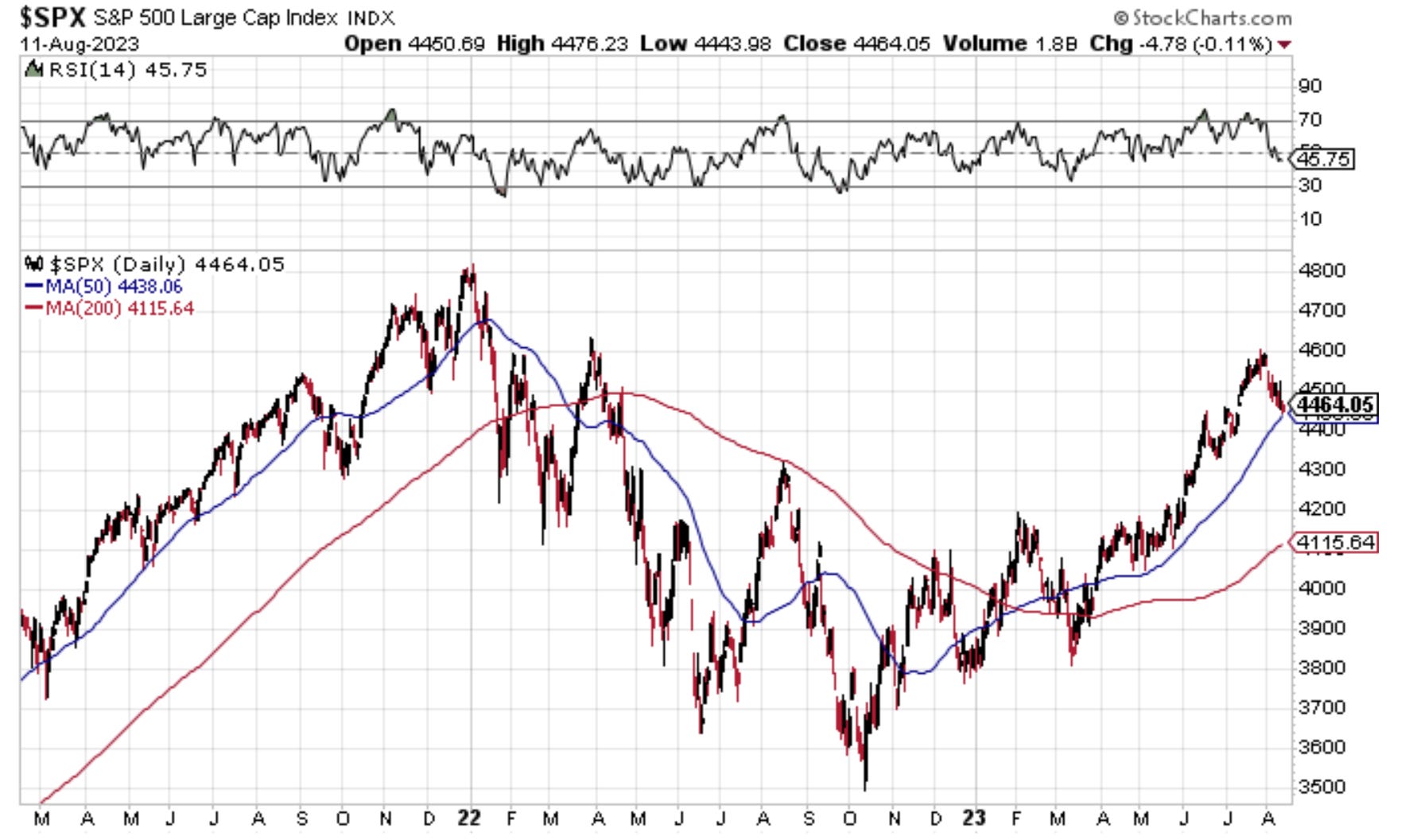
Source: @Callum_Thomas
2. Tech-NO: Seems like tech failed in its attempt to breakout to new highs (again, from overbought + bearish divergence) — this is a(/the) critical part of the bull story this year, so a chart like this is quite damning.
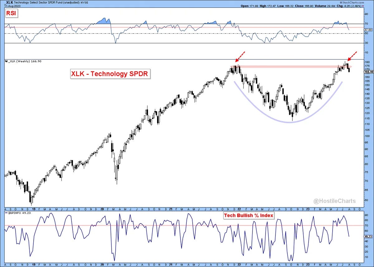
Source: @HostileCharts via @TheChartReport
3. Support & Resistance: Similar note, if tech takes out short-term support, then it opens up a prospective ~10% move down to previous resistance. Probably not much debate there, we all saw how frothy and extended tech got having run some 50% up off the Oct lows.
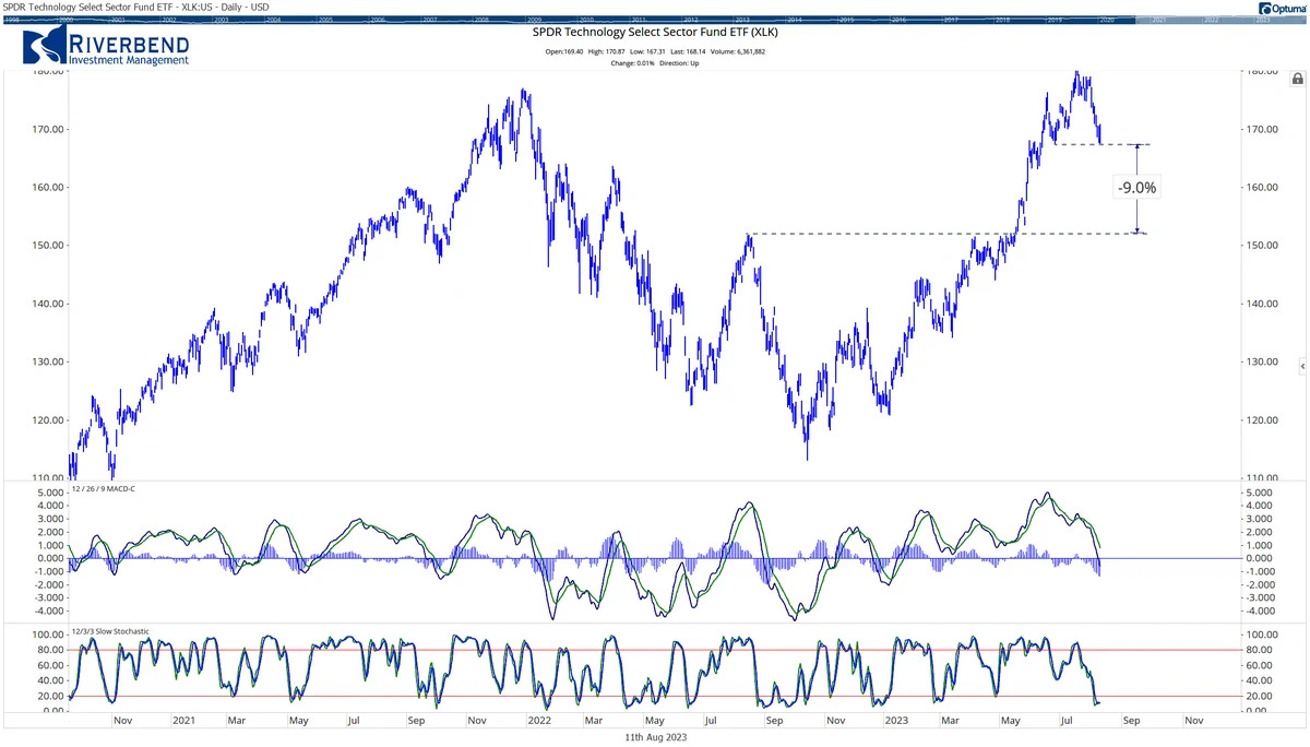
Source: @JohnRothe
4. Tick Tock Tech Top: Case in point — tech valuations got back to those crazy 2020/21 pandemic liquidity frenzy levels (and a key difference now is the record pace and magnitude of monetary tightening globally vs easing back then).

Source: @CameronDawson at NewEdge Wealth
5. Two Valuation Indicators, One Conclusion: Not to belabor the point too much, but if you look at absolute valuations for the S&P500 (PE ratios — this chart is showing the average of the forward PE, trailing PE, CAPE vs history) they are clearly expensive, and if you look at the equity risk premium (shown inverted — which basically shows the relative value of equities vs bonds) it’s also showing stocks as expensive (vs bonds). You might argue that both indicators have been higher in the past, but overall the risk/reward balance gets worse as these indicators go higher.

Source: Chart of the Week - US Equity Risk Premium Risks
6. Value of Value: Somewhat of the flipside of expensive tech; value stocks (the cheapest stocks) had dropped back to extreme cheap vs growth stocks. The clues are usually there…
