
Weekly S&P500 ChartStorm - 12 September 2021
This week: seasonality and the selloff, tax hike risk, investor positioning, large cap equity valuations, small caps, global giants, and lobbyists

Welcome to the Weekly S&P500 #ChartStorm (by email!)
The Chart Storm is a weekly selection of 10 charts which I hand pick from around the web (+some of my own charts), and then post on Twitter.
The charts focus on the S&P500 (US equities); and the various forces and factors that influence the outlook - with the aim of bringing insight and perspective.
Hope you enjoy!
p.s. if you haven’t already, subscribe (free) to receive the ChartStorm direct to your inbox, so you don’t miss out on any charts (…you never know which one could change the whole perspective!)
1. Another Market Dip? This chart puts the latest “dip“ into context vs the typical seasonal price pattern for the S&P500. If the market was going to do something a little more than a garden variety dip e.g. larger selloff/correction, this would - seasonally speaking - be around the time of year for it to do so. On Twitter I noted the wall of worry includes: negative seasonality, Fed taper, debt ceiling, delta/covid variants, backlogs, inflation, record fund flows, buyback blackout window, quarter end rebalancing… among other things. Since we’re talking seasons, let’s use a weather metaphor: cloudy with a chance of rain.

Source: @TopdownCharts
2. Corporate Tax Hike Probability: This chart shows that currently the prediction markets are calling just over a 60% chance of a lift in the corporate tax rate next year. I’ve previously talked about this: over the past 4 decades, falling tax rates have been a tailwind to global equity earnings per share (the US being a key part of that). Going forward I think it’s straightforward to argue that this will no longer be the case, and that we likely see upward pressure on tax rates to pay for the fiscal expansion seen during the pandemic; and the politics seem to be drifted in that direction too.

Source: @Pointedmacro
3. S&P500 Long Term Earnings History: This chart shows Last 12 Months’ Earnings Per Share for the S&P500 in log terms… the trend is your friend
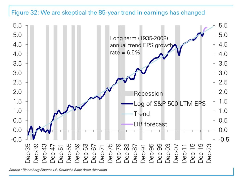
Source: @SamRo
4. AAII Asset Allocation Survey - Cash Allocations: Investors report that portfolio cash allocations have fallen to the 5th lowest on record... Part of this is completely natural and to be expected. However, part of it is also a sign of an aging market cycle and a gradual but steady shift in the risk vs return outlook.

Source: Blog - Cash is Trash?
5. AAII Survey - Equity Allocations: The next chart shows allocations to equities from the same survey, interestingly it’s “only“ the 25th highest reading on record (vs 5th lowest for cash). Clearly though this is still very much at significant levels, and the last time it got to these levels it spelled the end of a near-uninterrupted cyclical bull market run and the arrival of significantly higher volatility. But then again, with traditional alternatives like cash and bonds delivering negative real returns, arguably who can blame them?

Source: @TopdownCharts
6. Household Exposure to Equities: The next chart basically shows what you could call actual allocations to equities. Recall, the previous chart is just a survey and at that it is just a survey of one cohort of investors. This one shows what it looks like across the entire US household sector. Anyway, the key point is that it reached an all time high earlier this year. Should we be concerned?

Source: @Lvieweconomics
7. Valuations: This is a recurring topic; valuations - there are a few ways you can slice and dice US large cap equity valuations to make things seem reasonable or perhaps not as expensive as first glance or certain indicators may make it seem. But there is no avoiding the fact that we’ve had an amazing bull market and as such by most measures in absolute terms the US market is trading at much higher than usual levels — aka expensive. This particular chart shows the “Q“ (which is basically another version of the price to book ratio), and the CAPE/Cyclically Adjusted PE ratio - which is something we’ve discussed last week.
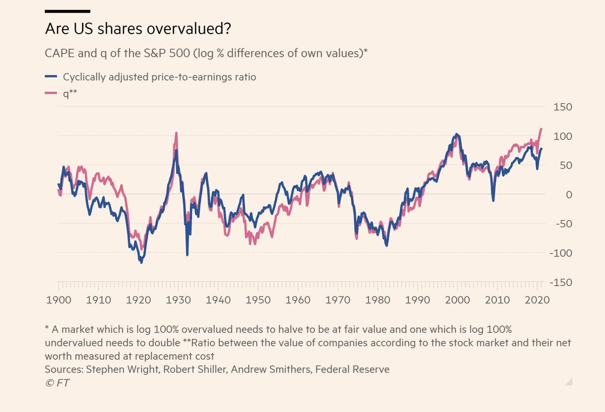
Source: @acemaxx
8. Big Value in Small Caps? This chart shows the relative value picture for US small cap equities (i.e. the forward PE ratio for small caps relative to the same for large caps). In many ways this is an echo of the previous chart in that one thing we can say about this chart is that large cap equities are expensive (relative to small caps). I think small caps are certainly starting to look interesting, especially given the capitulation in fund flows that we’ve seen recently.
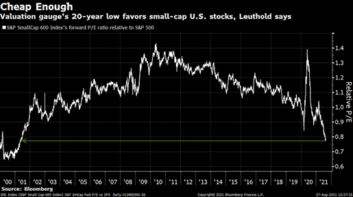
Source: @leadlagreport
9. Global Corporate Giants: This chart is basically a photo essay on the grand tension between the USA and China. More of an interesting food for thought chart, but equally giving nod to one of the major and most concerning geopolitical tensions of our time. I noted the other day that Biden & Xi managed to get on the phone for a call - that’s arguably a good sign, but a lot of damage has been done in the US-China relationship… long-gone are the days of “Chimerica“.

Source: @IndiaER CLSA
10. Lobbying Pays: Although this chart is a little dated, it goes to show the appeal of spending on lobbying - it seems to have paid off with the lobby-heavy basket of stocks outperforming during that window.
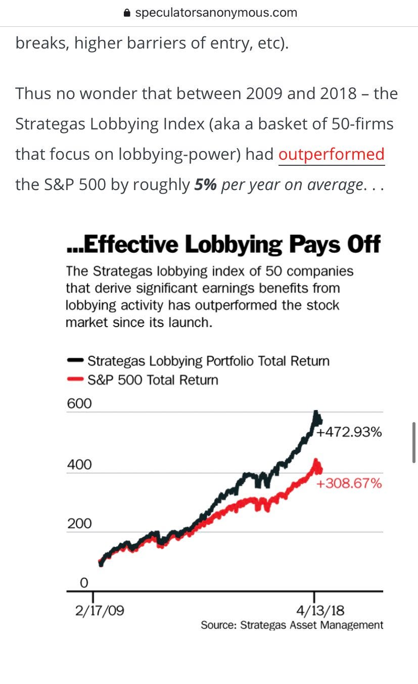
Source: @RadicalAdem
Thanks for following, I appreciate your interest!
oh… that’s right, almost forgot!
BONUS CHART >> got to include a goody for the goodies who subscribed.
Corporate Earnings: Just a quick snippet of a couple of charts that show the path of the S&P500 and earnings - it is perhaps a counter-point to the charts you see overlaying the Fed balance sheet vs the market.
Perhaps all that really matters is earnings, or at least perception/expectations of earnings - the first chart shows consensus next 12 months earnings.

The second chart shows trailing 12-months earnings.
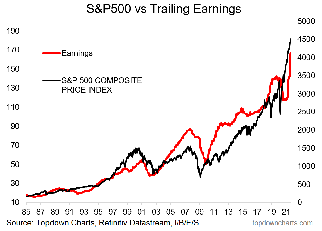
Again, firstly they both highlight the importance of earnings in driving stock prices over the longer run. But it also goes to show magnitude of the plunge and then subsequent recovery in earnings.
In this respect, maybe Fed taper is an overhyped risk?
—
Best regards,
Callum Thomas
SPONSOR: ( …he’s me!)
My research firm, Topdown Charts, has a new entry-level Substack service, which is designed to distill some of the key ideas and themes from the institutional fund manager service to provide the same high quality insights at a more accessible price.
Give it a try and let me know what you think