Weekly S&P500 ChartStorm - 12 June 2022
This week: crash vs bear, clues in Chinese stocks, P/E vs CPI, profit outlook, sentiment vs allocations, futures positioning, energy vs tech, passive investing, dividends...
Welcome to the Weekly S&P500 #ChartStorm — a selection of 10 charts which I hand pick from around the web and post on Twitter.
These charts focus on the S&P500 (US equities); and the various forces and factors that influence the outlook - with the aim of bringing insight and perspective.
Hope you enjoy!
NEW: Sign up to the (free) Chart Of The Week over at the new Topdown Charts Substack entry-level service: Subscribe to the Chart of the Week
Each week we send you one of the most interesting charts on our radar, along with commentary/context and a key takeaway — so you’re never left guessing on why the chart matters ...and the charts matter! > > > Subscribe Now
1. Bear Market vs Market Crash: This is probably the best image to use in a textbook to compare and contrast a bear market vs a market crash.
And p.s. forget about that “20% = bear/bull“ b.s., bear markets are a process, not a percent change. Current market action reflects removal of stimulus, correction of previous expensive valuations, and overall: a transition in the underlying business/financial cycle.
Source: @Callum_Thomas
2. FIFO: Keep an eye on China... Chinese tech sector basically provided the playbook for Nasdaq: first to fall and likely first to bottom. From a macro standpoint, China is also many months ahead — they never really stimulated that much, and actually ran fairly tight monetary/fiscal settings last year. And as such we’d seen significant slowing there even before the lockdowns. But also looking further out, they are most likely to be first to pivot to stimulus down the track too. So keep an eye on China macro and markets!
Source: @murphycharts
3. CPI and PE Ratios: Everyone's (current) favorite economic data report was out this week and it showed annual CPI inflation running at an 8.6% clip.
On this chart that would imply a P/E ~11x (Current P/E is ~20x 😅😓🥵).
Source: @JulianKlymochko
4. Profit Pitfalls: Some might look at the previous chart and proffer a statement such as: "OK, so what if P/E ratios go lower, at least earnings are growing, right?"
Thing is, the outlook for profits looks precarious if CEO confidence is anything to go by… (n.b. profits are the “E“ in the P/E ratio: if P/E goes down it can mean that either E went up and P stayed the same or that P went down and E stayed the same, but if E goes down and P/E goes down, then that is the worst cast scenario for the P)
Source: @IanRHarnett
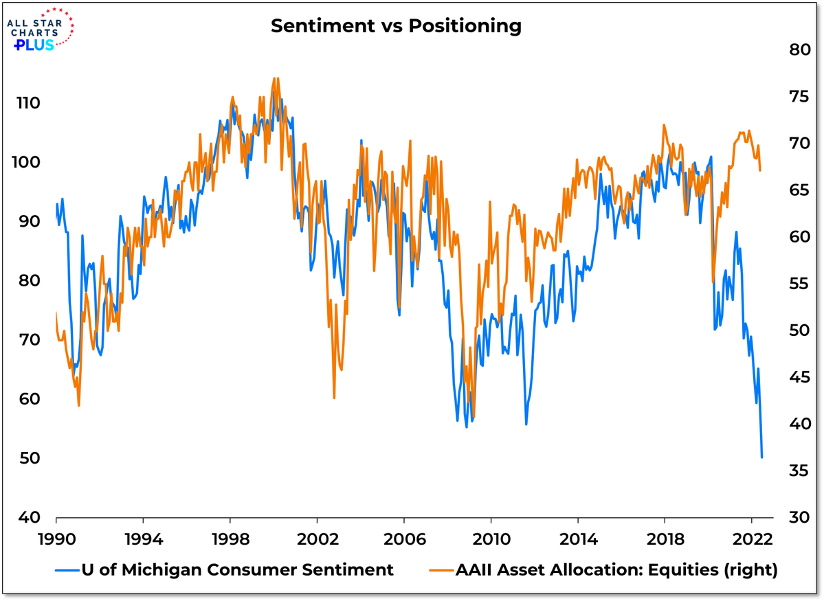
5. Consumer Sentiment vs Stockmarket Positioning: Consumers are extremely pessimistic, but yet they hold steady in their stockmarket holdings. This is either a broken correlation or a correlation that will break a lot of things... !
Source: @WillieDelwiche
6. Household Equity Allocations: In case you doubt the data in the previous chart (which in fact is simply a survey of members of the AAII), here is the aggregate view across all US households: equity allocations are bigger than ever before.
Source: @hedgopia
7. Futures Positioning: Meanwhile the pros are increasingly all-out: “Equity futures positioning (asset managers and leveraged funds) has now turned net short for the first time since the Brexit shock in **2016**”
(albeit, being futures positioning, there could be some hedging or L/S trades getting mixed into this)
Source: @GunjanJS
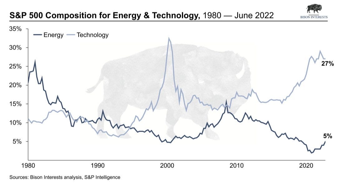
8. Energy vs Technology: Everyone was so busying investing in tech and chasing dreams of the future, we forgot to invest in energy, and now: results.
To be fair, I would not expect that these two lines will cross again any time soon as such, but definitely expect some further rotation.
Source: @Josh_Young_1 @BisonInterests
9. Passive vs Active: Corollary to the previous chart, the push to passive means that many investors were mindlessly drifted into massive tech exposures and out of energy (and materials for that matter) by virtue of delegating their investment strategy to simply “buy the biggest stocks“ (at least for passive funds that follow market-cap based indexes).
(albeit, to be fair a lot of active funds were probably boots into tech/momentum too!)
Source: @acemaxx
10. Dividend Growth: Most income oriented investors probably focus on dividend yield, but this chart goes to show that growth of dividends also matters…
Source: @DividendGrowth
Thanks for following, I appreciate your interest!
BONUS CHART >> got to include a goody for the goodies who subscribed.
Investment Sentiment Dissonance: this week’s bonus chart is a return traveler, updated to the latest. It shows a wide disconnect or dissonance between surveyed investor sentiment and actual portfolio allocations.
Again, there is that big disconnect that makes us ponder: are investors overreacting in their surveyed assessment of the outlook, or is investor allocations the next shoe to drop (in other words, is there more selling to come as the black line meets the blue line — perhaps leaving folk feeling a bit black and blue!).
One detail though I would point out in passing is that bonds have fallen alongside stocks… “normally” when stocks are falling bonds are rallying, but not so in the year 2022 when everything is down except for cash & commodities.
If bonds had rallied, then investor % allocations to equities would naturally get drifted lower by mathematics rather than active allocation changes as such.
Aside from all that, here is another very curious chart: this time showing investors’ extreme pessimism at odds with economic sentiment (i.e. combined signal from surveys of consumers, small business, home builders, manufacturers, and big businesses).
However, one difference in this chart is that the black line looks to be more resolutely in the process of “catching down“ to investor sentiment.
Again, we have an open question: are investors being overly dramatic in their response to surveys, or is a recession right around the corner?
Answer that question and you probably solve the previous chart too.
—
Best regards,
Callum Thomas
My research firm, Topdown Charts, has a new entry-level Substack service, which is designed to distill some of the ideas/themes/charts from the institutional research service to provide the same high quality insights at a more accessible price.
Give it a try and let me know what you think! :-)


Thanks !
Great work!!!!