Weekly S&P500 ChartStorm - 12 December 2021
This week: the rebound, Fed effects, inflation, real yields, profitability, valuations, options market, insiders, global equities, and the "S&P5"
Welcome to the Weekly S&P500 #ChartStorm (by email!)
The Chart Storm is a weekly selection of 10 charts which I hand pick from around the web (+some of my own charts), and then post on Twitter.
The charts focus on the S&P500 (US equities); and the various forces and factors that influence the outlook - with the aim of bringing insight and perspective.
Hope you enjoy!
p.s. if you haven’t already, subscribe (free) to receive the ChartStorm direct to your inbox, so you don’t miss out on any charts (you never know which one could change the whole perspective!)
1. The 50-Day Moving Average: It looks like the S&P500 is back to its old habit of bouncing off the 50-day moving average! After a sharp rebound, the market is currently contending with resistance — next week will be key… and on that note, the big event next week will be the December Fed meeting!
Source: @Callum_Thomas
2. Fed vs Markets: Speaking of the Fed, here’s a useful schematic of how the S&P500 tends to perform during different types of Fed hiking cycles. Unfortunately it does leave us guessing as to what type of regime we will be in this time. If we look at how some of the EM central banks have been exiting stimulus so far (they tend to move faster/earlier than the Fed) we have seen some fairly aggressive/rapid moves — which makes sense given the easing cycle was triggered by a shock, and the easing was aggressive and rapid. So with inflation expectations at risk of being anchored at high levels the Fed may need to go faster: thus at this juncture I’d guestimate that it’s either of the two lower lines…
Source: @Marlin_Capital
3. Real Yield Real Low: Speaking of the Fed & Inflation, here's the "real yield" for the S&P500... Historically whenever it approached or fell below 0% things tended not to work out too well (...unless you like bear markets!).
Source: @Theimmigrant84
4. Real Earnings Yield v2.0: Different version of the "real earnings yield" -- this one uses the CAPE earnings yield (more stable/less-noisy) and uses TIPS breakevens (arguably forward looking inflation*). Basically comes to a similar conclusion. Albeit, I would note that neither this nor the previous chart factors in the level of interest rates. Do you dare say “it’s different this time“?
Source: @topdowncharts
5. Non-profitable tech stocks: Seems like there may be a transition from the line "no profits? no problem!" to "no profits? no, problem!"
Source: @RobinWigg
6. Peak Profit Margins? Speaking of profitability, I wonder if all those issues around inflation, backlogs, wage pressures, etc are starting to trickle their way into profit margins… (not to mention the prospect of rising interest rates and taxes)
Source: @charliebilello
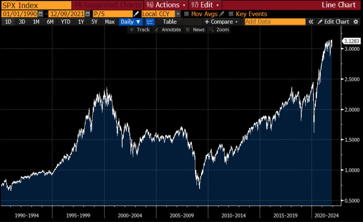
7. Price to Sales Ratio: A sign of the times — the S&P500 Price to Sales ratio has reached new all time highs: even higher than the dot-com bubble. Albeit an important piece of context is the previous chart… the profit margin is now almost *double* that seen during the dot-com bubble era.
Source: @nirkaissar
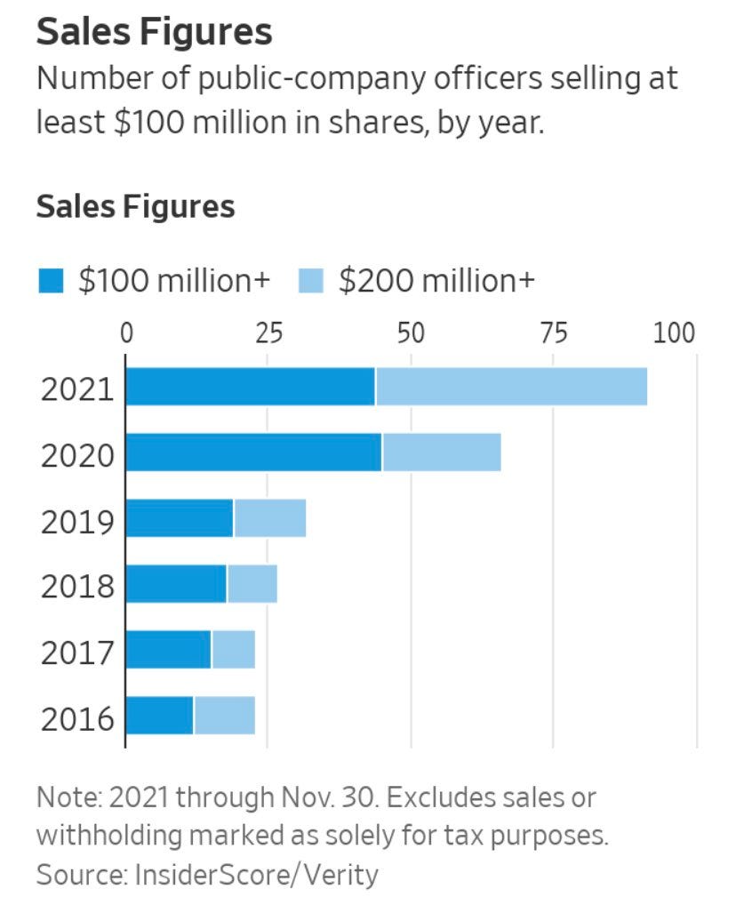
8. Insider Selling: Just another sign of the bull market times — more and more corporate insiders cashing out with bigger and bigger cheques. Clearly a higher stockmarket enables this, but I guess higher cost of living could be a factor?! Also, these people are clearly not fools to be in this type of position, and would actually be fools to not take a little off the table given where things sit.
Source: @KobeissiLetter
9. Wild Ride: “despite accounting for just 2.3% of the overall index, Tesla accounted for 86% of the amount spent on call option premiums for the top 50 stocks in the S&P500"
Source: @choffstein
10. “The S&P 5“ No that’s not a typo, this chart shows the “S&P 5“ — i.e. the top 5 stocks (…what it looks like if you just held the top 5 stocks: rebalancing monthly). Funnily enough it looks like the top 5 stocks are up 5 x over the past 5 years!
Source: @MichaelKantro
Thanks for following, I appreciate your interest!
oh… that’s right, almost forgot!
BONUS CHART >> got to include a goody for the goodies who subscribed.
USA vs the World: US equities utterly crushed global equities the past decade.
This chart shows the relative performance line for US vs global excluding-US equities (i.e. the rest of the world). There does appear to be a cycle here, and what a cycle!
I actually took a deep dive on this topic in my latest weekly, looking at the drivers/reasons (e.g. sector composition, US dollar, profitability/earnings, etc), and the outlook (valuations, expected returns, sector composition, and technicals).
Long-story short, there appears to be a 10-15 year cycle in play here, and a lot of the elements are falling into place for a turn in the cycle… however the cautionary on that is that if you take that upper limit as a rule (15-years), the current cycle could keep going into 2023.
Definitely an interesting (and important!) theme to keep tabs on…
—
Best regards,
Callum Thomas
SPONSOR: ( …he’s me!)
My research firm, Topdown Charts, has a new entry-level Substack service, which is designed to distill some of the key ideas and themes from the institutional fund manager service to provide the same high quality insights at a more accessible price.
Give it a try and let me know what you think


