Weekly S&P500 ChartStorm - 11 July 2021
Your weekly selection of charts...
Welcome to the Weekly S&P500 #ChartStorm (by email!)
The Chart Storm is a weekly selection of 10 charts which I hand pick from around the web (+some of my own charts), and then post on Twitter.
The charts focus on the S&P500 (US equities); and the various forces and factors that influence the outlook - with the aim of bringing insight and perspective.
Hope you enjoy!
1. Euphoriameter: It’s a bit of an unusual indicator, and like many market timing indicators, it does a decent job of picking bottoms and has a mixed record picking tops. What we can at the very least say is that downside risk is elevated as this one heads higher - and so the senses should be sharpened.
Source: The Euphoriameter
2. Investor Movement Index: On a very similar note, another composite sentiment indicator, this one from TD Ameritrade - who use the treasure trove of retail trader behavior data from their online brokerage business. The punchline is the indicator reached a record high in June. So there is definitely something going on here!
Source: TD Ameritrade IMX
3. Smoothed Sentiment: Just in case there was any doubt left, the smoothed (52-week average) of bullish responses in the Investors Intelligence survey shows sentiment the most bullish since 1976. Can we argue that they are bullish for a reason? Sure. Or that they are justifiably bullish? Possibly. But one thing is for sure, this is the very definition of a market extreme, and market extremes are where turning points can often be found. YouHaveBeenWarned
Source: @Not_Jim_Cramer
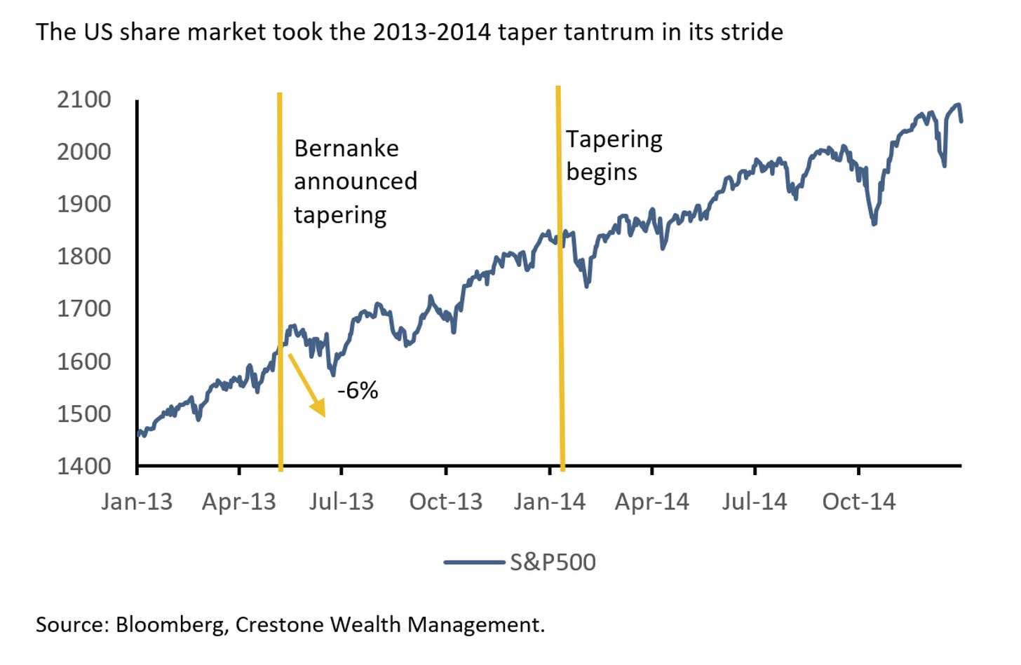
4. Fed Taper - Market Impact: I quipped on Twitter; “I can't wait for the Fed to Taper so I can BTFD“. Of course that was mostly in jest, and simply a reflection on what happened last time the Fed announced, and then enacted, tapering of its quantitative easing program. This time is different in many respects e.g. valuations are a lot higher, sentiment is a lot more extreme, and arguably the growth/tech-heavy US stockmarket is more sensitive to bond yields now. So maybe there will be an opportunity to buy the dip on a prospective taper-scare… but maybe that dip will be a bit …dippier.
Source: Crestone WM
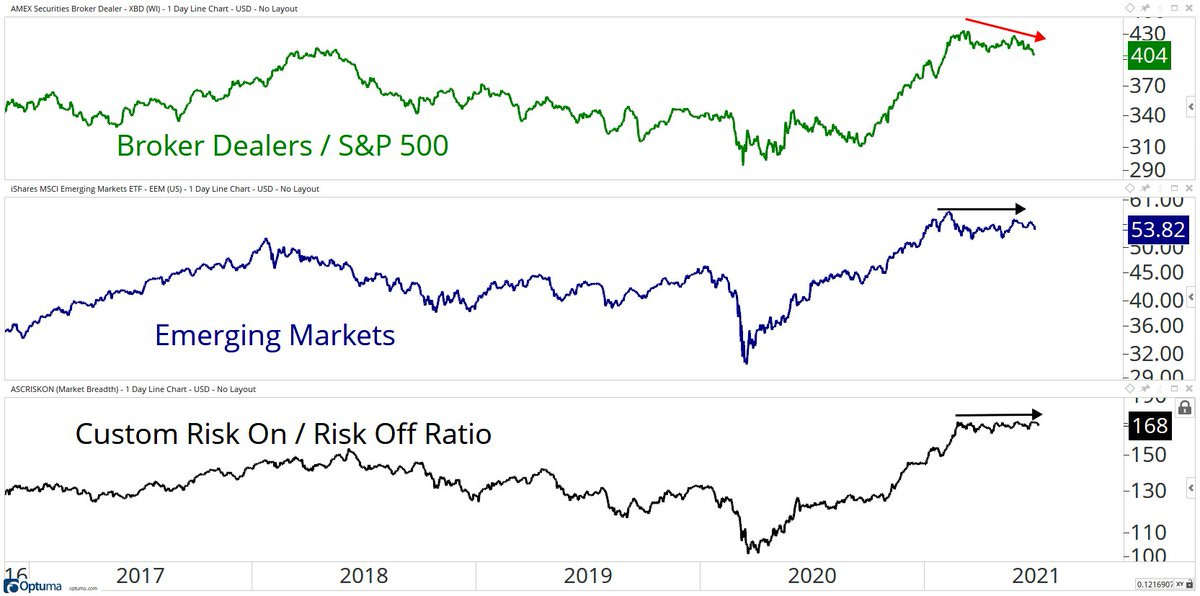
5. Broker Dealers vs the S&P500: This one stood out to me as perhaps just one example of a number of divergences and points of relative weakness. As I mentioned previously, short-term market breadth has been very weak as some turbulent rotation and unrotation has taken place. The relative weakness in broker dealers and choppy performance in EM is perhaps an orange flag waving on the short-term risk outlook.
Source: @granthawkridge
6. USA vs the World: After a couple of attempts at turning the corner and a multi-month trading-range, US equities have broken out vs global excluding-US equities. Interestingly, this puts the relative performance line at a stark divergence vs the US dollar index. The two often travel together; 1. because of simple FX translation effects; 2. because of relative earnings/economic prospects; 3. relative policy stance; and 4. the impact the USD has on global financial conditions and flows dynamics. So it’s definitely food for thought [and I will add some extra thoughts in the bonus chart section below - so keep reading!].
Source: 10 Charts to Watch in 2021 [H2 Update]
7. Deep Value in Consumer Staples: I like consumer staples along with a few other defensive sectors - simply because the relative valuation picture is starting to get so extreme that at some point it’s going to be a case of close your eyes, shut up, and buy. To be fair though, for defensive sectors to really outperform you do generally need to see a correction or bear market…
Source: @KailashConcepts
8. Tech Sector Valuations: Another “New Paradigm?“ Tech sector price-to-sales ratio reached a new record high. So there are a few things to say about this; e.g. price to sales is not a great metric, it doesn’t capture changes in profit margins etc, this time around the tech sector is more mature and actually is the “new economy“... Indeed, in many respects, it *is* actually different this time. But while some things are different, other things are the same e.g. the speculative frenzy that has been ignited by stimulus. Maybe it goes higher yet, but if you’re playing for more than days/weeks/months: the longer-term odds go increasingly against you as valuations move higher and higher.
Source: @JeffWeniger
9. S&P500 Valuation Model: Perhaps a counterpoint is this chart which shows the S&P 500 standardized against US GDP (not my favorite metric, not even close, but let’s run with it for a second) — vs US 10-year bond yields [inverted]. The key point or intimation is that lower and lower bond yields justify the ever-loftier absolute valuations. And to be fair my own various equity risk premium indicators show there is still some relative value.
Source: @morphoadvisory
10. PE10 Percentile Perspective: But back onto absolute valuations - this chart gives a sense for the statistical distribution or where we sit in the historical context for the PE10. The PE10 attempts to smooth distortive effects of volatility in earnings by taking the 10 year trailing average of earnings per share (so it tends to be a more reliable signal, but even then it still has its drawbacks). The key point: (sh) it’s expensive.
Source: @AdvPerspectives
Thanks for following, I appreciate your interest!
oh… that’s right, almost forgot!
BONUS CHART >> got to include a goody for the goodies who subscribed.
USA vs the World -- PE10 Valuations in Perspective: given some of the charts/themes this week, I thought it worth reviewing the PE10 for the US alongside its major global peers.
As the chart shows, US equities are increasingly extreme expensive vs their own history AND relative to the rest of the world. Indeed, Developed Markets excluding-US, and Emerging Markets both look reasonable vs their own history.
I wouldn’t exactly call EM or DM ex-US cheap by any means, but given the ever-wider valuation gap, their reasonable valuation levels vs history, and a few other things (e.g. sector exposures and macro linkages), I would say the odds are tilted in favor of Global vs US over the medium/longer-term.
Of course, in the immediate term with US equities breaking out vs global it could run further yet - which will only serve to widen the valuation gap further.
Definitely a key chart for globally-oriented investors to be mindful of.
—
Best regards,
Callum Thomas
SPONSOR: ( …he’s me!) My research firm, Topdown Charts, has a new entry-level Substack service, which is designed to distill some of the key ideas and themes from the institutional/fund manager service to provide the same high quality insights at a more accessible price.
Give it a try and let me know what you think :-)


