
Weekly S&P500 ChartStorm - 11 April 2021
Your weekly selection of charts...

Welcome to the Weekly S&P500 #ChartStorm (by email!)
The Chart Storm is a weekly selection of 10 charts which I hand pick from around the web (+from my own chart library), and then post on Twitter. The charts focus on the S&P500, US equities more broadly; and the various forces and factors that influence the outlook - with the aim of bringing insight and perspective.
Hope you enjoy!
1. Market Breadth is Unequivocally Strong: this chart shows market breadth across industries; breadth can be useful in flagging early signs of strength/weakness. At this point there seems to be no cause for concern in this chart.
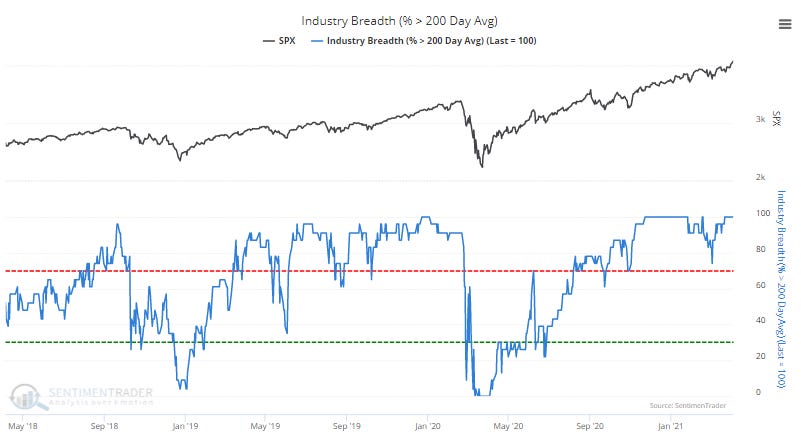
Source: @sentimentrader
2. Head and Shoulders… Continuation: The “head and shoulders“ formation can be a useful topping signal, but we can’t forget that like most chart patterns, it is not infallible. Indeed, sometimes what you think looks like a topping process may end up simply being a period of consolidation or market digestion before continuation higher.

Source: @TheOneDave
3. Record Flows in to US Equity ETFs: Speaks for itself... Investors/traders are increasingly bullish as monetary + fiscal support meets optimism on vaccination and eventual normalization.
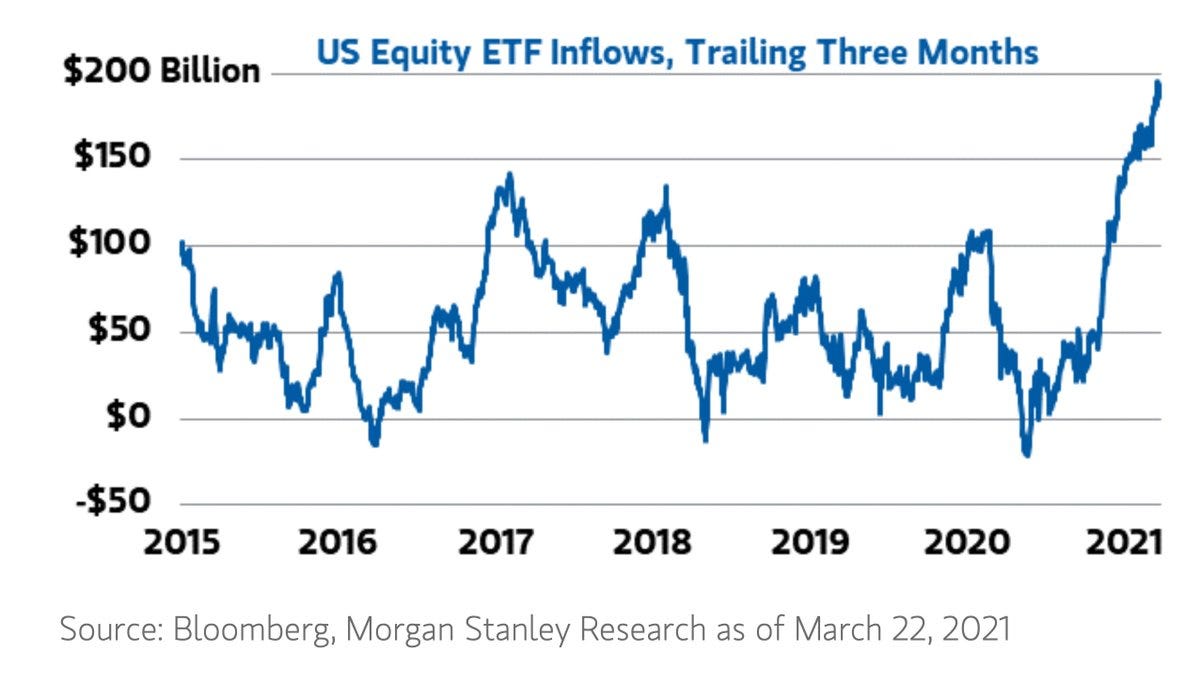
Source: @acemaxx
4. Cash Allocations Back to the Bottom of the Range: Thanks mostly to market movements, surveyed cash allocations have dropped - this means at the margin there is incrementally less cash in proportion to equities (less buying power), and also tells us investors are implicitly comfortable running lower allocations.

Source: Deploy the Cash… (or not?)
5. TD Ameritrade Investor Movement Index: This interesting sentiment indicator (based on trading account activity) has surged to the 3rd highest level since they began compiling the indicator (in 2010). Should be no surprise; especially in the context of the last two charts - sentiment is little short of euphoric.
Source: TD Ameritrade IMX
6. Sell Side Sell Indicator: basically this one is tracking sentiment of the sell side (analysts/strategists at investment banks). It’s a bit of a peculiar indicator, but could be worth noting as/when it hits the “sell signal“ level (which could well be soon).
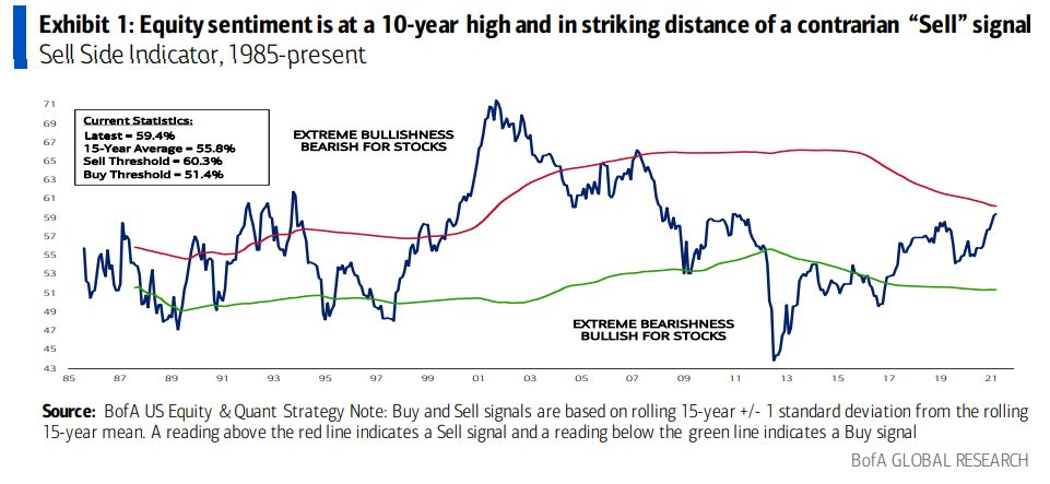
Source: @MikeZaccardi
7. Factor Performance Stats for Q1: What an interesting quarter it was “almost impossible not to make money in equities“ - biggest moves were in the under-favored, undervalued, and basically the beneficiaries of the evolving macro-thematic backdrop (i.e. vaccination/normalization, rising yields, rising commodities).

Source: @361Capital
8. The Perfect Environment to raise Equity Capital: Valuations are at cycle highs, the system is awash with liquidity, and there are clear signs of excess optimism. The right time to raise: and the chart shows that’s exactly what’s happening.

Source: @JulianKlymochko
9. Blended PE Ratio [simple average of PE10, trailing PE, forward PE]: A couple of interesting stats… Current reading = 33x. The All Time High (Jul 1999) = 34.8x. March 2020 = 17.3x. Also of note: if you hold the E side steady, then all we need is another ~5% up in the S&P500 to take out the all time high (i.e. US equities are very expensive).

Source: @topdowncharts
10. Price to Sales Ratio: I have my reservations about using this indicator given the apparent structural rise in profit margins, but still it is a very interesting chart - and echoes the conclusion of the previous chart.
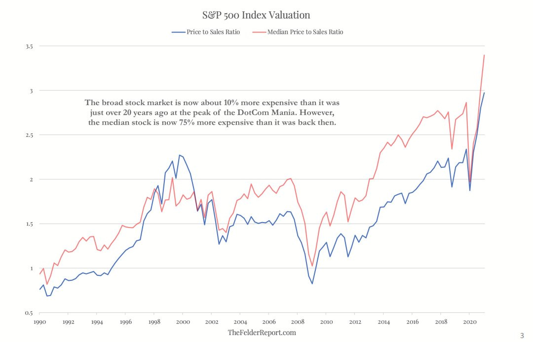
Source: @jessefelder
Thanks for following, I appreciate your interest!
oh… that’s right, almost forgot!
BONUS CHART >> got to include a goody for the goodies who subscribed.
Gold Miners: speaking of head and shoulders continuation patterns, gold miners previously looked to be in the process of putting in a head and shoulders top… but as of last week have rallied back above the neckline. Breadth is also starting to turn up from washed out levels.

I don’t like gold from macro standpoint (expect rising real yields, more fiscal + less monetary stimulus to exert headwinds), but we have seen a partial reset in valuations, an initial washout in flows/sentiment/positioning, and at least for now a key technical support level is holding for gold.
I would also acknowledge that while there is clear and present cause for optimism, there remains several notable near-term prospective downside risks. So I think despite my initial biases, it does look interesting…