Weekly S&P500 ChartStorm - 10 Mar 2024
Something a little different this week...
Welcome to the latest Weekly S&P500 #ChartStorm!
This week I’m on family vacation in Fiji (how dare you!) — but I wanted to keep my unbroken streak of never missing a weekend since starting this in 2015, so here’s a slightly different format than usual (which I prepared earlier — right now I’m probably snoozing or snorkeling).
This week I’m sharing charts from a series of recent educational articles I’ve been working on. So a little more of an educational bent, but still some very interesting and timely market insights too.
Get your notepad out, fetch your favorite beverage, and let’s go to school…
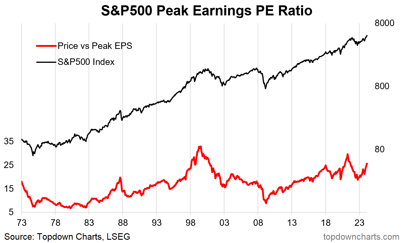
1. Price to Peak Earnings: Starting this week off with an indicator which I haven’t seen many people talking about in a while. It takes price and divides by the rolling max EPS (peak earnings). I like it because it’s simple, has a better signal than some of the other PE ratios, and is telling us interesting things right now. Basically after going to cheap levels (yes *cheap*) in 2022, it is now at its third most expensive level on record. The upside for bulls is that it could go higher… but that bull case requires a repeat of either 2020/21 or the dot com bubble.
Source: 16 Different Stockmarket Valuation Indicators
2. Forward PE: The previous one looks backwards at EPS, this one looks forward. Similar conclusion though, even if you substitute in the latest reading as the next 18-months earnings instead of next 12-months it’s still elevated vs history, and requires either a liquidity and stimulus mania (2020/21) or a new-paradigm mania (2000) if you wanted to believe that multiple expansion could drive stocks higher (and on that note, valuations could simply stay unchanged and super strong earnings could instead drive things higher... reminds me of the “what would I have to believe?” exercise from Peter Attia).
Source: 16 Different Stockmarket Valuation Indicators
3. Price to M2 Ratio: Here’s a valuation indicator that *everyone* was talking about a while ago (mostly during the 2020/21 stimulus frenzy) — but now that M2 money supply has peaked and started to contract, no one seems to talk about it anymore… especially interesting as the indicator reaches new highs.
Source: 16 Different Stockmarket Valuation Indicators
4. Earnings Yield vs Cash Rate: This one is interesting because in its simplicity is relative efficacy. Buy when it’s high, reduce exposure when it’s low/negative. And it makes intuitive sense (higher cash rates = higher opportunity cost to holding risky equities, also higher cash rates = tighter monetary policy; headwind to economy, macro downside risks). Interesting then to note that all 3 measures of the earnings yield are now lower than the 3-month T-Bill rate.
Source: 16 Different Stockmarket Valuation Indicators
5. It’s in the Price: This one uses quant black magic to just turn the price into a valuation signal by itself… appealing because it has a better and more actionable signal than most other valuation indicators, appealing arguably also to those who think the price reflects all fundamental information. Anyway, much like the others, this one is at warning levels — not necessarily a sign or signal of an imminent crash or even a simple gentle turn in the market… but definitely time to pay more attention to risk management, and 100% for sure it is *NOT* cheap anymore.
Source: 16 Different Stockmarket Valuation Indicators
6. Composite indicator: This one combines signals from the PE ratios, equity risk premium, and price-based mean reversion — similar message; stay nimble, risk management in mind. Also shown in this one is the indicator vs subsequent longer-term returns: decent track record, but also a reminder that valuations tend to be more useful for longer-term holding periods… except at extremes, where the information can actually be a lot more tactically relevant (especially at market bottoms).
Source: Using Valuations to Navigate the Cycle
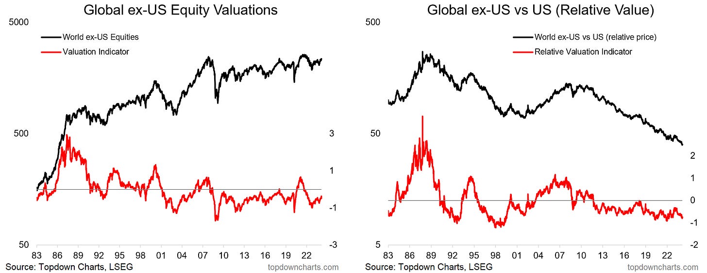
7. US Stocks vs Global: Meanwhile, if you look at global stocks, it’s the opposite. Still cheap vs history, and cheap vs US (albeit global vs US stocks are still in value-trap mode… at least until the trend turns, and/or until you get a push down to cathartic extremes).
Source: How to Use Value Signals for Global Equities
8. US Stocks vs Other Assets: But it’s not just global stocks — bonds and commodities are also cheap (albeit, worth noting both have been cheaper before). Certainly though in terms of relative value across asset classes, US stocks are not the place to be. From a multi-asset investment strategist perspective (my background), this one really stands out — the best time to go diversifying is when there are big valuation gaps. For example, back in 2021 both stocks and bonds were expensive, while commodities were cheap — as it happened 2022 delivered a macro scenario which massively favored commodities and stomped on both stocks and bonds. To me that is a resounding use-case for valuations, especially for asset allocation.
Source: Detecting Opportunities in Commodities
9. Cheap Treasuries: Honing in on treasuries for a second, while there is obviously more to it than just valuations (macro, Fed, sentiment, positioning, inflation resurgence risk, etc), just on valuations, treasuries are cheap… one of the cheapest readings on record — and the valuation indicator has a decent track record. So yes, maybe you should wait until the cycle turns, but in the immediate term valuations are saying maybe reduce exposure to stocks and increase exposure to bonds.
Source: Using Valuations to Navigate the Cycle Topdown Charts
10. The 60/40 Portfolio — Back to Neutral: Back on the 2022 situation, I find this chart to be truly fascinating — as we saw in chart 8 both stocks and bonds were expensive in 2021… so of course in hindsight 60/40 was *doomed* back then. Now things are different in two ways, firstly, at a portfolio level valuations are reasonable for the 60/40 portfolio vs previously expensive. But also, again on chart 8 — we are now in a situation where stocks are expensive and bonds are cheap… forget opinions and charts showing rolling historical correlations, if valuations are like that then you can have greater confidence that bonds will be a future diversifier and correlations will go down.
Contrast that to 2021 when both were expensive — of course bonds would be a bad diversifier and maybe even a source of risk vs a dampener of risk, and of course correlations should probably end up going positive, as they did. So I would say 60/40 is indeed *not dead* (but I would also say that 60/40 is too limited, especially given the compelling relative and absolute value opportunities elsewhere e.g. commodities, global equities, etc!).
Source: Using Valuations to Navigate the Cycle Topdown Charts Professional
Thanks for reading, I appreciate your support! Please feel welcome to share this with friends and colleagues — referrals are most welcome :-)
Looking for further insights? Be sure to check out my work at Topdown Charts (Institutional Investment Research Services)


Have a great vacation!
Have a great vacation!