
Weekly S&P500 ChartStorm - 1 August 2021
Your weekly selection of charts...

Welcome to the Weekly S&P500 #ChartStorm WriteUp
The Chart Storm is a weekly selection of 10 charts which I hand pick from around the web (+some of my own charts), and then post on Twitter.
The charts focus on the S&P500 (US equities); and the various forces and factors that influence the outlook - with the aim of bringing insight and perspective.
Hope you enjoy!
1. S&P 500 Monthly Chart: First up this week is a quick check on the monthly charts - not much to say here; solid month despite the bout of volatility, the index up +2.3% m/m (2.4% including dividends). That makes it +17% YTD as of Friday’s close.
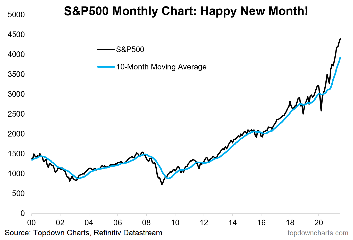
Source: @topdowncharts
2. S&P 500 Cycle Composite: As I noted on Twitter, for the chart above it was “Happy New Month“ — for this one, it may well be “Not-So-Happy new month!“ The Cycle Composite (mix of seasonality signal, presidential cycle, and decennial cycles) points to a potentially problematic next couple of months.

Source: @dnl8201
3. S&P500 Election Cycle: Here’s a chart with just the presidential cycle, but specifically for the first year of a new party in the WH. I guess you could call it that phase where all the nice promises of the election campaigns start to bump up against the political realities (e.g. a smaller infrastructure spending plan than expected).
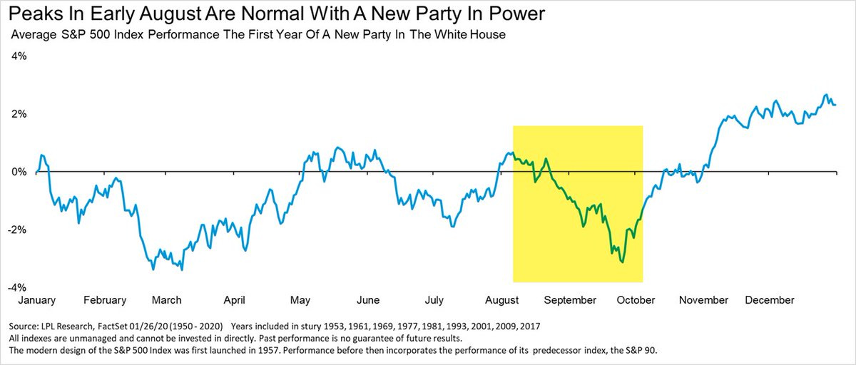
Source: @RyanDetrick
4. S&P 500 Seasonality Pattern: And here is the seasonal pattern by itself, as I’ve noted before, seasonality is simply a statistical characterization of the past (past performance does not necessarily = future performance); it is an average (averages can deceive); and there are many exceptions to the seasonal rule. That said, it is an interesting point to note - maybe after such a strong run, the market is due for a bit of a breather.

Source: @topdowncharts
5. Earnings Revisions vs Economic Surprises: Interesting divergence... Analysts keep revising earnings upwards (you could say they are increasingly optimistic; or even being surprised by the improved earnings backdrop). But the data is disappointing economists (maybe economists simply got to optimistic!). Perhaps at the margin we put this in the bearish bucket should earnings revisions momentum potentially stall and be the one to close the gap.
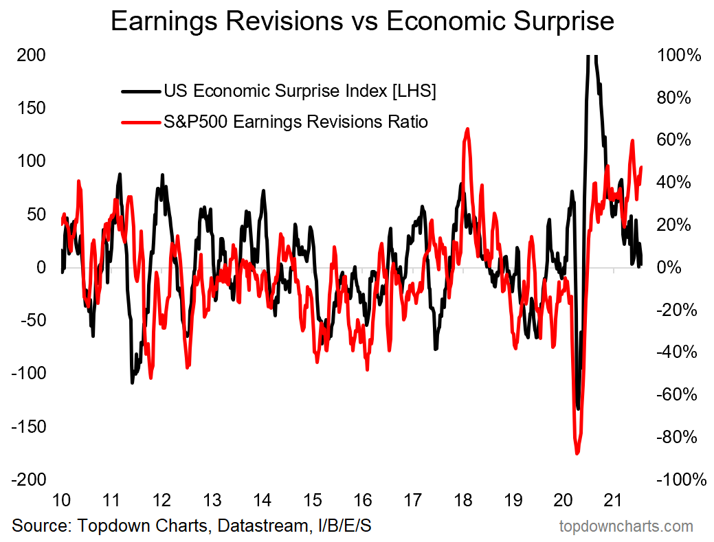
Source: @topdowncharts
6. Cash on the Sidelines: It’s a phrase that many people love to hate. Some even suggest that there is no such thing. But one factual observation we can make is that money market mutual funds still have massive amounts of cash parked in them - almost the same amount as during the peak of pandemic panic. What’s changed is the market has gone up, so the purchasing power of that cash has dropped… basically fallen right in-half. Bullish or Bearish?
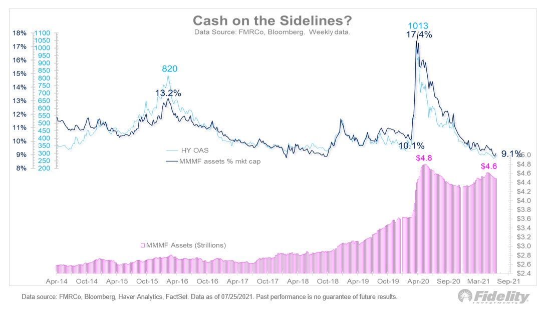
Source: @TimmerFidelity
7. Fund Manager Futures Positioning: This next chart shows fund managers are very much bulled-up on US equities, meanwhile could be called mildly optimistic on Developed Markets (EAFE), and sleeping on Emerging Markets!
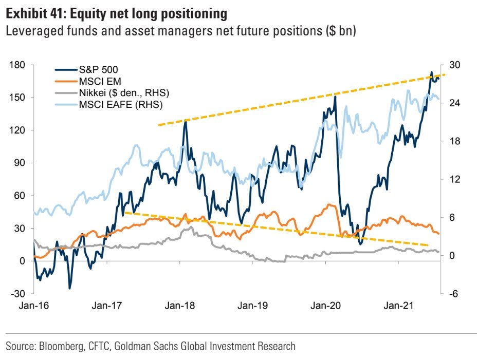
Source: @StockBoardAsset
8. S&P500 Energy Sector Weighting: I find this one really interesting - it shows the progression of the Energy Sector from once a major component of the S&P500 and a major contributor to earnings to now not contributing much at all, and almost an afterthought. Part of this is the secular bear market in commodities (which seems to be over now), and the rise of ESG investing. I think that we shouldn’t count out the energy sector just yet - yes: oil & gas likely decline in importance longer-term, but right now we are still addicted to fossils!

Source: Energy Sector Equities - Low Energy?
9. Real Earnings + Dividend Yield: Pretty interesting chart, I would point out the real yield aspect is likely skewed in part due to inflation rate base effects… but at the same time I am kind of fixated on some of those previous episodes where this indicator made similar downward-facing forays - markets didn’t react well.
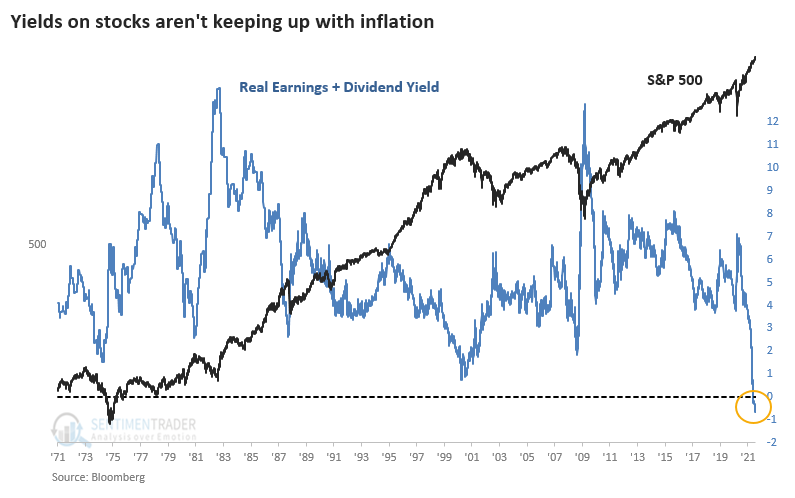
Source: @sentimentrader
10. Dividend Yield + Buyback Yield: Lastly, this one is a good reminder that when thinking about dividend yields we really ought to consider the buyback yield also. In that respect, I wonder if the chart above might not look as bad… but then again even adding back buyback yields, you probably end up with a similar signal/movement. Still, a very interesting chart to remember.
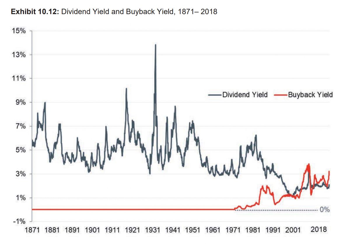
Source: @S_Caufield
Thanks for following, I appreciate your interest!
oh… that’s right, almost forgot!
BONUS CHART >> got to include a goody for the goodies who subscribed.
Most Shorted Stocks: This chart shows (in the red) the Refinitiv Most Shorted Stocks Index - as of the past month, it turns out the short-sellers have basically been on the money (i.e. the most shorted stocks have underperformed).
But perhaps the thing that I find most interesting about this chart is the series of wild rotations we’ve seen. Instead of trying to pick a decade-long rotation or major turning point, maybe we should just think more about the possibility of an ongoing procession of rotations and un-rotations…

Indeed, I would call this just one example of rotating rotations - also of note: value vs growth had a strong run and then gave it all back, EM vs DM the same (and then some), Small vs Large, US vs Global, EM Asia vs EM ex-Asia, to name a few.
So with the Most Shorted Stocks Index starting to stabilize/consolidate, and the relative performance line seeming to find some support, maybe we are setting up for another rotation of rotations!
—
Best regards,
Callum Thomas
SPONSOR: ( …he’s me)
My research firm, Topdown Charts, has a new entry-level Substack service, which is designed to distill some of the key ideas and themes from the institutional service to provide the same high quality insights at a more accessible price. It’s a good way to sample what we’re doing and support the cause.
Give it a try and let me know what you think
Alternatively forward this to someone you think might get value out of it
Thanks! :-)