Off-Topic ChartStorm: Recession Watch
This edition takes stock of the growing evidence pointing to recession...
Welcome to another edition the “Off-Topic ChartStorm“.
Unlike the usual weekly ChartStorm (which focuses on the S&P500 and related issues), the Off-Topic ChartStorm is basically a semi-regular special focus piece with topics spanning macro, markets, stocks, commodities, regions, and research notes.
You should expect to see a mix of the timely and front-of-mind issues, as well as some more non-obvious areas under the radar.
Hope you enjoy!
1. Recession Feeling: Recession is slowly but surely becoming the consensus as the evidence builds up — the latest BofA fund manager survey shows the majority now expecting recession over the next 12-months. While you sometimes want to go against the consensus, the chart goes to illustrate how the crowd often gets it right on the way into a changing situation (and then often ends up overstaying its welcome). The key example would be the leadup to 2008. The 2020 situation on the other hand was an entirely different beast — basically artificial (turn the economy off over night), and paired with massive stimulus. 2022/23 meanwhile is your more traditional recession setup, and likely doesn’t involve the same kind of quick fix.
Source: @MikeZaccardi
2. "New Orders?" or "No Orders!" The empire manufacturing future new orders indicator has dropped into recession territory.
Source: @Lvieweconomics
3. Tech Sector Layoffs: Although ‘small’ in the scheme of things (the sector has a disproportionately small share of employment vs earnings/market cap/GDP contribution) but as a canary in the coalmine it's a very clear warning sign. I would point out that a lot of the larger tech companies have already disrupted/eaten sufficient market share that by now it’s less about adoption and innovation and more about what’s happening with the economy in terms of marginal revenue growth. This would be a key sign and symptom if that assertion is true (cost-cutting into a downturn).
Source: @carlquintanilla
4. Housing Boom & Bust Cycles: One key element of the apparent impending recession is the rapidly unfolding housing bust (and it can easily become a self-reinforcing factor). With the interest rate shock + cost of living shock + apparent economic slowdown (+fact that US housing market is the most overvalued in history), housing is naturally going to have a bad time.
Can already see it in the charts...
Source: @zerohedge
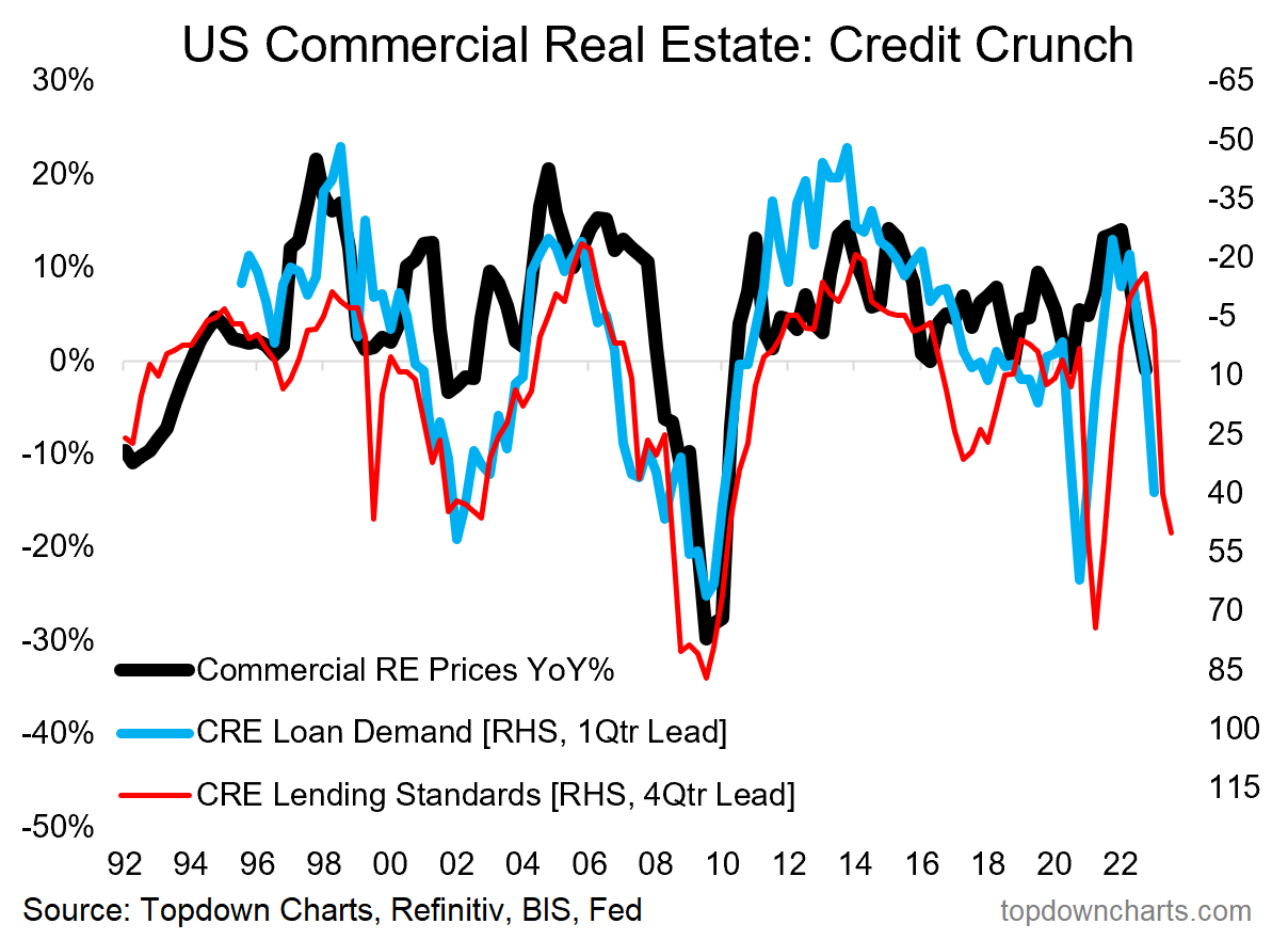
5. CRE Crunch: It's a similar story in Commercial Real Estate, where rising interest rates, uncertainty on occupancy (WFH and cost cutting), and stretched prices thanks to yield-chasing, have seen banks become a lot more cautious on lending — which is often a precursor to a downturn in in the sector.
Source: @topdowncharts
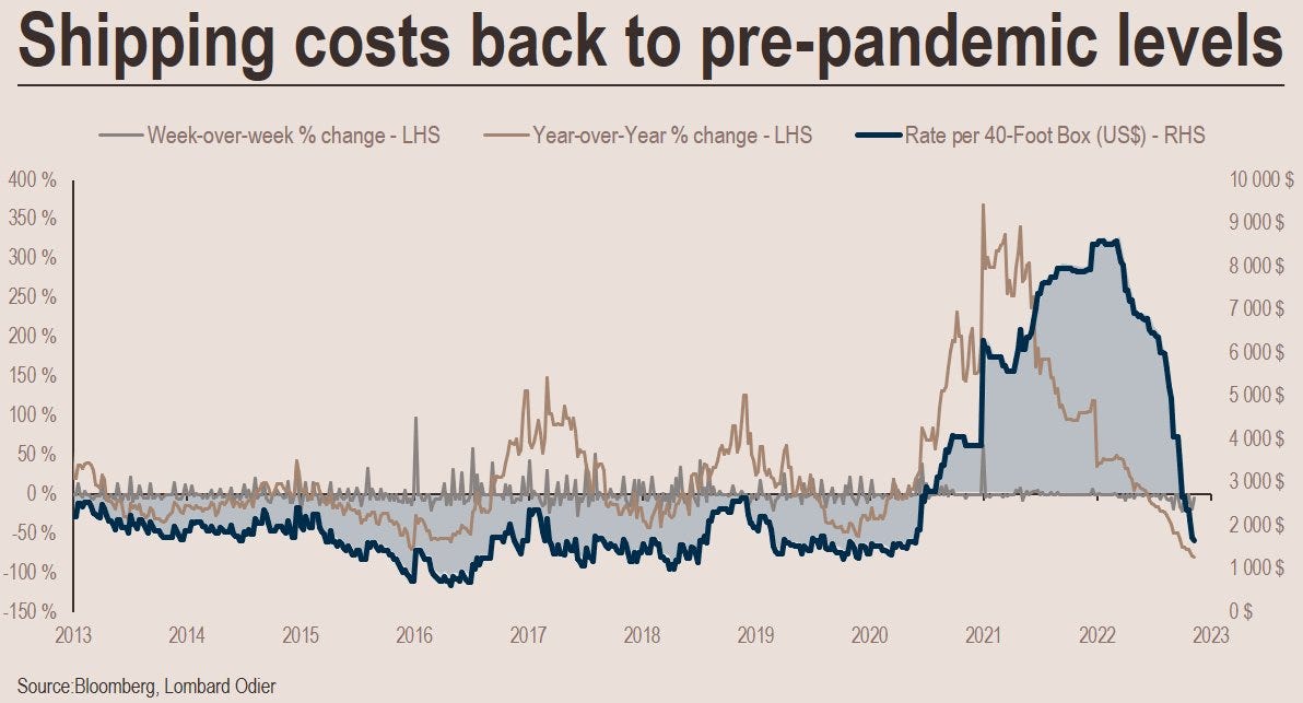
6. Shipping Sink: Taking a global perspective, there are some clear signs that global trade is cooling. The demand + supply shocks drove shipping costs to record levels, but as the supply side responds and demand cools: round-trip.
Source: @stephanemonier
7. Global Credit Crunch: The monetary tides are going out… If a rising tide floats all boats, a receding tide may well sink all boats!
Source: @MacroAlf
8. The Monetary Script: The global manufacturing PMI is sticking to the script set by central bankers. It's simple: ease policy, economy goes up, tighten policy, economy goes down. This is counter-cyclical macroeconomic policy 101.
Source: @topdowncharts
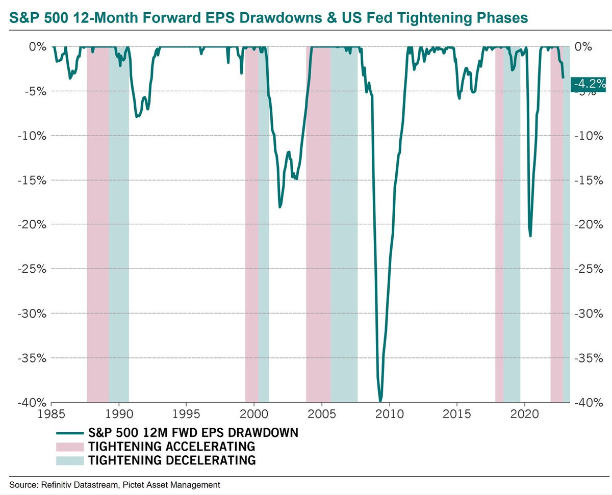
9. Pivot vs Profits: Pivot Likers need to take note on this one. Yes, the Fed likes to decelerate tightening and then ease heading into recession... but then earnings go down (and sometimes bigly).
Source: @steve_donze via @MichaelAArouet
10. Recession Trading: Best not to get to cavalier about risk taking heading into recession, it's hard to know how long/deep a recession will be (+what may break along the way). This chart is a cautionary that yes markets will look to price recession in, but often the ultimate bottom comes later in the process...
Source: @saxena_puru
BONUS CHART >> got to include a goody for the goodies who subscribed.
Deflatometer: stock markets around the world are pricing in a global recession.
This chart tracks the proportion of countries who are seeing a negative annual rate of change in their stockmarket (along side the same for forward earnings, and industrial production). The 2008 and 2020 episodes show how it lights up in tough times.
Clearly there are a few episodes here where the market got out of hand relative to what happened with the economy (basically: red line go up = markets puking, blue/black line go up = economy hurting).
As things stand, most of the world’s stockmarkets are in a downturn. But perhaps most notably, we are starting to see more countries show up with falling earnings and industrial production — this is what you would expect to see during the early stages of a global recession.
It’s hard to know in advance how deep and drawn-out a recession will be, but I would note that we are seeing a record pace of monetary tightening, and multiple leading indicators around the world are pointing to recession.
So I don’t think the markets are wrong to price-in recession. Pragmatically speaking it means a more cautious approach remains warranted. But the other implication of this chart is that if by some chance recession doesn’t eventuate (or is shallower/shorter than expected) then it will be back to business for markets…
—
Best regards,
Callum Thomas
My research firm, Topdown Charts, has a NEW entry-level service, which is designed to distill some of the ideas/themes/charts from the institutional research service to provide the same high quality insights at a more accessible price.
Give it a try and let me know what you think! :-)
For more details on the service check out this recent post which highlights: What you get with the service; Performance of the service; and importantly: What our clients say about it…


You said at the top; "Hope you enjoy". Well, I did, and then I didn't! Is there any good news out there? Wow. Thanks Callum!
That was cool, nice charts! Cheers