Off-Topic ChartStorm: Bonds!
This edition looks at the state of play in the bond market (focused on longer-term treasuries), the risks, divergences, opportunities, and outlook...
Welcome to another edition the “Off-Topic ChartStorm“.
Unlike the usual weekly ChartStorm (which focuses on the S&P500 and related issues), the Off-Topic ChartStorm is basically a semi-regular special focus piece with topics spanning macro, markets, stocks, commodities, regions, and research notes.
You should expect to see a mix of the timely and front-of-mind issues, as well as some more non-obvious areas under the radar.
Hope you enjoy!
NEW: Sign up to the (free) Chart Of The Week over at the new Topdown Charts Substack entry-level service: Subscribe to the Chart of the Week
Each week we send you one of the most interesting charts on our radar, along with commentary/context and a key takeaway — so you’re never left guessing on why the chart matters ...and the charts matter! > > > Subscribe Now
1. Bond Bear Market: So much for "safe" and "conservative" fixed income assets... Bloomberg global bond index down more than -20% since the peak (and note that is total return, so it includes interest income earned from holding bonds (also note, this is nominal — the real or CPI adjusted figure would make it closer to -30% or worse!)).
Source: Endowus
2. Bearish Momentum: Popular treasuries ETF, TLT 0.00%↑ , seeing a major negative momentum thrust; price action is completely dominated by extreme downside volatility. Bottoms can be found in these conditions, but with treacherous risk.
Source: @exposurerisk
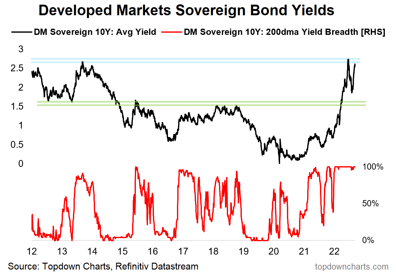
3. Global Government Bond Yields: Developed markets 10-year bond yields are still basically on a one-way road. Average yield across 18 countries is pushing up towards the highs, and 200dma breadth remains maxed-out in the direction of higher yields.
Source: @topdowncharts
4. Zooming Out: The long-term bond Price [n.b. we’ve been switching back and forth between charts of price and yields, which as you should know - move inversely] is at a critical juncture here, very real risk of breaking down and a new wave of pain for bonds (equally though, this would be a convenient place to bottom).
Source: @mark_ungewitter
5. Bond Energy: Energy markets appear to be saying bond yields should be gong lower. However it seems like the 30-year yield is believing the line that lower energy is just because of SPR releases.
We will soon know the truth... (which is probably something in between!)
Source: @FusionptCapital
6. Bond Yields vs Backlogs: It took a while for bond yields to catch up to rising backlogs, but now the open question is how long will it take bond yields to catch back down to easing backlogs?
Source: Chart of the Week - Backlogs and Bond Yields
7. Another Macro Divergence: With economic data surprising to the downside, again, the question is how long can rising bond yields go on for?
Source: @deerpointmacro
8. Yet Another Macro Divergence: And another one, copper/gold ratio edging lower vs bond yields higher. Which one of these is "wrong" ?
Source: @andrewjames3200
9. (on the other hand...) The long-term rate of inflation model says bond yields can still go higher (and possibly even stay higher, if inflation stays high).
Source: Chart of the Week - Bond Yields and Inflation
10. Macro Tides: (but) with the global liquidity tides going out, and numerous leading indicators pointing to lower growth and inflation, it's probably only a matter of time and timing for bonds.....
Source: @RaoulGMI via @DTAPCAP
Thanks for following, I appreciate your interest!
Summary and Closing Thoughts
To sum up, bonds (focused on longer-term treasuries in this context) face a fairly mixed technical backdrop, with an established bear market and substantial bearish momentum. Yet at the same time, you might argue that bonds look technically oversold, and price seems to be sitting at a critical make-or-break juncture.
Overlay upon that the various macro divergences, where most growth/economic data (and macro analogs) point to lower bond yields. Yet at the same time, those focused on inflation might argue that bond yields have further upside to come. So there is something for bulls and bears at the moment.
I think the easiest way to reconcile all this is to say that it’s simply a matter of time and timing. The inflation fixation is keeping bonds under pressure right now (along with unfriendly central bank policies), but paradoxically, or perhaps logically; the more that inflation is a problem the more that central banks will tighten and the higher that bond yields go the greater the headwinds for the economy.
That means the greater the odds of a global recession, and longer-term bonds are supposed to price off of that sort of thing. But with high inflation still a clear and observable reality in the data, maybe what it will really take is for growth risks to go from just a whole bunch of leading indicators to actual clear and observable weakness in the data. And interestingly, several PMIs are starting to show just that…
Appreciate your ongoing support and interest.
—
Best regards,
Callum Thomas
My research firm, Topdown Charts, has a new entry-level Substack service, which is designed to distill some of the ideas/themes/charts from our institutional research service to provide the same high quality insights at a more accessible price.
Give it a try and let me know what you think! :-)


The market is masterful as to the uncertainty of the (any S, M,L ) coming moves, to how we understand and apply both technicals and fundamentals. So devious in that respect,. An A game is always required. Bonds could pay big, just not yet. (Own TYD FYI).
Excellent post, thank you. Just one remark.
Graph 10 looks a bit “iffy”: in 2011, 2015 and 2019, the CB liquidity -14M lead and CPI moved in opposite directions, only the 2020 trough and the 2022 peak coincide. That feels like some just “fitted” a time shift to make the latest trough/peak coincide. Lots of recency bias in that.