Off-Topic ChartStorm: Bond Yields
Bond yield special edition: technicals, flows, positioning, sentiment, macro, policy rates, inflation, a look at what's driving bond yields...
Here’s a quick “Off-Topic ChartStorm“ on bond yields.
Unlike the usual weekly ChartStorm (which focuses on the S&P500 and related issues), the Off-Topic ChartStorm is a semi-regular focus piece with topics spanning macro, markets, stocks, commodities, regions, and various other intriguing research.
NEW: Sign up to the (free) Chart Of The Week over at the new Topdown Charts Substack entry-level service: Subscribe to the Chart of the Week
Each week we send you one of the most interesting charts on our radar, along with commentary/context and a key takeaway — so you’re never left guessing on why the chart matters ...and the charts matter! > > > Subscribe Now
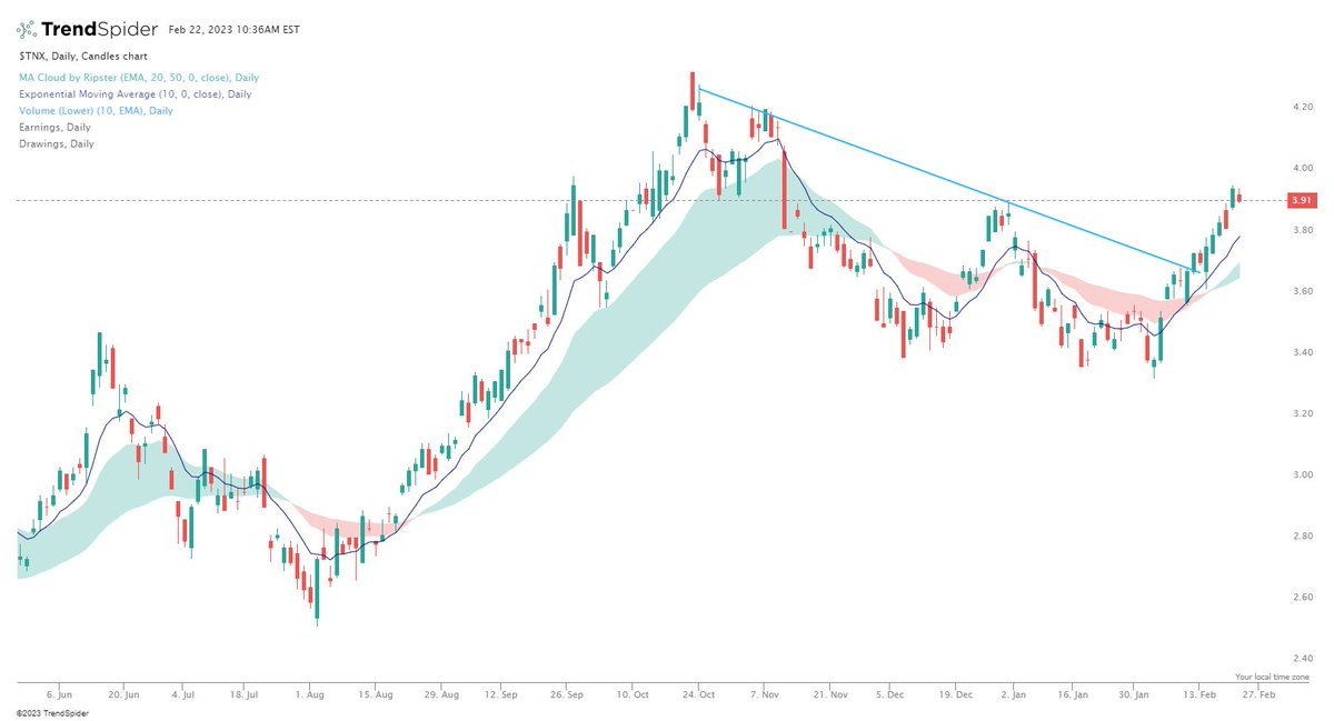
1. Bond Yields Breaking Out Again: Interesting chart showing US 10-Year treasury yields breaking higher – “if this was a stock, it would be a decent setup” (breakout, moving averages turning up, short-term moving average crossover). And the way I look at the world, if I see an interesting technical chart like this to me it is a prompt to go and fill out the rest of the picture to see if there is a there there.
Source: @jonathanharrier
2. Back into Bonds: As yields rise investors are getting back into bonds. At a certain point, the yield from buying and holding bonds outweighs the risk of mark-to-market capital losses on bonds if yields rise further. But also interesting from a sentiment standpoint to see the big run of big outflows turn the corner.
Source: @biancoresearch
3. Fund Managers Like Bonds: Meanwhile, fund managers are already on board; overweight bonds and underweight equities. Essentially they are betting on bonds to outperform equities e.g. in a situation of recession where yields go down and stocks stumble as earnings dive and risk appetite fades.
Source: @BobEUnlimited
4. Bond Yield Macro Divergence: But for now, the bond market is not buying the recession thesis – global PMIs point to economic slowdown, while bond yields are trading as if it’s economic boom times.
Source: @Callum_Thomas
5. All-in to All-out: Back on flows, investors are selling both stocks and bonds. But perhaps most interesting in that chart is the climax of inflows around the peak in bonds, and now a tentative tick up from record outflows.
Source: Topdown Charts @TopdownCharts
6. Bond Sentiment: This chart shows bond market sentiment from the Consensus Inc indicators. There’s two interesting things: 1. Sentiment is still mostly bearish (shown inverted); and 2. The shift in sentiment regimes/ranges from the deflation risk period to inflation risk period (and how sentiment is turning off the edge of the range – consistent with the upside move in yields underway at the moment).
Source: Topdown Charts @TopdownCharts
7. Rising Rates vs Rising Yields: Another aspect tangled up in the inflation narrative is the rising rates aspect, and historically the direction + peaks/troughs of policy rates set the tone for bonds, and thus a scenario of further rate hikes will likely mean a window of further upside for bond yields (and hence a sustainable bottom in bonds probably needs a peak (and pivot) in policy rates).
Source: Topdown Charts @TopdownCharts
8. Taylor-Made: This version of the Taylor Rule suggests cash rates are still way too low. And based on the previous comments, would also suggest that bond yields may also need to head higher yet.
Source: @LynAldenContact
9. Inflation Bond Model: Another perspective, my long-term rate of inflation model is still pointing to US 10-year yields in the high 4%’s. And going back to that macro divergence chart, it’s clear that the bond market is still pricing off inflation and policy rates rather than recession risk (for now).
Source: Topdown Charts @TopdownCharts
10. Bond Yields vs Nominal Growth: And to belabor the inflation vs growth aspect a little further, this one shows bond yields loosely linked to the rate of nominal GDP growth. Which again speaks to the point that inflation and/or growth need to head lower for bond yields to come back down (but also implies that if nominal growth finds a new higher plateau then so too will cash rates and bond yields).
Source: @ssinvestments8
Thanks for following, I appreciate your interest!
My research firm, Topdown Charts, has a NEW entry-level service, which is designed to distill some of the ideas/themes/charts from the institutional research service to provide the same high quality insights at a more accessible price.
Give it a try and let me know what you think! :-)
For more details on the service check out this recent post which highlights: What you get with the service; Performance of the service; and importantly: What our clients say about it…


Great charts on bonds. What is missing is that the Fed’s bond buying program artificially lowered bond yields too far. We are now just reverting back toward normal. The market has been conditioned for the Fed to artificially lower rates since 2008. This why the YC was so inverted. (50 years experience with this)
UK gilts look like they could be in trouble next week